

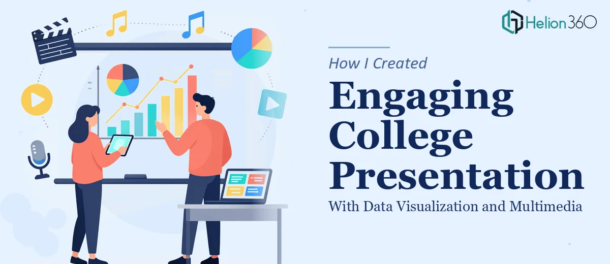
The Assignment Looked Simple Until It Wasn't
The brief was straightforward enough: a college presentation covering a topic with real data, delivered to classmates and an instructor within two weeks. Nothing about that sounds particularly daunting on the surface. But the moment I sat down and looked at what the assignment actually required — key data points visualized clearly, a compelling narrative arc, infographics, and multimedia elements woven in — I realized this wasn't just about slapping some bullet points on a slide.
The audience was going to judge this in real time. The instructor would be evaluating not just the content, but how well the information was communicated. A cluttered, inconsistent deck would undermine even solid research. The stakes weren't enormous in a business sense, but they were real — this was a graded presentation that needed to stand out. I knew immediately that doing it right was the only option worth considering.
What Doing This Well Actually Requires
I spent time researching what separates a forgettable college presentation from one that actually lands. What I found was that the gap between the two is almost entirely about execution discipline — not effort.
First, effective data visualization in a presentation isn't just dropping in a chart. The right chart type has to match the data story: a bar chart for comparisons, a line chart for trends over time, a scatter plot for correlations. Using the wrong type doesn't just look off — it actively confuses the audience.
Second, multimedia integration is more involved than embedding a video. The element has to cue at the right moment, be sized correctly within the slide layout, and not compete visually with the surrounding content. Getting that balance wrong breaks the flow of the whole presentation.
Third, narrative structure — the actual story arc across slides — requires deliberate planning. Without it, even great data reads as a data dump rather than an argument. That planning work happens before a single slide gets designed.
By that point, I had a clear picture of the complexity involved. This wasn't a weekend project.
What the Work Actually Involves
The right approach to a presentation like this starts with a structural audit of the raw content. The practitioner maps a story arc across the deck — typically an opening hook, a problem or context setup, evidence-based body sections, and a clear conclusion — before any visual work begins. For a data-heavy academic presentation, that means deciding which data points carry the argument and which are supporting detail. A well-structured 15-slide deck usually has no more than one core idea per slide, with a headline that states the point rather than labels the topic. Getting this sequencing right is harder than it sounds; most people underestimate how much rewriting the source content requires before it's ready to be designed.
Visual Enhancement of Presentation is where execution friction compounds quickly. Proper slide layout uses a consistent grid — typically a 12-column structure — so that charts, text blocks, and images align predictably across every slide. Typography follows a clear hierarchy: a title at roughly 36pt, subheadings at 24pt, and body copy no smaller than 18pt for legibility in a classroom setting. Chart formatting alone demands attention: axis labels, data callouts, and legend placement all need to be legible at presentation distance. Someone new to these rules can spend hours on a single slide just trying to get the visual weight balanced, let alone consistent across the full deck.
Multimedia integration — embedding video clips or animated infographics — adds another layer entirely. Each element needs to be sized and positioned so it doesn't disrupt the slide's visual hierarchy, and it needs to be tested for playback in the actual presentation environment. Infographics require their own design pass: iconography, color coding, and flow direction all need to reinforce the data story rather than decorate it. A standard academic presentation with three to five multimedia elements can easily take a full day of production time just for that layer, before accounting for revision cycles or compatibility issues across different display setups.
Why I Brought in Helion360 to Handle It
Looking at all of that, I made a straightforward call: this project needed a team that already had the tools, templates, and design experience in place — not someone learning on the job with my deadline on the line.
Helion360 handled the full project end-to-end. That meant taking the raw research and content, building the narrative arc, designing every slide with proper grid structure and typography hierarchy, producing the data visualizations in the correct chart formats, and integrating the multimedia elements correctly. The whole thing was turned around quickly — done in days, not the better part of two weeks I would have spent stumbling through it myself.
What stood out was that the execution depth was already there. The team works on presentations like this constantly, which means the decisions that take a first-timer hours — which chart type, how to scale the infographic, how to handle slide-to-slide visual consistency — were handled without friction.
The Result and What I'd Tell Anyone in My Spot
The final deck was clean, consistent, and genuinely engaging. The data visualizations communicated clearly without overloading any single slide. The multimedia elements cued at the right moments and sat naturally within the layout. The narrative moved from context to evidence to conclusion in a way that felt deliberate rather than assembled.
More practically: the presentation held the room. Classmates were visually engaged throughout, and the structure made the argument easy to follow without additional explanation. That outcome came directly from the execution quality — not just the underlying research.
Anyone looking at a data-heavy presentation with real data, multimedia elements, and an audience that will judge the delivery as much as the content — should recognize early that the execution work is substantial. If you want it handled end-to-end and delivered fast, like the team that created this engaging CPD presentation on 3D laser scanning, Helion360 is the team to engage.