

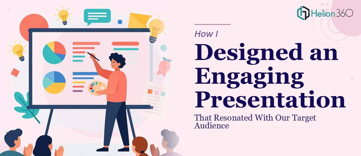
The Moment I Realized This Presentation Had to Actually Land
We were at a pivotal point with a new project. The goal was straightforward on paper: take everything we had learned about our potential customers — from surveys, focus group findings, and interview data — and build a presentation that would communicate those insights clearly to internal stakeholders and help shape our go-forward strategy. The stakes were real. Decisions about positioning, messaging, and investment were riding on this presentation being understood and trusted by the people in that room.
The problem was that the raw material was dense. There were pages of qualitative notes, quantitative response data, and behavioral patterns that didn't naturally connect to each other. Dumping that into a slide deck wasn't going to work. I knew immediately that this needed to be done properly — not just formatted, but genuinely designed to communicate.
What I Found a Well-Built Audience Insights Presentation Actually Requires
When I started looking at what a presentation like this really involves, it became clear quickly that it wasn't a formatting exercise. Translating customer research into an engaging PowerPoint presentation meant making a series of deliberate decisions that most people without a design and storytelling background aren't equipped to make under deadline pressure.
The first signal of complexity was the narrative architecture. Customer insights data doesn't come pre-ordered into a story. Someone has to look at the full body of research and decide what the audience needs to hear first, what builds on what, and where the logical conclusion lands. That's editorial judgment, not slide-building.
The second signal was data visualization. Survey results, demographic breakdowns, and behavioral patterns each require different chart treatments to be legible and persuasive. Choosing the wrong chart type doesn't just look bad — it obscures the finding entirely.
The third signal was consistency at scale. A presentation with this much content across many slides needs to hold together visually. That requires a disciplined design system, not just good taste on a few hero slides.
What the Work Actually Involves
The foundation of a strong audience insights presentation is structural and narrative work — auditing the full body of research, identifying the three to five core findings that actually matter to the business decision at hand, and mapping those into a story arc with a clear beginning, middle, and resolution. A practitioner working on this has to decide what gets cut, what gets combined, and what needs its own dedicated slide to breathe. That editorial process alone takes hours when the source material is rich and multi-layered. Getting it wrong means a deck that feels like a data dump rather than a persuasive argument, regardless of how well the slides look.
Once the narrative is set, the visual mechanics have to carry it. Proper data visualization in a presentation context follows specific rules: bar charts for comparisons across categories, line charts for trends over time, and donut or stacked charts for compositional breakdowns — each with a maximum of four to six data series before legibility collapses. Typography hierarchies typically run at 36pt for headline statements, 24pt for supporting labels, and 16pt for annotations or source citations. Building these correctly inside a master slide system — so that every layout propagates consistently — is the kind of task that takes an experienced practitioner a fraction of the time it takes someone doing it for the first time.
Polish and consistency across the full deck is where most self-built presentations fall apart. A properly designed audience insights presentation applies no more than four brand colors, uses a single typeface family across all slide types, and maintains consistent margin and padding — typically built on a 12-column grid — from the first slide to the last. When the content runs to twenty or thirty slides, maintaining that discipline without a design system already in place is genuinely difficult. One inconsistent layout or an off-brand color applied to a chart legend is enough to undercut the credibility of the findings themselves in a high-stakes room.
Why I Brought in Helion360 to Handle It
I looked at what this presentation needed and recognized immediately that attempting it myself wasn't a realistic path. I didn't have the time, the design tooling, or the specialized experience to execute narrative architecture, data visualization, and visual consistency at this level — not with the deadline I was working against.
Helion360 handled the full project end-to-end using market research presentation design services. That meant going from the raw research findings all the way through to a finished, presentation-ready deck — narrative structure, chart design, layout system, and brand application included. They turned it around quickly, in a fraction of the time it would have taken me to work through even the structural decisions alone. The work that needed to happen — editorial judgment on the findings, proper chart selection for each data type, and a consistent visual system across every slide — was handled by a team that does exactly this kind of work every day, with the expertise and tooling already in place.
What I'd Tell Anyone Looking at the Same Problem
The finished presentation did what it needed to do. The findings were clear, the story held together logically, and the visual design gave the data the weight it deserved in the room. Stakeholders engaged with the insights rather than struggling to parse them — which was the whole point.
What I took away from this is that a presentation built on customer research is only as effective as the design decisions made around that research. The data can be solid and the findings genuinely useful, but if the deck doesn't communicate them with clarity and visual discipline, the strategic value gets lost.
If you're sitting on a body of audience research and need it translated into a presentation that actually resonates — without spending weeks figuring out how to do it yourself — Helion360 is the team to engage. They handled this end-to-end, delivered fast, and brought the kind of execution depth that this work genuinely requires.