

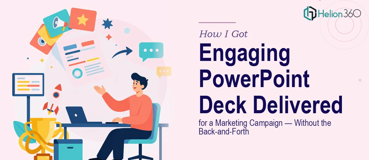
The Campaign Was Real and the Deck Had to Match It
We had a marketing campaign coming together — clear messaging, defined audience, a tight timeline. The only thing missing was a presentation that could actually carry it. Not a rough set of slides with bullet points and stock photos, but a polished, on-brand PowerPoint deck that looked like the campaign itself: sharp, purposeful, and built to hold attention.
The stakes were straightforward. The deck would be used across multiple touchpoints — stakeholder briefings, internal alignment sessions, and external-facing presentations. If it looked thrown together, the campaign would feel thrown together. That was not an option.
I knew immediately this wasn't a task to hand off casually or attempt to patch together from a template. A properly built PowerPoint slide deck for a marketing campaign has real craft behind it. I needed to understand what that craft actually involved before deciding how to move.
What I Found Out When I Actually Looked at What This Takes
My first instinct was to scope the problem properly. So I looked at what a genuinely well-executed marketing presentation requires — not a prettied-up document, but a designed communication tool.
The first thing that stood out was the narrative architecture. A marketing deck isn't a report. Every slide has to earn its place in a sequence that builds toward something. Getting that sequence right — knowing what to say first, what to hold back, how to pace the reveal of key messages — is a structural problem, not just a visual one.
The second signal was brand integrity. Keeping a consistent visual identity across 20 or 30 slides, with varied content types and data, requires more than picking the right colors. Font hierarchies, spacing rules, icon language, image treatment — every element has to behave consistently or the whole thing reads as inconsistent.
The third thing was animations and motion. Done poorly, slide animations are a distraction. Done well, they guide attention and reinforce the message. Getting that balance right takes real experience with timing and purpose — not just a few hours in PowerPoint.
That combination of complexity told me clearly: this wasn't a weekend project.
What Building This Deck Actually Involves
The work starts with a structural and narrative audit of the source material. A strong marketing PowerPoint deck is built on a clear story arc — problem, tension, solution, proof, call to action — and every slide maps to a specific beat in that arc. The right approach involves stripping back the raw content, identifying the core message hierarchy, and sequencing slides so each one moves the audience forward. Most people underestimate how long this takes. Reworking a content structure that's been drafted as a document into a slide-by-slide narrative can take as long as the visual design itself, especially when the messaging spans multiple audience segments.
Visual mechanics are the second layer. A professional marketing presentation uses a 12-column layout grid to ensure consistent alignment across every slide, a strict typographic scale — typically 36pt for headlines, 24pt for subheads, 16pt for body — and a palette capped at four brand colors applied according to a defined hierarchy. Charts and data visuals get formatted to match, not just pasted in from a spreadsheet. Every image follows the same treatment rules: consistent crop ratios, matched color grading, unified framing. Getting all of this right across a full deck means working in master slide templates from the start and never letting individual slides drift from the grid. That discipline is what separates a deck that looks professional from one that merely looks busy.
The third layer is animation and motion design. Effective slide animations in a marketing deck follow a clear rule: every motion element must direct attention, not decorate. Entrance animations on key data points use precise timing — typically 0.3 to 0.5 second eases — so they feel deliberate rather than theatrical. Builds are used sparingly, triggered to support spoken delivery rather than run on auto. Getting this right requires testing across different screen environments and presentation contexts. It also requires resisting the impulse to animate everything, which is where most non-specialists lose the thread and end up with a deck that distracts rather than communicates.
Why I Brought Helion360 in to Handle the Full Project
Once I understood what the work actually required, the decision was easy. I didn't have the hours to learn master slide architecture properly, and I wasn't going to produce animation timing at the quality this campaign needed through trial and error. The smart move was to engage a team that does this work every day with the tooling already in place.
Helion360 handled the project end-to-end. They took the raw campaign messaging and content, built the narrative structure from scratch, designed the full visual system — grid, typography, color application, icon language — and delivered a complete deck with purposeful animations throughout. The turnaround was fast. What would have taken me weeks of learning and iteration was done in days, with the depth of execution the campaign actually required.
What stood out was that nothing came back requiring a round of fundamental fixes. The structure was right, the brand was right, and the motion design was calibrated correctly for the presentation context. That's the difference between a team that's done this a hundred times and someone figuring it out as they go.
What the Deck Delivered — and What I'd Tell Anyone in My Position
The finished presentation matched the campaign. Every slide felt intentional. The visual system held together across every content type — text-heavy context slides, data visuals, and full-bleed image slides — without any of the inconsistency that usually creeps in when decks are assembled piecemeal. Stakeholders noticed. The campaign had a presentation that could actually represent it.
If you're looking at a similar project — a marketing campaign deck that needs to be built properly, not just assembled — and you want it handled end-to-end without the learning curve, Helion360 is the team to engage. They delivered fast and handled every layer of execution this kind of work demands.