

When Safety Training Slides Are Too Important to Get Wrong
I had a workplace health and safety training module that needed to land with a mixed audience — floor staff, supervisors, and new starters all in the same room. The content was solid: incident reporting procedures, hazard identification steps, emergency protocols. But the slides it lived in were a wall of bullet points and clip art that had not been touched in years.
The stakes were real. This was not a discretionary presentation — WHS training is a compliance requirement, and if the material doesn't connect with the audience, it doesn't stick. People tune out, they miss the key procedures, and the training effectively fails. I needed six slides that communicated clearly, held attention, and respected the seriousness of the subject matter without putting anyone to sleep.
I knew straight away that a quick reformat wasn't going to cut it. This needed to be done properly.
What I Discovered This Kind of Presentation Actually Requires
I started looking at what genuinely effective safety training presentations do differently. The gap between a functional slide deck and one that actually works in a training room is bigger than most people expect.
First, WHS presentations carry domain-specific obligations. Content hierarchy has to follow the structure of the training framework — hazard identification before control measures, risk ratings before reporting procedures. A designer who rearranges slides for visual balance without understanding that logic can inadvertently break the instructional sequence.
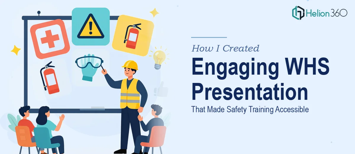
Second, the visual language matters enormously for this audience. Safety training relies on recognition — colour-coded risk levels, internationally understood iconography, clear signal hierarchy on each slide. Getting that wrong doesn't just look bad; it creates genuine comprehension problems.
Third, six slides sounds manageable until you factor in that each one needs to carry a distinct instructional purpose, maintain consistent visual identity, and work as a standalone reference that someone can photograph or revisit later. That's a lot of design discipline packed into a small deck.
I could see this was not a weekend project.
What the Design Work Actually Involves
The right approach starts with a structural audit of the source content before any design decisions are made. For a WHS presentation, that means mapping the instructional sequence — what the audience needs to know first, what builds on that, and what needs to stand alone as a reference point. Done well, each of the six slides is assigned a single primary message, and the narrative flows from hazard awareness through to reporting and response. The friction here is that most source content doesn't arrive in this order. Reorganising it without losing critical compliance details requires genuine familiarity with training module structure, not just slide editing.
Visual mechanics in a safety training context follow stricter conventions than a typical business presentation. A proper layout system uses a 12-column grid, limits the deck to a maximum of four brand-aligned colours plus two signal colours (typically red and amber for risk indicators), and applies a consistent typographic scale — 36pt for slide titles, 24pt for subheadings, 16pt for body text at minimum. Iconography must align with ISO 7010 safety symbols where relevant. Deviating from these conventions doesn't just look unprofessional — it can confuse an audience that has been trained to read those visual cues a specific way. Setting this system up correctly across a master slide template, so it propagates without manual adjustment on every slide, takes experienced hands.
Polish and consistency across all six slides is where most DIY attempts fall apart. Each slide must carry the same grid alignment, the same icon style weight, the same corner radius on any callout boxes, and the same spacing between elements — even when the content volume varies significantly between slides. One slide might carry a two-step process diagram; the next might be a full-bleed image with a text overlay. Maintaining visual cohesion across that range, while keeping the deck feeling intentional rather than assembled, requires a level of layout discipline that takes hours to execute and even longer to review if you're not doing it daily.
Why I Brought Helion360 in to Handle the Full Project
Once I understood what the work actually involved, the decision was straightforward. I was not going to spend a week learning master slide architecture and WHS iconography conventions when I had a training session scheduled and compliance obligations to meet.
I brought in Helion360 to handle the full project end-to-end. That meant the content restructure, the visual system build, the iconography selection, and the final polish across all six slides. They handled the instructional sequence logic, the layout grid, the colour and typography system, and the consistency pass — everything that needed to happen for this to work as a professional training asset. What I valued most was the speed and their expertise with Company Training Modules that streamline both delivery and retention.
What the Deck Delivered and What I'd Tell Anyone in the Same Position
The six slides came back as a cohesive, professionally structured WHS presentation that worked for every level of the training audience. The instructional flow was logical, the visual hierarchy was clear, and the risk indicators were immediately readable without needing explanation. Feedback from the training session confirmed that the material landed — participants engaged with it, asked the right questions, and the key procedures were retained.
The deck also held up as a reference document. Participants could photograph individual slides and come back to them without needing the full session context to understand what they were looking at. That's the mark of interactive educational materials that genuinely work in practice.
If you're looking at a WHS presentation — or any training material — that needs to be credible, compliant, and visually accessible, and you want it handled end-to-end without the learning curve, Helion360 is the team I'd engage. They delivered fast and brought exactly the kind of execution depth this type of work demands.