

The Task Looked Simple. It Wasn't.
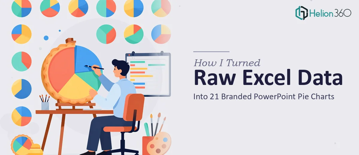
I had a spreadsheet — actually, several of them — packed with percentage-based data that needed to become a presentation. Twenty-one pie charts, all formatted consistently, all matching brand guidelines, all inside a single PowerPoint file. On paper, it sounded manageable. I've worked with Excel before and I know my way around a basic chart.
But once I started, I realized the scope was bigger than I had estimated.
Where Things Started to Break Down
The data itself wasn't the hard part. The challenge was the consistency. When you're building one or two charts, you can adjust formatting manually and move on. When you're building twenty-one, every small decision — the color scheme, the label placement, the legend style, the font size on each slice — has to be made once and applied perfectly across every single slide.
I spent a few hours trying to get the first few charts right. I could get the data in, but the pie charts kept coming out slightly off. The colors didn't match the brand palette exactly. The labels were overlapping on smaller slices. Some charts had slightly different sizing than others. And the slides themselves didn't feel cohesive — they looked like charts dumped onto a page, not a designed presentation.
I also realized I wasn't sure how to handle the brand guidelines side of things. I had a color reference, but translating those hex codes consistently across every chart in PowerPoint while keeping everything pixel-aligned was taking longer than the actual data work.
Bringing in the Right Help
After a few hours of rework and still not being satisfied with the output, I reached out to Helion360. I explained the project — raw Excel data, 21 pie charts, consistent design, brand colors, clean slide formatting. Their team asked a few focused questions about the brand guidelines, the data structure, and the intended audience for the presentation. Then they got to work.
What I handed over was a messy spreadsheet and a brand color reference. What came back was a fully structured PowerPoint file.
What the Final Presentation Looked Like
Every one of the 21 pie charts was built directly from the Excel data with accurate percentages. The color scheme was consistent across all slides — not approximately consistent, but exactly consistent, using the correct brand colors throughout. Each chart had clean labels, properly placed legends, and percentage callouts that didn't overlap or crowd the visual.
The slides themselves were formatted with enough white space that the charts could breathe. The typography matched the brand. Each slide followed the same layout logic, so scrolling through the deck felt intentional rather than assembled.
Helion360 also included notes within the file explaining how each chart was structured, which made it easy to update the data in the future without breaking the formatting.
What This Taught Me About Data Visualization in PowerPoint
Building a single chart from Excel data is straightforward. Building a presentation-ready set of charts that holds up visually, stays on-brand, and communicates data clearly across 21 slides is a different discipline entirely. It requires someone who understands both the data and the design — and knows how to move between Excel and PowerPoint without losing accuracy along the way.
Consistency is the hardest part of this kind of work. It's not enough for each chart to be individually correct. They all have to feel like they belong to the same visual system. That takes planning, attention to detail, and honestly, a lot of patience.
The other thing I underestimated was the brand compliance piece. When a presentation is going in front of an audience, the charts can't just be close to the brand colors — they need to be exact. That level of precision is harder to achieve than it sounds when you're working slide by slide.
If you're looking at a similar project — raw data that needs to become a clean, branded presentation with interactive charts, Helion360 is worth reaching out to. They handled the complexity efficiently and delivered a file that was ready to use without further cleanup. You might also benefit from exploring a data visualization toolkit that can help automate and standardize this kind of work, or reviewing how others have tackled raw data into interactive dashboards.