

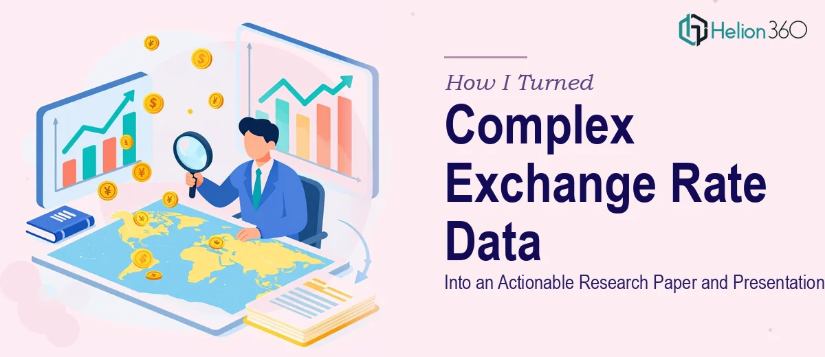
When the Data Is Deep but the Deadline Is Real
I had been sitting with months of collected data on exchange rate volatility and price levels across multiple global markets. The raw numbers were solid. The patterns were there. But converting all of it into something coherent — a research paper backed by proper literature, and a PowerPoint presentation that could speak to both academic reviewers and business decision-makers — was a different challenge entirely.
I am comfortable working with economic data. I understand how currency fluctuations interact with domestic price levels, how purchasing power parity behaves under stress, and what the empirical literature on exchange rate pass-through typically argues. But sitting down to actually write a full research paper — with structured methodology, synthesized references, and a narrative that holds together from abstract to conclusion — is a specific kind of work. And doing that while also building a presentation that distills all of it clearly? That was two separate full-time tasks running in parallel.
Where the Process Started to Break Down
My first attempt at structuring the research paper started reasonably well. I had a clear thesis around how exchange rate volatility affects consumer price levels in emerging markets, and I had data to support it. The problem came at the literature review stage. Synthesizing decades of academic work — from Dornbusch's overshooting model to more recent empirical studies on exchange rate pass-through in developing economies — into a coherent, non-repetitive narrative took far longer than I had budgeted.
At the same time, I was trying to sketch out the PowerPoint presentation. Every time I pulled a chart from the dataset and dropped it into a slide, it looked like exactly what it was: raw output from a spreadsheet. There was no visual logic to the flow, no hierarchy in how findings were introduced, and no clean way to make the exchange rate volatility analysis feel digestible to an audience that included non-economists.
I was not struggling because the subject was unclear to me. I was struggling because transforming research depth into communication clarity is a skill that sits alongside economic analysis, not inside it.
Bringing in the Right Support
After hitting that wall, I came across Helion360. I explained the full scope — the research paper structure, the literature synthesis requirement, the dataset, and the dual audience for the presentation. Their team asked the right clarifying questions immediately: Who would be reading the paper? What was the primary argument? How technical should the PPT be for the business audience versus the academic one?
That level of intake told me they understood the distinction between writing about economics and writing economics communication. I handed over my data files, my preliminary outline, and a set of key papers I had already identified as foundational.
What the Delivered Work Looked Like
The research paper came back structured cleanly — introduction, theoretical framework, literature review, data and methodology, results, discussion, and conclusion. The literature section drew meaningfully from established exchange rate volatility research and connected it directly to our empirical findings without feeling like a catalogue of citations. The methodology section explained the statistical approach in a way that could satisfy an academic reader without losing a finance professional skimming for implications.
The PowerPoint presentation took a different but equally deliberate approach. The opening slides established the macro context for why exchange rate volatility and price levels matter right now. The data visualizations were rebuilt so that each chart told one story clearly, rather than presenting all variables at once. The final section translated the research findings into practical implications for international trade and financial planning — exactly the kind of framing a business audience needs.
Helion360 also ensured the visual language of the slides matched the seriousness of the content — clean layout, consistent typography, no decorative noise that would distract from the economic argument being made.
What This Experience Clarified
Research papers and presentations are not just formats. They are different modes of communicating the same underlying thinking. A paper rewards depth and precision. A presentation rewards sequence and clarity. Getting both right at the same time, especially on a topic as technically layered as exchange rate pass-through and price level dynamics, requires more than subject knowledge — it requires Financial Presentation Design Services.
If you are working through something similar — a complex dataset, an economic argument that needs to live in both a written paper and a slide deck, a dual audience with different expectations — Helion360 is worth reaching out to. They handled the translation from raw research to polished deliverables, and the final output reflected the quality the data deserved.