

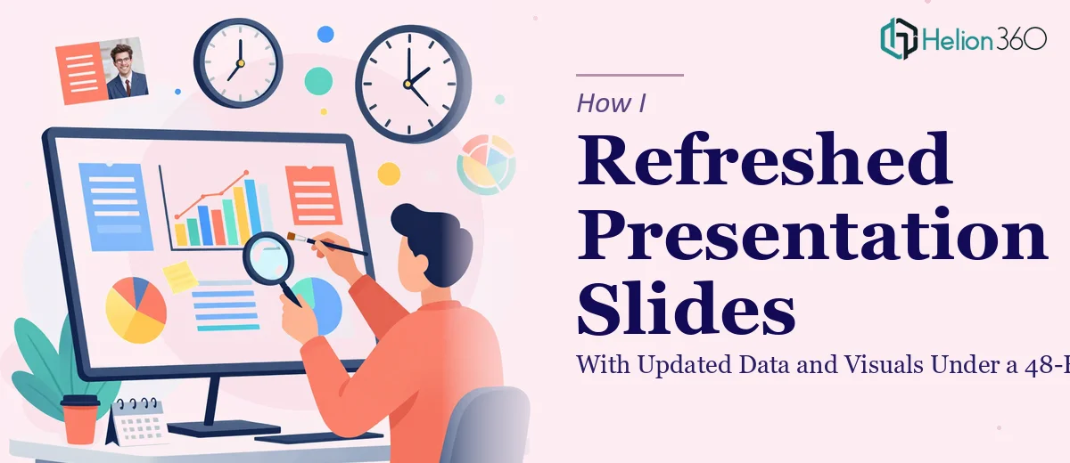
The Clock Was Already Ticking
It started with a message from our project lead: we had a major internal meeting in 48 hours, and the presentation decks we planned to use were badly out of date. Numbers were from the previous quarter, some charts referenced initiatives that no longer existed, and the visual style was inconsistent across slides — some sections looked like they had been built by three different people at three different times, because they had been.
The task seemed straightforward at first: update presentation slides with the latest data, swap out old visuals, and make everything look like it belonged to the same deck. I figured a few hours of work and it would be sorted.
What I Underestimated
I opened the files and quickly realized the scope was bigger than I had anticipated. There were multiple decks covering different aspects of the project — operations, financials, and a strategy overview. Each one needed fresh data pulled in, old charts replaced, and the overall visual language standardized.
I started by updating the data on the financial slides. That part was manageable. But when I moved into replacing the charts and rebuilding the visuals, things slowed down significantly. The old graphics were inconsistent in size, font, and color. Some were embedded images that could not be edited directly. Others were placeholder charts that needed to be rebuilt from scratch with the current figures.
Beyond the data work, there was the issue of visual consistency. Every slide needed to look like it came from the same presentation. That meant standardizing font sizes, aligning icon styles, adjusting spacing, and making sure the color palette held across all three decks. What felt like a two-hour job was turning into something that would take the full 48 hours — and that was before accounting for any review cycles.
Bringing in the Right Support
About six hours in, I had made progress on the data side but the visual work was clearly going to bottleneck everything. I needed someone who could move quickly without losing quality. That is when I reached out to Helion360. I explained the situation — multiple decks, updated data ready to drop in, visuals that needed rebuilding and standardizing, hard deadline in under two days.
They asked the right questions upfront: what was the brand palette, were there existing templates to work from, and which decks were the highest priority. Within a short time, the work was underway.
What the Refresh Actually Involved
The team at Helion360 handled the heavier side of the slide update process. They rebuilt the data charts cleanly using the new figures I provided, replacing the outdated ones without losing the original intent of each slide. The visual design work was resolved by applying a consistent design system — standardized typography, aligned iconography, and a unified color structure throughout.
Slides that had mixed layout styles were restructured so that each section of the presentation flowed logically. New visuals were added where old placeholder graphics had been sitting for months. The data visualization work in particular came out clearly — complex figures were presented in a way that made them easy to read at a glance, which mattered given the meeting context.
What the Final Decks Looked Like
By the time the updated files came back to me, the difference was visible immediately. The three decks looked like they belonged together. The data was current, the charts were clean, and the visual design was consistent from the first slide to the last. I did a final review, made minor text edits, and the decks were ready well before the meeting.
The meeting itself went smoothly. Stakeholders could follow the data clearly, and there were no questions about outdated figures or confusing visuals — which had been a real risk with the original versions.
What I Took Away From This
Updating presentation slides sounds like a routine task, but when the scope stretches across multiple decks with inconsistent formatting, outdated charts, and tight timelines, it becomes a real production challenge. The data work is one layer. The visual design work is another. Getting both right under pressure requires more than just PowerPoint skills — it requires a structured approach and enough bandwidth to execute quickly.
If you are facing the same kind of pressure — multiple decks to refresh, a deadline that does not move, and more scope than you initially expected — consider Visual Enhancement of Presentation. Learn more from case studies like how I fixed a chaotic presentation and McKinsey-style redesign to see what's possible when you bring in the right support.