

The Brief Looked Simple at First
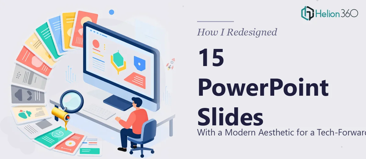
I was handed 15 existing PowerPoint slides and told to make them look modern. The target audience was a group of tech-savvy clients — the kind of people who notice when a font isn't right or when padding is inconsistent across slides. The marketing campaign they would support needed to feel polished, intentional, and on-brand.
On the surface, a PowerPoint slide redesign for 15 slides didn't sound like a complicated job. I figured I could update the typography, swap in the brand colors, and clean up the layouts over a weekend.
I was wrong.
Where It Got Complicated
The existing slides were a mix of styles — some had dense text blocks, others had low-resolution graphics, and almost none of them used the brand colors consistently. A few slides had embedded charts that were locked in ways that made them difficult to edit without breaking the layout entirely.
My first attempt involved applying a master slide theme to unify the look. It helped in some areas and broke things in others. Slides with custom text boxes didn't respond the way I expected, and the logo placement kept shifting depending on the slide content.
The bigger challenge was the visual language itself. The brand had a clear identity — clean lines, a dark-toned palette with sharp accent colors, and a preference for minimal, high-contrast layouts. Translating that into a consistent system across 15 slides, each with different content types, required more than template-swapping. It required actual design thinking applied slide by slide.
I had the direction. I did not have the bandwidth or the specialized eye to execute it at the level the campaign required.
Bringing in the Right Support
After spending more time than I should have on a set of slides that still didn't feel right, I reached out to Helion360. I explained the scope — 15 slides, a defined brand identity, a tech-forward audience, and a need for high-resolution, ready-to-use files. Their team asked the right questions upfront: brand guidelines, color codes, logo files, and what the slides were being used for.
That intake process alone told me they understood what a proper professional PPT upgrade actually involves. It's not just about making things look better in isolation — it's about creating a coherent visual system that works across every slide.
What the Redesign Actually Involved
Helion360's team approached the project as a full visual transformation rather than a cosmetic touch-up. Each slide was assessed for its content type — data-heavy, text-led, image-focused — and redesigned accordingly rather than forced into a single template that didn't suit everything.
The brand colors were applied with purpose, not uniformly plastered across every element. The logo was integrated cleanly into the layout system rather than dropped on top. Typography choices reflected a clean, modern presentation design sensibility — generous spacing, strong hierarchy, and restrained use of color to draw attention where it mattered.
Slides that had previously felt cluttered were restructured so the content could breathe. Charts were rebuilt to match the visual style of the rest of the deck. Every slide was output in high resolution, ready for use in both presentation mode and print if needed.
The Result and What I Took Away
When the revised files came back, the difference was immediately clear. The deck looked like it had been designed as a single cohesive piece rather than assembled from parts. It had the kind of clean slide aesthetic the brief called for — the sort that doesn't call attention to itself but makes the content easier to absorb and the brand easier to trust.
What I learned from this is that a tech brand presentation isn't just a slide file. It's a visual argument that you take your audience seriously. When the design looks effortful, the content is taken more seriously too. Trying to rush that process or treat it as a quick formatting job almost cost us the quality the campaign needed.
If you're sitting on a deck that needs a real design upgrade — not just a new color scheme — Helion360 is worth reaching out to. They handled the complexity I couldn't, and delivered files that were genuinely ready to use.