

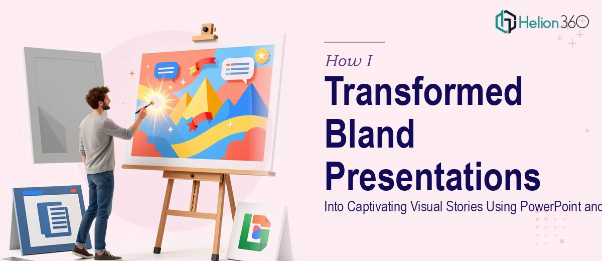
When a High-Profile Presentation Looks Like a Word Document
I had a deadline, a full deck, and a problem I couldn't ignore. The slides were technically complete — every data point was there, every section was outlined — but opening the file felt like reading a poorly formatted report. Walls of text, default fonts, generic clip art, and zero visual hierarchy. The content was solid. The presentation was not.
This wasn't just a minor cosmetic issue. The deck was going in front of a room full of decision-makers, and the first impression would matter as much as the message itself. I needed to transform these slides from information dumps into something that actually told a story.
What I Tried On My Own
I started the way most people do — adjusting colors, swapping in a cleaner font, trying to make charts look less like spreadsheet exports. I spent a few hours moving elements around in PowerPoint, experimenting with slide transitions, and browsing through Google Slides themes. The result was marginally better, but still flat.
The real roadblock wasn't effort — it was the complexity of what good presentation design actually requires. Color theory, visual hierarchy, advanced animation sequencing, cohesive layout systems — these aren't things you improvise in an afternoon. I was losing time trying to solve a problem that needed genuine expertise, and the deadline wasn't going to wait.
Bringing in the Right Help
After hitting that wall, I came across Helion360. I explained the situation — a high-profile deck, tight timeline, and slides that had strong content but zero visual impact. Their team understood the brief immediately and took it from there.
What struck me was how they approached the project. Rather than just applying a template, they asked questions about the audience, the tone we wanted to set, and the story arc of the content. They weren't treating it as a formatting job — they were thinking about presentation design as a communication tool.
What the Transformation Actually Looked Like
Visual Storytelling Through Structure
The first thing Helion360 tackled was the narrative flow. The slides were reorganized so each section built naturally on the last — a clear opening hook, supporting data mid-deck, and a strong closing. Visual storytelling isn't about making things pretty; it's about guiding the audience through information in a way that feels effortless.
Color Theory and Branding Consistency
They applied a deliberate color system — one that matched our brand palette but also used contrast strategically to draw the eye to key points. Every slide felt part of the same family, which made the whole deck look cohesive rather than patched together.
Advanced Animation and Dynamic Charts
The static bar charts became animated sequences that revealed data points one at a time, giving the presenter control over pacing. Custom infographics replaced text-heavy bullet slides. Even in Google Slides, where animation options can feel limited, the team found ways to make transitions feel intentional rather than decorative.
Handling Last-Minute Changes
Midway through, the scope shifted — two new sections were added and one was removed. Helion360 absorbed the changes without disrupting the visual system they'd built. The updated slides matched the rest of the deck as if they'd been planned from the start. That kind of flexibility is harder to maintain than it looks, especially under a tight deadline.
What I Took Away From This
The finished presentation was a noticeable step up — not in a showy way, but in the quiet way that signals professionalism. Slides that used to require a lengthy verbal explanation now communicated visually. The audience could follow the story without being talked through every element.
More importantly, I understood after going through this process that good PowerPoint and Google Slides design isn't about knowing the software — it's about knowing how people read, process, and respond to visual information. That's a skill set that takes real time to develop.
If you're working on a presentation that matters and you're sensing the gap between your content and how it looks on screen, that instinct is worth trusting.
Let Helion360 Handle the Hard Part
If your slides need more than a quick cleanup — if you're dealing with a high-stakes deck, complex data, or a presentation that needs to hold an audience's attention from start to finish — Helion360's team is built for exactly that kind of work. They step in where the complexity starts and deliver something you can walk into a room with confidently.