

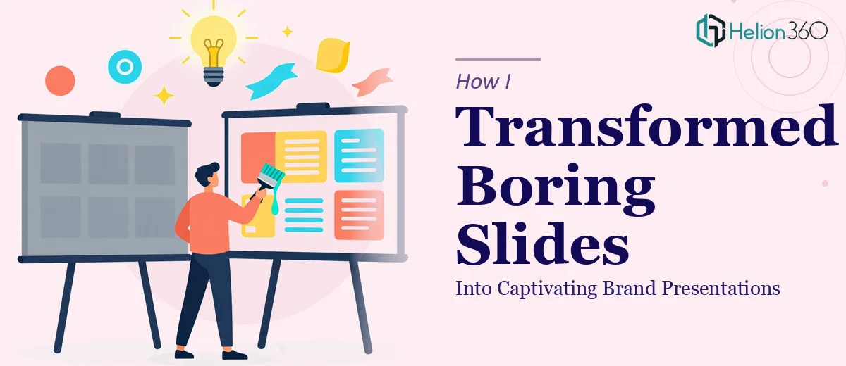
The Slides Were Done. The Problem Was Everything Else.
We had a product launch coming up and the presentation was technically complete. Slides were filled with content, bullet points were organized, and the data was all there. But every time I opened the file, something felt off. The visuals were flat. The fonts clashed. The colors had no consistency. And nothing about it felt like us.
I knew what a strong brand presentation was supposed to look like — clean layouts, intentional use of color, typography that guides the eye, visuals that reinforce the message instead of competing with it. I just couldn't get our slides there.
What I Tried on My Own
I spent a few days attempting a PowerPoint redesign myself. I switched fonts, tried new color palettes, reorganized some layouts. The results were uneven. Some slides looked better, others looked worse, and the deck had no visual cohesion from start to finish.
The core issue was that good presentation design isn't just about making things look pretty. It requires an understanding of color theory, hierarchy, spacing, and how each element interacts with the brand identity. I could see what was wrong, but I couldn't consistently fix it across 30+ slides while managing everything else tied to the launch.
At some point, it becomes less about effort and more about the right set of skills.
Where Helion360 Came In
After hitting that wall, I came across Helion360. I shared the deck, walked their team through the brand guidelines we had, explained the context of the launch, and described the kind of impression we wanted to make.
They didn't just polish what was there — they rebuilt the visual logic of the entire presentation. The first thing they addressed was consistency: a master slide structure that made sure fonts, spacing, and color usage were uniform across every single slide. From there, they worked through the content layout, replacing text-heavy slides with cleaner visual storytelling formats.
Data slides were especially transformed. Charts that had looked like raw Excel exports became clear, well-labeled visuals with color coding that matched our brand palette. Sections that had felt disconnected were reorganized to flow naturally from one to the next.
What the Before and After Actually Looked Like
The before version had:
- Inconsistent fonts across slides (three different typefaces with no hierarchy)
- Generic color fills that didn't match our brand colors
- Cluttered layouts with too much text per slide
- Charts and tables that looked like they were copy-pasted from a spreadsheet
The after version delivered by Helion360 had:
- A single, clean font system with clear heading and body hierarchy
- A refined color palette pulled directly from our brand kit
- Slides structured around one key idea each, with supporting visuals
- Custom-styled charts and infographic-style data slides
The difference wasn't subtle. Someone from our team who hadn't been involved in the process opened the new file and immediately asked who redesigned it.
What This Process Taught Me About Presentation Design
Good slide design is not a shortcut you can take with a template. It requires decisions at every level — which information goes on which slide, how much white space to use, how to make a data point land visually, how to keep brand identity consistent without making the deck feel rigid.
I also realized that presentation redesign is one of those tasks where the gap between "done" and "done well" is enormous. Our original deck communicated the information. The redesigned version communicated the information and made people want to keep watching.
Typography choices, color contrast, layout breathing room — these are not aesthetic preferences. They directly affect how your audience receives and retains your message.
Getting It Right the First Time Saves More Than Just Time
For a product launch, a brand presentation is often the first real impression you make on potential partners, customers, or stakeholders. A flat, inconsistent deck signals something about your standards — even if unintentionally.
The work Helion360 delivered gave us a presentation we were genuinely proud to share. More importantly, it gave us a visual system we could continue using — the slide templates, the color conventions, the layout patterns — all of it was reusable and on-brand.
Let Helion360 Handle the Slides You've Been Putting Off
If your presentation is technically ready but visually falling short, Helion360 can step in and take it the rest of the way. Their team works with your brand, your content, and your timeline to deliver something that actually looks the part.