

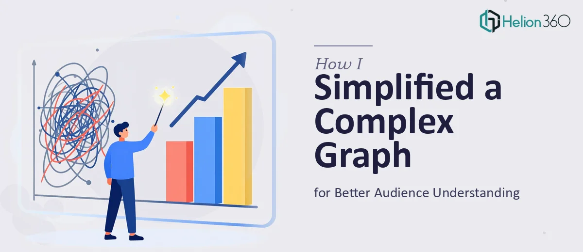
When a Financial Graph Loses the Room
There is a specific moment most presenters recognize — the one where a financial chart lands on screen and the audience visibly disconnects. Eyes drop, heads tilt, whispered side conversations start. The data is accurate, the numbers matter, but the graph has failed to communicate anything useful in the time it has to land.
This happens constantly with complex financial visuals: multi-series line charts tracking five metrics over four years, waterfall charts with seventeen bars and no grouping logic, dual-axis graphs where neither axis is labeled clearly. The person who built the chart understands it because they lived inside the data. The audience has never seen it before and has roughly eight seconds to absorb it.
The stakes here are real. A board presentation where the revenue trend is misread. An investor deck where the margin story gets lost in a cluttered chart. A quarterly review where the team leaves confused about what actually changed. When financial graphs fail, decisions get made on incomplete understanding — or worse, the presenter loses credibility before they have made their argument.
Simplifying a complex financial graph is not about dumbing the data down. It is about doing the interpretive work ahead of time so the audience does not have to.
What Good Financial Graph Simplification Actually Requires
The instinct most people follow is to start editing the chart directly — removing a data series here, changing a color there. That approach almost always produces a cleaner-looking version of the same problem. Real simplification starts earlier and works from a different set of questions.
The first requirement is a clear editorial decision about what the graph is actually supposed to prove. A financial chart that tries to show revenue growth, margin compression, expense variability, and forecast uncertainty simultaneously is not one chart — it is four charts in a trench coat. Good simplification means deciding which of those stories this slide is telling and stripping everything else out.
The second requirement is understanding the audience's baseline. A CFO reading a budget variance chart needs different scaffolding than a sales team seeing EBITDA for the first time. The same underlying data may need to be visualized entirely differently depending on who is in the room.
The third requirement is choosing the right chart type for the claim being made. Trend over time calls for a line chart. Part-to-whole relationships call for a stacked bar or pie with no more than five segments. Comparisons across categories call for a simple grouped bar. Mismatching chart type to data claim is one of the most common sources of confusion in financial presentations, and no amount of color cleanup fixes a fundamentally wrong chart type.
The Practical Approach to Cleaning Up a Financial Graph
Start With a Data Audit Before Touching the Chart
The most useful first step is not opening the chart editor — it is opening the underlying data and asking: what is the single most important number or trend on this slide? Everything else becomes supporting context or gets moved to an appendix.
For a revenue trend chart, that primary story might be the compound growth rate across the full period. For a cost breakdown, it might be that one category has grown disproportionately. Once that story is named explicitly, the simplification work has a clear direction.
A practical rule: if the chart requires more than one sentence to explain what it shows, it is doing too much work. The target is a chart where the title can state the conclusion — "Gross Margin Has Held Steady at 62% Despite Revenue Volatility" — and the visual confirms that claim immediately.
Apply a Strict Visual Hierarchy to the Chart Elements
Done well, a simplified financial chart uses no more than two data colors — one for the primary series and one for a comparison or benchmark series. A third neutral color, typically a light gray, handles reference lines, grid lines, and axis labels. This palette discipline forces the eye toward what matters.
Typography inside charts follows the same hierarchy logic applied to slides broadly: the chart title sits at 18pt or larger, data labels sit at 11-12pt, and axis labels sit at 9-10pt. Anything smaller than 9pt in a chart is effectively invisible on a projected screen and should be removed or consolidated.
Grid lines are almost always overused in financial charts. The standard in dense financial data visualizations is to keep horizontal grid lines only, set them to 15-20% opacity, and remove vertical grid lines entirely. This alone reduces visual noise by roughly a third without touching the data.
Use Annotation to Do the Interpretive Work
One of the highest-leverage moves in financial graph simplification is replacing data labels with targeted annotations. Instead of labeling every point on a twelve-month revenue line, a callout box at the inflection point — "Q3 contract win: +$2.4M" — tells the audience what changed and why. The rest of the line carries context without demanding attention.
For waterfall charts, which are among the most frequently misread financial visuals, the simplification approach involves grouping small contributors. Any individual bar contributing less than 3% of the total change should be consolidated into an "Other" category. A waterfall with seven bars is readable. One with seventeen is not, regardless of how well it is colored.
For dual-axis charts, the better solution is almost always to separate the two series into adjacent single-axis charts sharing a common x-axis. Dual-axis charts require the reader to mentally track two different scales simultaneously, which introduces interpretation errors even among financially literate audiences.
Structure the Slide Around the Chart, Not the Other Way Around
The slide layout matters as much as the chart itself. A simplified financial graph needs breathing room — a minimum of 24px of white space on all sides when working in a standard 16:9 widescreen layout. The chart title should sit above the visual as a declarative sentence, not a descriptive label. "Revenue by Quarter" is a label. "Revenue Growth Has Accelerated in H2" is a title that does interpretive work.
The source citation belongs at the bottom in 8pt gray text, present but unobtrusive. A single-sentence takeaway in the slide's subtitle position — just below the chart title — gives the audience the conclusion before they even read the chart, which dramatically improves comprehension speed.
Common Pitfalls That Undermine the Work
The most frequent mistake is skipping the editorial decision about what story the chart tells and going straight to visual cleanup. A tidier version of an ambiguous chart is still an ambiguous chart. The question "what is this chart proving?" has to be answered before any design work begins.
A second common failure is over-relying on color to distinguish data series. In financial presentations, where charts are often printed in grayscale or viewed on low-contrast projectors, a palette that relies on red versus green versus blue versus orange collapses completely. The rule is to design the chart so it communicates correctly in grayscale first, then add color as a reinforcing layer.
Inconsistency across slides is a compounding problem. If the primary brand blue is used as the highlight color on slide four but appears as a background element on slide nine, the audience's ability to use color as a navigation cue breaks down. Financial decks with more than eight slides benefit from a documented color-use convention: primary action color, comparison color, neutral, and alert — applied consistently throughout.
Underestimating the time required for annotation work is another reliable trap. Writing good callout copy — concise, precise, no jargon — takes longer than building the chart. Budgeting thirty minutes for annotation on a complex financial slide is not excessive.
Finally, treating a working draft as a finished chart is a version of the same problem. The gap between "I can read this" and "an unfamiliar audience can read this in eight seconds" is wider than most presenters realize. Showing the draft to someone who has not seen the data is the only reliable way to find out where comprehension breaks down.
What to Carry Forward
The core insight behind all of this work is that a financial graph is not a data container — it is an argument. The chart exists to prove a specific claim to a specific audience, and every visual element either supports that claim or dilutes it. Starting from that frame changes every decision that follows, from chart type selection to annotation copy to how much white space surrounds the visual.
The clearest indicator that a financial graph has been simplified effectively is that the audience can state the chart's conclusion back to you without having read the title. If they can do that, the chart has done its job.
If you would rather have this kind of work handled by a team that does it every day, complex financial data is what Helion360 specializes in.