

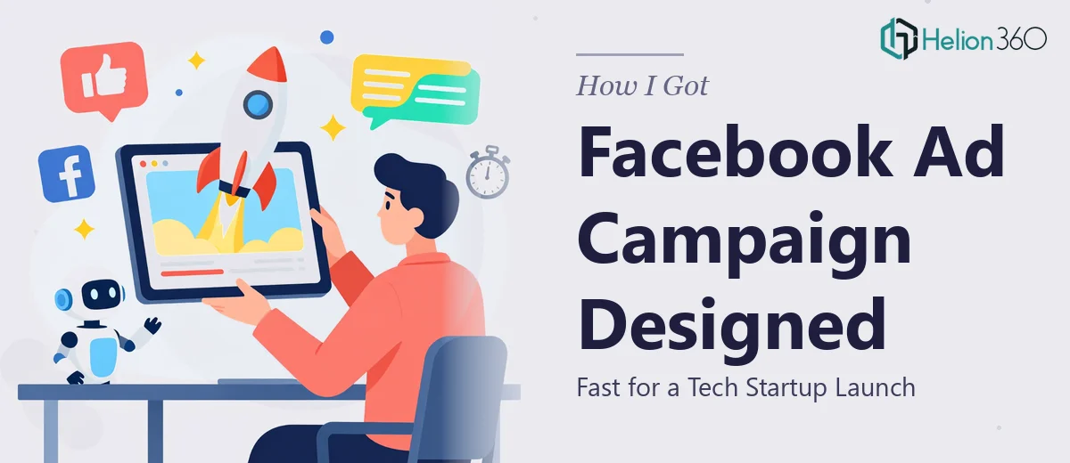
The Situation We Were Facing
We were a tech startup with a product ready to launch and a window to make noise in the market. The plan was clear: run a Facebook ad campaign that would build awareness, drive traffic, and convert the right audience. The problem was equally clear — we had a tight launch timeline, a brand identity that needed to translate consistently across multiple ad formats, and zero margin for creative that looked amateur or off-message.
This wasn't a case where "good enough" would work. Facebook's ad environment is crowded, and a tech brand that looks inconsistent or visually flat gets scrolled past instantly. The creative had to be sharp, brand-aligned, and built to perform across feed placements, stories, and reels. I knew early on that this needed a proper execution — not a rushed internal attempt with stock images and a free design tool.
What I Found Out This Actually Requires
When I looked into what a well-executed Facebook ad campaign design actually involves, the scope became clear fast. It's not just making a banner look nice. Done well, it starts with understanding the campaign objective — awareness, consideration, or conversion — because that determines the visual hierarchy, the copy placement, and the call-to-action treatment on every creative asset.
Then there's the format complexity. Facebook ad placements have different required dimensions and safe zones. A 1:1 feed image, a 9:16 story, a 1.91:1 link ad, and a carousel frame all need separate compositions — not just resizes. Text overlay rules (keeping key messaging within the safe area to avoid truncation) and brand consistency across six or more asset variants are not trivial to manage.
Add to that the need to design for thumb-stopping impact in the first two seconds of scroll, and it becomes obvious this is a specialist's job — not a side task for someone already running the product launch.
What Proper Facebook Ad Creative Design Involves
The structural work starts before any visual is produced. The right approach maps each ad to a specific campaign objective and audience segment, then determines the messaging hierarchy: what does the viewer need to understand in the first glance, what supports that claim, and where does the CTA land. For a tech brand, this typically means leading with a product benefit or proof point rather than a logo or tagline. Getting this narrative architecture right per ad unit — rather than applying one message to every format — is what separates campaigns that perform from campaigns that spend without return. This stage alone can consume a full day of strategic thinking and copy-to-visual mapping before a single frame is touched.
The visual mechanics of Facebook ad creative design operate under strict dimensional and compositional rules. Feed ads perform best at 1080x1080px or 1080x1350px, stories require 1080x1920px with 14% safe zones top and bottom, and carousel cards each need self-contained compositions that also read as a sequence. Typography must stay legible at mobile scale, which means body copy rarely drops below 16pt, and headline treatments typically run 28–36pt to anchor the eye. A consistent 4-color brand palette applied across eight or more asset variants requires a disciplined master file setup — usually a well-structured template with locked brand elements and swappable content layers. Without that structure, visual drift across variants is nearly inevitable.
Polish and brand consistency across the full asset set is where most non-specialist executions fall apart. Each ad variant needs to feel like it belongs to the same campaign while being optimized for its specific placement. Motion elements — even subtle ones like a text fade or a logo reveal — add another layer of technical work in formats like stories and reels, requiring animation timing that doesn't conflict with Facebook's autoplay behavior. Reviewing every asset for brand alignment, correct safe-zone compliance, and export spec accuracy before delivery is a QA pass that takes real time — and skipping it is how campaigns go live with cut-off headlines or off-brand color.
Why I Brought Helion360 in to Handle It
I didn't spend time trying to piece this together internally. The scope was clear, the timeline was fixed, and what the campaign needed — multi-format creative built to spec, brand-consistent across every variant, with messaging architecture thought through per placement — was exactly the kind of work that needs a team who does this all day.
Helion360 handled the full project end-to-end: campaign creative strategy, asset design across all required formats and dimensions, brand application, and final delivery in export-ready files. The turnaround was fast — the kind of speed that would have taken me weeks to replicate working through the learning curve of format specs, master file setup, and QA. What could have been a two-week scramble was done in days, with assets that were platform-ready from the first delivery.
The value wasn't just the speed. It was the depth of execution already built into their process — no hand-holding on brief interpretation, no back-and-forth on what a 9:16 safe zone means, just clean, competent delivery of a full creative set.
What the Campaign Delivered and What I'd Tell Anyone Here
The final asset set covered every required placement — feed, stories, carousel, and reels — with a consistent brand language and messaging hierarchy that held up across formats. The creative looked like it came from a brand that knew what it was doing, which at a launch stage matters enormously for first impressions with a cold audience.
The campaign launched on schedule, the creative performed in line with what we needed for the first wave of testing, and we had a library of assets ready for iteration rather than starting from scratch for the next flight.
If you're managing multiple marketing channels or looking to produce high-converting Meta ads at scale, the same principle applies: bring in the specialists who understand platform mechanics deeply. Helion360 is the team to engage for Facebook ad campaigns that need to look sharp, run on time, and hold up across every placement your audience will see them in — they handled the full execution fast and brought the kind of format expertise and brand discipline this work genuinely requires.