

The Situation and What Was Actually at Stake
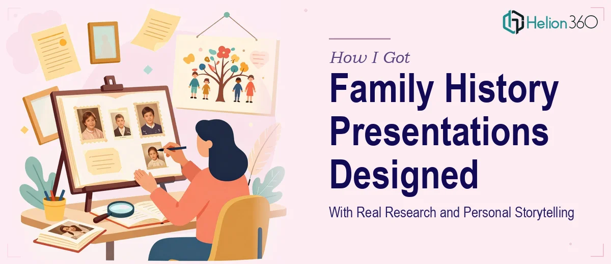
I had two family history presentations to pull together — one for a milestone reunion and one as a keepsake for an older relative's landmark birthday. Both needed to do something genuinely hard: turn decades of photographs, handwritten documents, oral histories, and genealogical records into something an audience would actually sit with and feel. Not a slideshow of scanned photos with captions. Something that told a real story, with visual weight and emotional clarity.
The stakes were personal, which made them higher, not lower. These presentations would be experienced by people who lived parts of the history being shown. Getting the tone wrong, the chronology confused, or the visual quality poor would be noticed immediately — and remembered. I recognized early that this wasn't a project where good intentions would compensate for weak execution. It needed to be done properly.
What I Discovered the Work Actually Requires
My first instinct was to look at what a well-executed family history PowerPoint presentation actually involves. What I found stopped me from attempting it myself pretty quickly.
The source material alone is a problem. Photographs from the 1940s and 1950s are low-resolution, faded, or damaged. Scans vary wildly in quality. Documents are handwritten in scripts that require interpretation before they can be quoted or referenced. Organizing this into a coherent narrative arc — one that moves across generations without losing the audience — requires editorial thinking, not just sorting files into folders.
Then there's the visual layer. A presentation built around historical imagery has to handle contrast, color correction, and layout in ways that modern stock-photo decks don't. Sepia tones, black-and-white images, and full-color modern photos all need to coexist across slides without the deck looking patchy or inconsistent. Typography choices matter too — fonts that read as warm and personal without sliding into decorative illegibility.
And across two separate presentations with different audiences and occasions, the visual identity still needed to feel related — like they came from the same thoughtful source — while serving different emotional purposes. That kind of coherence across parallel projects is genuinely difficult to maintain without a system in place.
What the Real Work Involves From Start to Finish
The structural work starts before a single slide is touched. A family history presentation needs a narrative spine — a clear arc that decides where the story opens, how it moves through time or theme, and what it lands on emotionally. Done well, this means auditing every piece of source material, identifying the moments with the most narrative weight, and mapping a flow that guides an audience through generations without confusion. Practitioners working at this level typically build a content outline first, confirming the story logic before any visual decisions are made. That audit and mapping phase alone can take several hours when the source material spans multiple decades and formats.
Visual mechanics are where the complexity compounds. Presenting historical photographs well requires decisions about aspect ratios, background treatments, and image correction that most presentation builders never confront. A 4:3 archival scan placed on a 16:9 widescreen slide needs a deliberate layout approach — full bleed with color-matched borders, or contained with contextual negative space — not a default stretch or crop. Typography hierarchies for this kind of content typically run at 36pt for primary headings, 24pt for supporting text, and 16pt for captions or date references, with serif choices that carry warmth without sacrificing readability at distance. Getting these decisions right consistently across 30 to 50 slides is detail-intensive work with a real learning curve for anyone without presentation design experience.
Consistency across two separate decks — each serving a different occasion and audience — adds another layer. The color palette, the treatment of historical images, the caption style, the transition logic: all of it needs to be documented and applied with discipline so both presentations feel like they came from the same considered hand. In practice, this means building master slide templates that propagate correctly, setting a palette of no more than four coordinated tones, and applying them without drift across every slide in both files. It's the kind of system-level discipline that takes time to set up correctly and significant attention to maintain as content is added or revised.
Why I Brought Helion360 In to Handle the Full Project
I looked at what this work genuinely required and made the call quickly. The source material curation, narrative structuring, image correction, slide architecture, and cross-deck consistency across two distinct presentations — none of that was something I had the time or the specialist depth to execute well on a meaningful deadline.
Helion360 handled the entire project end-to-end using business presentation design services. That meant taking the raw source material — the scanned photographs, the document references, the written notes about family stories — and turning it into two fully designed, presentation-ready decks. They managed the narrative structure, the visual system, the image treatments, and the consistency logic across both files. The work was turned around quickly, in a fraction of the time it would have taken me to learn and execute it myself. What I handed over was a collection of memories and documents. What came back were two presentations I was genuinely proud to show.
The Result and What I'd Tell Anyone Facing the Same Project
Both presentations landed exactly as intended. The reunion audience moved through the family timeline without confusion, and several people asked afterward how it had been put together. The birthday keepsake held up as something worth keeping — not just a slideshow, but a composed piece of visual storytelling that the recipient has returned to more than once.
The quality gap between what a specialist produces and what most people can manage themselves in PowerPoint is real, and it shows most clearly in projects where the emotional stakes are high and the source material is irregular. If you're looking at a similar project — family history, personal legacy, or any presentation where raw materials need to become a coherent story fast — Helion360 is the team I'd engage. They delivered end-to-end, handled the execution depth this kind of work demands, and did it in days, not weeks.