

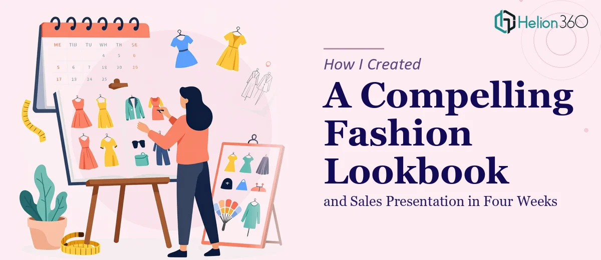
A New Collection, a Hard Deadline, and a Lot Riding on the First Impression
We had a new collection ready to launch and four weeks to make it look like it belonged in the same conversation as the brands our buyers already respected. The stakes were real: this wasn't an internal update or a mood board for the team. It was a sales presentation and digital lookbook that would go directly in front of buyers, stockists, and retail partners — people who make quick, visual judgments and move on.
I knew immediately that "good enough" wasn't an option. A poorly executed lookbook doesn't just fail to impress — it actively signals that the brand isn't ready. The presentation needed to capture the collection's identity, tell a coherent brand story, and make the buying decision feel easy. That combination — visual quality, narrative clarity, and sales utility — isn't something that falls together by accident. It requires real craft, and I recognized quickly that this project needed to be handed to people who do exactly this kind of work.
What I Found a Fashion Lookbook and Sales Presentation Actually Requires
Once I started mapping out what a professional-grade lookbook and sales presentation actually involves, the scope became clear fast. This isn't a matter of dropping product images onto a template and calling it done.
A lookbook that works commercially has to do two things simultaneously: it has to feel like an editorial experience and function like a sales tool. Those two objectives create real tension. The visual language has to evoke the brand's aesthetic — mood, color story, texture, lifestyle — while also presenting product details in a format buyers can actually act on: pricing tiers, SKU references, available colorways, and ordering logic.
Beyond the imagery, the narrative structure matters enormously. Buyers flip through dozens of lookbooks in a season. The collections that land are the ones with a clear point of view, communicated quickly. That means every page spread has to do deliberate work — not just look pretty, but advance the story and keep the reader moving forward.
And then there's the technical side: high-resolution image handling, consistent typography across 20 to 40 pages, color accuracy across formats (screen versus print-ready PDF), and brand application that holds together from cover to last spread. I saw immediately that doing this well was a full-time project for someone who already knew what they were doing.
What the Work Actually Involves
The first area that needs serious attention is structural and narrative design. A fashion lookbook isn't a catalog — it has a flow. The right approach involves auditing the collection to identify story clusters: hero pieces, supporting pieces, complementary colorways. From there, a practitioner maps a page-by-page arc that opens with maximum visual impact, builds through the collection's range, and closes with something that sticks. Done well, this means roughly 30 to 40 pages organized into three to five distinct visual chapters. Without this structural layer, a lookbook becomes a random sequence of product images that doesn't hold a buyer's attention past the first few spreads. Getting the architecture right before a single layout is built is what separates a professional result from a well-intentioned one.
The second area is visual mechanics — the grid, typography hierarchy, and image treatment system. Professional lookbook layouts typically operate on a modular grid, where image crops, white space ratios, and text placement follow consistent rules across every spread. Type hierarchy follows a strict system: a display size for section headers, a mid-size for product names and short descriptors, and a small but legible size for ordering details — something like 36pt, 20pt, and 11pt. Image treatment decisions — whether to use full-bleed photography, bordered frames, or layered compositions — must be made once and applied consistently. These mechanics are invisible when done right and immediately obvious when done wrong. Building a layout system that holds across 35 pages without visual drift takes hours of careful templating.
The third area is brand consistency and finish. Every color used in the presentation needs to pull from a locked palette — typically no more than four to five brand colors — and every typographic choice must match the brand's approved typefaces. For a fashion brand, this also means the mood of the imagery, the tone of any copy, and the overall aesthetic register have to feel unified. A single off-brand font choice or an image with inconsistent color grading can undercut the entire piece. Polish at this level requires a systematic review pass across every slide or spread, checking spacing, alignment, color accuracy, and file resolution — work that's tedious and time-consuming even for an experienced designer.
Why I Brought in Helion360 to Handle It
I didn't spend a week attempting a draft only to realize I was in over my head. I assessed what this project actually needed — narrative architecture, a disciplined visual system, brand-consistent polish across 35-plus pages, and a print-ready plus screen-optimized deliverable — and recognized right away that the smart move was to engage a team that handles exactly this kind of work.
Helion360 took on the full project end-to-end. They handled the structural story mapping, built the layout system from scratch to match our brand, and executed every spread from the opening hero pages through to the sales order section at the back. The turnaround was fast — the kind of speed that comes from having the tooling, templates, and expertise already in place rather than building from zero. What could have consumed weeks of my team's time was handled in a fraction of that, without sacrificing the detail level the project required.
The Result and What I'd Tell Anyone in This Situation
What came back was a lookbook and sales presentation that looked and felt like it belonged at a professional trade show. The visual storytelling was tight, the brand identity held all the way through, and the sales section gave buyers exactly the information they needed in a format that made acting on it straightforward. The collection landed well with the buyers who saw it — and more than one noted that the presentation itself made the brand feel credible and ready.
The presentation materials didn't just support the launch — they were part of what made the launch land. If you're looking at a similar project and need it executed end-to-end with the quality and speed a real collection launch demands, Helion360 is the team I'd engage — they delivered fast and brought the kind of craft this work genuinely requires.