

The Moment I Realized the Stakes Were Higher Than I Expected
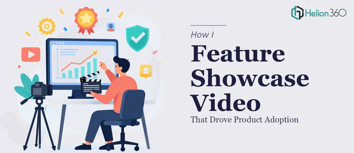
We had a product update worth talking about. New features, a cleaner workflow, meaningful improvements that real users had been asking for. The plan was to put together a feature showcase presentation — something that could be used across sales calls, onboarding sessions, and internal walkthroughs — to get the whole organization aligned and drive actual adoption.
The deadline wasn't flexible. The audience included both technical stakeholders who needed specifics and business users who needed clarity. A mediocre slide deck wasn't going to cut it. A wall of bullet points was definitely not going to move anyone. I could see immediately that this presentation had to do real communicative work — explain what changed, why it mattered, and how to use it — without losing the room in the first five minutes.
That's when I knew this needed to be handled properly, not cobbled together over a weekend.
What I Found Out the Solution Actually Requires
My first instinct was to sketch it out myself. I had the product knowledge. I had the content. But when I started researching what a genuinely effective product feature showcase presentation looks like, I ran into the complexity fast.
The structural challenge alone was significant. A feature showcase isn't a sales deck and it isn't a training manual — it occupies an awkward middle ground where every slide has to balance demonstration, context, and persuasion simultaneously. Getting that balance wrong means you either over-explain to buyers or under-explain to new users.
Then there's the visual layer. Product UI screenshots, workflow diagrams, and feature callouts all need to coexist in a layout system that doesn't look like a patchwork quilt. Consistent annotation styles, readable contrast ratios, and a grid that holds together across thirty-plus slides — none of that happens by accident.
And then there's brand discipline. Every company has a visual identity that needs to show up correctly in a presentation like this. That means more than slapping a logo in the corner — it means applying typography hierarchies, color systems, and spacing rules that make the whole thing feel intentional and professional. That's a skill set, not a task.
What the Work Actually Involves
The first dimension of a feature showcase presentation is the narrative architecture — the decision about what sequence of information moves an audience from unfamiliar to capable. Done well, this means auditing all available source material, mapping a logical flow that mirrors how a user actually encounters the product, and scripting each slide's job before a single visual element is placed. The right approach uses a three-act structure: context (why this matters), demonstration (what it does), and outcome (what changes for the user). Getting this architecture wrong means slides that feel disconnected, audiences that disengage, and a presentation that has to be rebuilt from scratch. That structural audit and story mapping alone typically takes a practitioner several focused hours to do correctly.
The second dimension is the visual mechanics of a product presentation. Feature callouts require a consistent annotation system — typically a single accent color drawn from a brand palette of no more than four colors, with callout boxes at a standardized size and position so the eye knows where to look. Typography hierarchy matters here too: slide titles at 36pt, supporting text at 24pt, and caption or annotation text no smaller than 16pt to remain legible in a projected or shared-screen environment. UI screenshots need to be cropped, scaled, and framed consistently across every slide, which means establishing a layout grid — usually a 12-column structure — that governs every element's placement. For someone without a working master slide system already in place, building this correctly from the ground up is a multi-hour investment before the first real content slide is complete.
The third dimension is polish and brand consistency across the full deck. A thirty-slide feature showcase accumulates small inconsistencies fast — a slightly different shade of blue on slide 14, an icon set that doesn't match on slide 22, a footer that shifts two pixels between slides. Catching and correcting these requires a systematic pass through every slide against a defined brand standard, not just a quick visual skim. This kind of quality control is where self-built presentations most often fall apart, because the person who built the deck is too close to it to see the drift. A practitioner doing this correctly will also ensure that animation and transition behavior — if used — is restrained and purposeful, typically limiting motion to entrance animations on key data points only.
Why I Brought Helion360 In to Handle the Full Project
I looked at what the work genuinely required and made the call quickly. I didn't have the time to build a proper master slide system, audit the narrative arc across thirty-plus slides, and maintain brand consistency through every revision cycle. More importantly, doing it halfway wasn't an option given who would be seeing this presentation.
Helion360 handled the full project end-to-end — from narrative structure and content organization through visual design, brand application, and final quality control. They turned it around quickly, in a fraction of the time it would have taken me to learn and execute the mechanics myself. What I handed over was a content brief and brand assets. What came back was a polished, cohesive feature showcase presentation ready for immediate use across multiple audience types.
The team clearly does this work regularly. The tooling, the process, and the design instincts were already in place — I didn't need to explain what good looked like.
The Result and What I'd Tell Anyone Facing the Same Situation
The presentation landed well. Internal teams used it in onboarding sessions within days of delivery. Sales used it on calls the same week. The visual consistency made the product look as capable as it actually was, and the narrative structure meant audiences understood the features in context rather than in isolation. Product adoption conversations shifted — people were asking how to use the features, not whether they were worth using.
If you're looking at a similar scope — a product showcase, a feature walkthrough, anything that needs to communicate clearly across technical and business audiences — and you want it handled end-to-end without burning weeks on a learning curve, Helion360 is the team I'd engage. They delivered fast and brought exactly the execution depth this kind of work requires.