

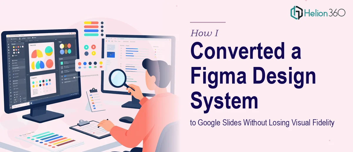
When a 32-Page Figma File Needs to Become a Presentation That Still Looks Like the Brand
I had a fully built Figma design system — 32 pages of components, carefully defined color tokens, custom type scales, and a layout grid that the product and brand teams had spent months refining. The business need was straightforward: this system needed to live inside Google Slides so that the broader team could actually use it for decks, client presentations, and internal updates without touching Figma at all.
Simple enough on the surface. But the moment I started looking at what a real conversion actually required, it was clear this wasn't a copy-paste job. The stakes were real — brand consistency, executive presentations, client-facing material. A sloppy conversion would mean every slide built from it would look slightly off, and that compounds fast across a team of twenty people building decks every week. This needed to be done properly, not approximated.
What I Found the Conversion Actually Required
I started pulling apart what fidelity actually means in this context, and it wasn't long before the complexity surfaced. Figma operates on a pixel-precise vector canvas with defined spacing tokens, component overrides, and auto-layout logic. Google Slides is a presentation environment with a fixed aspect ratio, a different font rendering engine, and no native component system whatsoever.
Three things signaled to me immediately that this wasn't a weekend project. First, the custom typefaces used in the Figma system don't always render identically in Google Slides — spacing, weight, and fallback behavior all differ across browsers and operating systems, which means every heading and body text block needs individual verification. Second, the color tokens in Figma (defined as HEX, HSL, or design variables) have to be manually mapped to Google Slides' theme palette and applied consistently across master slide layouts — there's no automated import. Third, the layout grid — a 12-column system with defined gutters and margins — has to be reconstructed as a set of guide-aligned master slides, and any component that used auto-layout in Figma needs to be rebuilt as a static-but-aligned slide element. Each one of these is its own technical exercise with its own edge cases.
The Work That Needs to Happen
The first layer of the work is structural: auditing the Figma file and mapping every component to its Google Slides equivalent before a single slide is built. A 32-page design system typically includes primary and secondary layouts, iconography at multiple sizes, data visualization templates, and several content archetypes. The right approach involves cataloguing each component type, flagging what translates directly, what needs to be rebuilt from scratch, and what simply cannot exist in Google Slides the same way it does in Figma. Skipping this audit means building slides that look right at first glance but break when someone tries to use them — misaligned placeholders, missing states, inconsistent spacing.
The second layer is the visual mechanics of the master slide system. Proper execution means building a 12-column grid into the Slide Master, defining a type hierarchy at specific sizes — typically 36pt for primary headings, 24pt for subheadings, 16pt for body — and encoding no more than four brand colors into the theme palette with exact HEX values. Getting a master slide system right takes significant time even for someone experienced with Google Slides' Slide Master editor; for someone unfamiliar with it, the learning curve alone can consume the better part of a week before a single layout looks correct.
The third layer is polish and consistency across all 32 pages. Every slide layout needs to be checked for pixel-level alignment, consistent use of the brand palette, correct font weight application, and proper behavior when content is added or removed. The discipline here is in the details: a misaligned logo placeholder on the master propagates to every slide built from it, a slightly wrong shade of a brand color gets locked in permanently, and an oversized body text block forces users to break the grid every time they add a bullet. Catching all of these requires a methodical QA pass — not just a visual skim.
Why I Brought in Helion360 to Handle It
I recognized quickly that attempting this myself wasn't a realistic use of my time. The audit alone — cataloguing every Figma component against what Google Slides can support — was going to take days, and that was before a single master slide was built. I didn't have weeks to spend learning the edge cases of Slide Master behavior while also managing everything else on my plate.
Helion360 handled the full conversion end-to-end. That meant the component audit, the master slide build, the type and color system encoding, and the final QA pass across all 32 pages. They turned it around quickly — done in days, not the weeks it would have taken me to work through the learning curve and execution myself. What made the difference wasn't just speed; it was the fact that they already had the process, the tooling, and the pattern recognition for exactly this kind of project. They knew where fidelity breaks down in a Figma-to-Google Slides conversion before they even opened the file.
The Result and What I'd Tell Anyone Facing the Same Situation
What came back was a Google Slides master system that held the visual fidelity of the original Figma design — correct typefaces with verified rendering, exact HEX brand colors encoded into the theme, a 12-column grid reconstructed as usable master layouts, and every component rebuilt to behave predictably when the broader team used it. The first presentation built from the new system looked like the brand. So did the tenth.
Anyone who uses Google Slides as a team presentation environment knows how much damage a poorly built slide master does over time — every deck drifts a little further from brand until nothing looks consistent anymore. Getting the foundation right matters, and it requires a level of precision that most people don't have the bandwidth to apply under a real deadline.
If you're looking at a similar conversion and need it handled end-to-end without the weeks of learning curve, consider the expertise required for design system conversions to presentations — they delivered fast and brought exactly the execution depth this kind of work demands.