

The Deadline Was Real and So Was the Pressure
I had a finance proposal pitch deck that needed to be ready within a week. The audience wasn't casual — these were people who evaluate financial strategies for a living, and first impressions carry real weight in that room. The deck had to cover a lot of ground: a cover slide, company introduction, financial strategy overview, market analysis, financial projections, and a conclusion. Each section needed to do its own job while the whole thing held together visually and tonally.
Sloppy design on a finance pitch deck doesn't just look bad — it signals something to investors and stakeholders about how seriously you take the work. I knew this needed to be done properly, in InDesign, with consistent branding throughout. That combination of content complexity, tool specificity, and deadline made it clear almost immediately that this wasn't something to attempt casually.
What Doing This Well Actually Requires
I started looking into what a properly executed finance pitch deck in InDesign actually involves, and the scope came into focus fast. This isn't a template-swap job. InDesign is a professional layout tool built for print and publication design — it gives you precise control over every element, but that control comes with a learning curve and a set of conventions that matter.
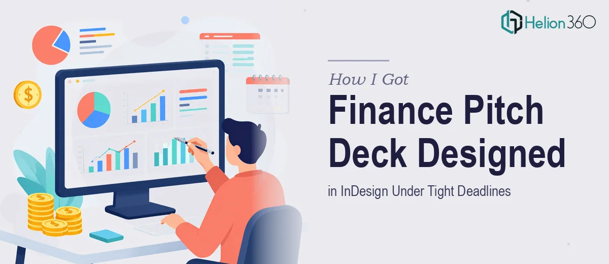
The financial content itself adds another layer. Market analysis data and financial projections can't just be dropped in as tables. They need to be visualized in a way that's immediately readable — the right chart types selected for the right data, with annotation and callouts that guide the reader without overwhelming them. Getting that wrong makes the numbers harder to trust, not easier.
On top of that, the branding consistency across a multi-section deck is its own discipline. Typography hierarchies, color application, spacing rules — these need to hold across every slide, including the slides that are heavy with data. That's where a lot of self-managed decks fall apart: they look fine on the cover and ragged three sections in.
What the Work Actually Involves
The right approach to a finance pitch deck starts with structural and narrative work before a single layout decision gets made. That means auditing the source content — the financial strategy, the market data, the projections — and mapping a clear story arc across the slides. In a finance context, the sequencing matters: the deck needs to build logical momentum from the overview to the market analysis to the projections, with each section earning the next. Practitioners working at this level typically define a slide-by-slide brief first, establishing what each section must communicate and what it can leave out. That brief becomes the design spec. Skipping it means rebuilding later, which is expensive when you're on a one-week deadline.
Visual mechanics in InDesign for a deck like this involve precise grid work and typography discipline. A well-executed finance deck typically runs a 12-column layout grid with consistent margin gutters, and a type hierarchy of roughly 36pt for primary headings, 24pt for subheadings, and 14–16pt for body and data labels. InDesign's paragraph and character styles need to be set up correctly from the start so they propagate uniformly across master pages — a process that takes several hours to configure properly for someone not already fluent in the tool. Paragraph style drift across sections is one of the most common reasons a deck looks inconsistent even when the designer thinks it looks fine.
Data visualization for the financial projections and market analysis sections requires deliberate chart type selection. Bar charts work for period-over-period comparisons; line charts communicate growth trajectories; waterfall charts are the standard for showing net financial position across variables. Each chart needs a clean axis structure, a limited color palette — no more than three to four data colors drawn from the brand palette — and callout annotations that surface the key insight without requiring the audience to interpret the visual themselves. Building these correctly in InDesign, with proper alignment and consistent label sizing, takes significantly longer than most people estimate when they haven't done it before.
Why I Brought in Helion360 to Handle It
Once I understood what this work actually required — the structural briefing, the InDesign master page setup, the data visualization decisions, the branding consistency across every section — it was obvious that attempting it myself within a week wasn't realistic. I didn't have the InDesign fluency, the financial design conventions, or the time to build any of that from scratch.
I engaged Helion360 to handle the full project end-to-end. That meant everything: the narrative structure and slide-by-slide brief, the InDesign layout and master page configuration, the chart design for the projections and market analysis, and the final polish pass to make sure branding held consistently across all sections. The polished investor pitch deck was turned around quickly — done in days, not weeks — and handled in a fraction of the time it would have taken me to work through the learning curve alone.
What made the difference was that this is the kind of work Helion360 does continuously. The tooling is already in place, the design conventions for finance presentations are already understood, and the execution process is already calibrated for tight timelines.
The Outcome and What I'd Tell Anyone in My Spot
What came back was a clean, professional finance pitch deck — properly structured, visually consistent, with data visualization that made the projections and market analysis immediately readable. The cover set the right tone, the financial strategy section was clear without being cluttered, and the projections held up to scrutiny because they were presented correctly. The deck did the job it needed to do in that room.
If you're looking at a compelling startup pitch deck with real stakes, a tight deadline, and content complexity that makes it more than a design job — Helion360 is the team I'd engage. They handled the full scope fast and brought the kind of execution depth this work genuinely requires.