

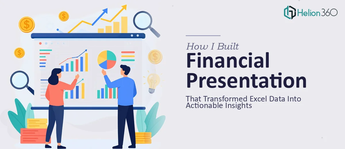
When the Spreadsheet Stops Being Enough
I had spent weeks building out our startup's financial model in Excel. Revenue projections, burn rate, unit economics, month-over-month growth — it was all there, buried across multiple tabs and hundreds of rows. The numbers were solid. The problem was that nobody outside of a spreadsheet was ever going to sit through that file and come away inspired.
We had an important internal review coming up, and I knew the data needed to be translated into something people could actually read, follow, and act on. A financial presentation) — not just a pretty deck, but one that told a real story with our numbers at the center.
So I opened PowerPoint and started from scratch.
What I Tried to Do Myself
I pulled the key metrics I wanted to highlight: total revenue forecast, customer acquisition cost, gross margin, and a 12-month cash flow projection. My plan was to build slides around these, drop in some charts, and keep it tight.
The charts came out looking generic. Excel's default graph styles do not translate well into a presentation context — they feel like they belong in a report, not a boardroom. I tried reformatting them manually, adjusting colors, removing gridlines, adjusting font sizes. Each fix created a new inconsistency somewhere else.
The bigger issue was layout. I was not sure how to present financial projections) in a way that was both accurate and visually digestible. I needed the numbers to feel authoritative, not cluttered. And I needed the whole deck to look like it came from a company that took design seriously.
After a few hours of patching things together, I realized the result still looked like an Excel file dressed up in PowerPoint clothing. That was not going to work.
Handing It Off to Someone Who Knew What They Were Doing
A colleague had mentioned Helion360 after they helped with a different project. I reached out, explained what I had — a detailed Excel file with financial data and a rough slide structure — and what I needed: a polished financial presentation that made the data clear, visual, and compelling.
Their team took it from there. I did not have to explain what a KPI was or walk them through the logic of each projection. They understood the financial context and got to work building slides that were structured around the data, not just decorated on top of it.
What the Final Presentation Looked Like
The deck came back organized around a clear narrative. The summary slide led with our three most critical metrics — presented with clean data visualization that made the numbers land immediately. Each subsequent section had a specific job: one slide handled the revenue model, another showed the 12-month cash flow with a properly formatted bar chart, and another broke down unit economics in a way that even non-finance stakeholders could follow.
The charts were completely rebuilt) from the raw Excel data. Clean typography, consistent color coding, and a layout that guided the eye without overwhelming it. The projections were presented with enough context that they felt credible — not optimistic noise, but grounded forecasts.
The slide on gross margin used a combination of a line chart and a concise callout block that highlighted the trend without requiring the reader to decode the graph. That approach was exactly what I had been trying to figure out on my own.
What This Project Taught Me
Building a financial presentation is not just a design task, and it is not just a data task. It sits right at the intersection of both. You need someone who understands how financial information should be structured and how visual design can support — not compete with — that structure.
Data visualization in a financial context requires discipline. Every chart needs a clear purpose, every number needs to be placed where it will be seen and understood, and the overall flow of the deck needs to move the audience toward a conclusion rather than just show them a lot of figures.
If you are working with Excel-based financial data and need to turn it into a presentation that actually communicates something, Helion360 is worth reaching out to — they handled the complexity I was struggling with and delivered a result that held up in the room.