

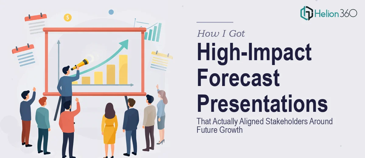
The Problem I Was Staring Down
Our leadership team had scheduled a strategy review, and I needed to walk a room full of stakeholders through forward-looking market analysis — growth forecasts, competitive positioning, trend data — and land on a unified direction for the next planning cycle. The stakes were real: decisions about resource allocation, new market entry, and competitive response were going to follow directly from this presentation.
The underlying research existed in fragments. There were spreadsheets with trend data, analyst summaries, internal notes from a competitor review, and some rough projections. None of it was in a form that could be put in front of an executive audience. A disjointed slide deck pulled together quickly would have undermined the credibility of the analysis itself.
I recognized immediately that getting this right — not just presentable, but genuinely persuasive and clear — required a level of craft and structure that wasn't going to happen by carving out a few hours on a weekend.
What I Found This Kind of Work Actually Requires
Once I started looking at what a properly constructed business forecast presentation involves, the scope became clear fast.
First, the source material has to be audited and restructured before a single slide gets designed. Raw research doesn't translate directly into a narrative. Someone has to decide what the story is — what the data actually argues for — and build a logical flow that carries a skeptical audience from context to conclusion without losing them.
Second, the data visualization layer is its own discipline. Forecast presentations live and die on how well charts communicate directional trends and relative positioning. The wrong chart type, an inconsistent axis scale, or a cluttered legend turns a strong data point into a question mark in the room.
Third, the presentation has to hold together visually and tonally as a unified document — not a collection of slides that each look like they came from a different source. That requires consistent type hierarchies, a disciplined color palette, and layout decisions that stay coherent across dozens of slides. That's not incidental polish. It's what makes the work credible.
What the Work That Gets This Right Actually Involves
The foundation of a strong forecast presentation is structural and narrative work. Done well, this starts with mapping the source material against a clear story arc — typically: market context, growth signals, competitive landscape, strategic implication, recommended direction. Each section needs to earn its place in the sequence. The practitioner's decision at this stage is how much detail supports the argument versus how much obscures it. That editorial judgment, applied across 25 to 40 slides of mixed research, takes real time and a disciplined eye. Someone unfamiliar with this kind of document architecture will often produce a slide order that feels like a research dump rather than a case being made.
The visual mechanics layer is where forecast presentations most commonly fall apart in practice. A proper forecast deck uses chart types matched precisely to the claim being made — waterfall charts for cumulative change, indexed line charts for relative trend comparison, diverging bar charts for competitive gap analysis. Typography follows a strict three-level hierarchy: a primary headline at roughly 36pt, supporting body copy at 24pt, and data labels or footnotes at 14–16pt. Margins and whitespace aren't aesthetic choices — they're functional, keeping the reader's eye moving in the right direction. Setting these up correctly in a master slide template, and having them propagate without breaking across the full deck, takes hours even for someone experienced with the tooling.
Polish and consistency across the full document is the third layer, and it's where effort compounds quickly. A forecast presentation shown to a leadership team needs no more than four brand-aligned colors used with clear purpose — one for primary data, one for benchmarks, one for highlights, one for neutral context. Every slide needs to pass a visual audit for alignment, spacing, and label clarity. In a 30-plus slide deck built from heterogeneous source material, that audit touches dozens of individual elements. One misaligned chart legend or inconsistent heading weight is the kind of detail that signals to an experienced audience that the work wasn't done carefully — and that doubt transfers to the analysis itself.
Why I Brought in Helion360 to Handle It
I didn't spend time attempting this myself. The combination of structural judgment, data visualization mechanics, and full-deck polish was clear enough — this was a project for a team that does this work every day, with the process and tooling already in place.
Helion360 handled the project end-to-end: auditing and restructuring the source research into a coherent narrative flow, building the visualization layer with chart types matched to each data story, and delivering a fully consistent, brand-aligned deck ready for the room. The turnaround was fast — done in days, not the weeks it would have taken me to work through the learning curve and execution on my own.
What made the difference wasn't just the design output. It was that the team understood what the presentation was trying to accomplish strategically and built the deck to serve that goal, not just to look good on screen.
The Outcome and What I'd Tell Anyone in My Spot
The presentation landed well. Stakeholders moved through the material without getting lost in the data, the strategic direction was clear before the final slide, and the follow-on discussion was focused on decisions rather than clarifications. That's the outcome a forecast presentation is supposed to produce — and it only happens when the structure and the visual execution are both working.
The research was always solid. What it needed was a team that could translate it into something a room full of decision-makers could act on. That translation — narrative, visualization, and polish, end-to-end — is exactly what the work required, and exactly what got delivered.
If you're looking at a similar project and want it handled end-to-end without the weeks of learning curve, Helion360 is the team to engage — they move fast, they understand what the work actually requires, and they deliver at the level of execution this kind of presentation demands.