

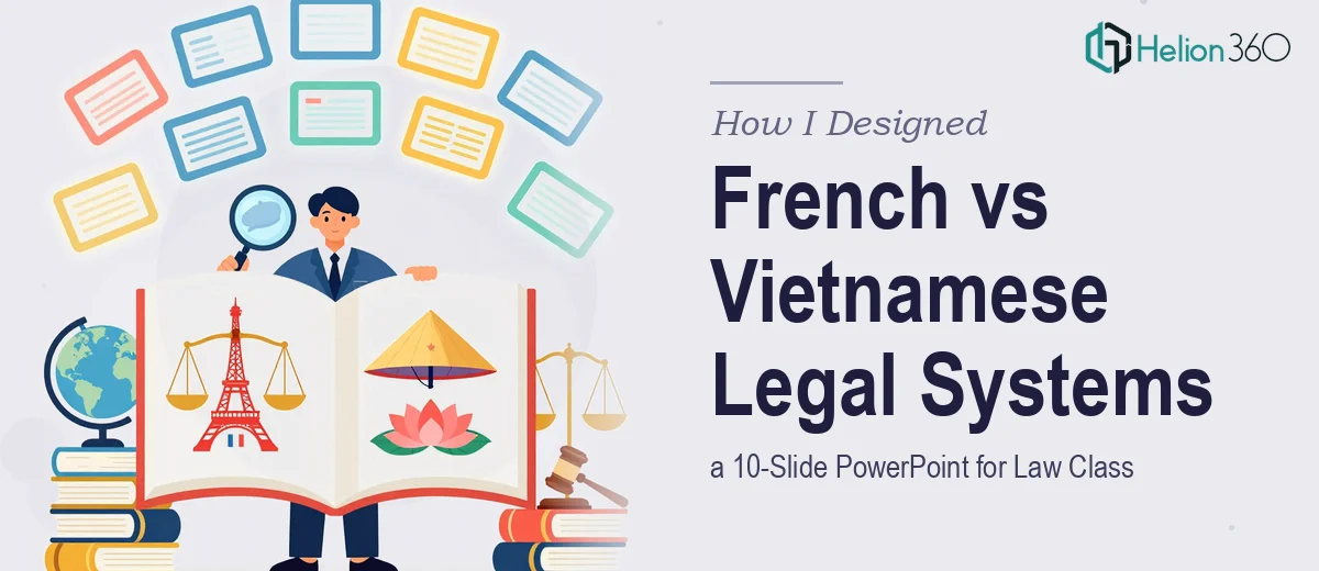
The Assignment Was Clear. The Execution Was Not.
I had a comparative law presentation coming up in a few weeks. The topic was straightforward enough — compare the French and Vietnamese legal systems across key areas like legal foundations, rights, responsibilities, and recent legislative changes. Ten slides. Clean, well-researched, visually organized.
On paper, it sounded manageable. In practice, it turned into one of the more complicated academic design projects I had taken on.
Why I Couldn't Just Open PowerPoint and Wing It
The content itself was the first problem. Comparative law between France and Vietnam is not a light topic. France operates under a civil law system rooted in the Napoleonic Code, while Vietnam follows a socialist legal framework heavily influenced by that same civil law tradition — but with significant ideological and structural differences. Capturing that nuance in 10 slides without either oversimplifying or overwhelming an audience took real thought.
I spent a few evenings mapping out slide topics: an overview of each legal system, constitutional structures, civil and criminal law differences, individual rights frameworks, recent reforms, and a side-by-side comparison. That part I could handle. But turning dense legal content into something a classroom audience would actually follow visually — that is where I started running into walls.
Every layout I tried looked either too text-heavy or too vague. Comparison slides were the worst. Two legal systems with very different structures do not fit neatly into a standard two-column template. The data needed visual hierarchy, not just bullet points.
Where Helion360 Came In
After spending more time reformatting slides than actually preparing for the presentation itself, I reached out to Helion360. I explained the scope — a 10-slide academic PowerPoint on comparative law, France versus Vietnam, with a tight turnaround before final presentations.
Their team asked the right questions upfront. What was the audience? What tone did the slides need to strike — formal academic, or accessible and engaging? Were there specific slides that needed comparison charts or visual breakdowns? Within the first exchange, it was clear they understood that this was not a generic design job. The subject matter had structure, and the slides needed to reflect that.
Helion360 took the content outline I had drafted and built the full deck from there. They handled slide structure, visual hierarchy, color use, and layout — translating legal comparison data into something clean and readable. The side-by-side comparison slide, which had been giving me the most trouble, came back as a well-organized visual that made the differences between the two systems immediately clear without requiring the audience to read a paragraph.
What the Final 10 Slides Covered
The completed presentation followed a logical flow that worked well for a class setting:
Slide 1 was a title and agenda overview. Slides 2 and 3 covered the historical and structural foundations of each legal system separately. Slide 4 compared constitutional frameworks side by side. Slides 5 and 6 looked at civil and criminal law in each country. Slide 7 focused on individual rights and how they are protected or limited under each system. Slide 8 addressed recent legal reforms in both France and Vietnam. Slide 9 was a key differences summary — the most visually dense slide, handled cleanly with icons and a structured layout. Slide 10 wrapped up with conclusions and discussion prompts for the class.
Every slide had a clear visual purpose. Nothing felt like a placeholder.
What I Took Away From This
The content knowledge was never the issue. I understood the material. What I underestimated was how much work goes into translating that knowledge into a presentation that communicates well under time pressure in a classroom.
Good comparative law PowerPoint design is not just about making things look polished. It is about helping an audience track two parallel systems at once without losing the thread. That requires intentional layout decisions — and that is harder than it sounds when you are also the one preparing to present.
Getting Helion360 involved at the right moment meant I could spend my remaining prep time on the actual presentation, not on slide formatting. The deck arrived ready to use, and the class session went smoothly.
Need Help With a Complex Academic or Research Presentation?
If you are working on a presentation that involves dense subject matter, tight timelines, or comparison-heavy content, Helion360 is worth reaching out to. Their team steps in when the work gets too layered to handle alongside everything else on your plate.