

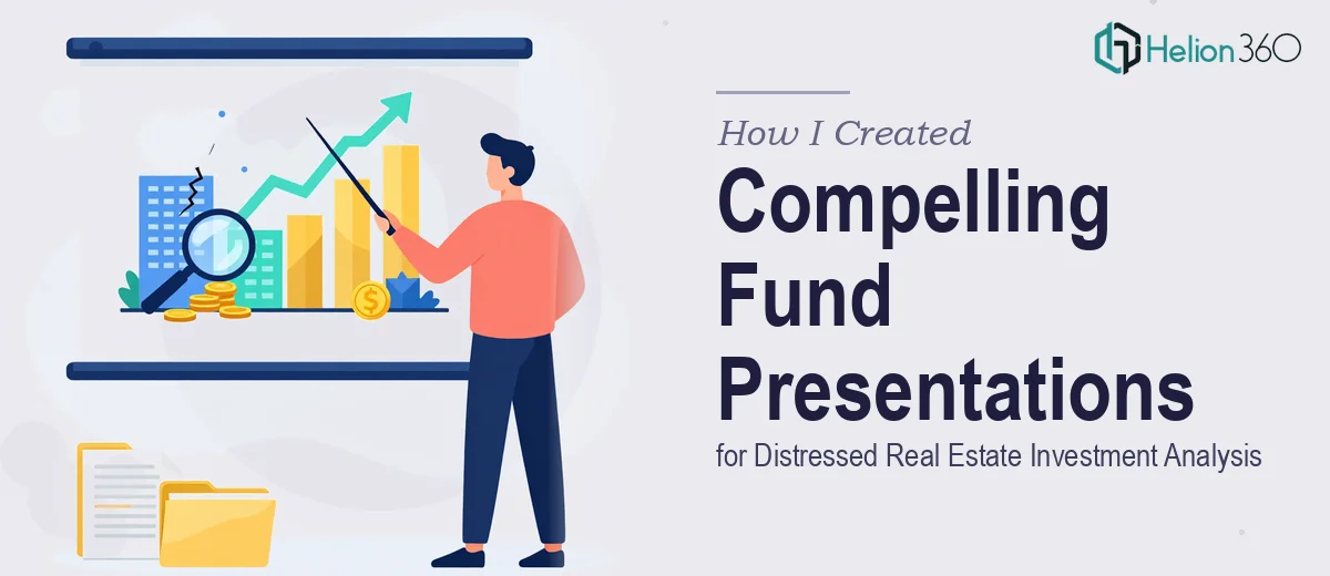
The Problem with Our Investment Presentation
Our fund team was preparing a comprehensive presentation for a distressed real estate investment analysis. The audience included institutional allocators and senior partners who review dozens of decks a month — people who notice immediately when data visualization is sloppy, when the narrative doesn't flow, or when a chart is technically accurate but visually unreadable.
The stakes were real. This wasn't an internal update or a preliminary briefing. It was a formal fund presentation where the quality of how we communicated our thesis — market dislocations, asset-level distress metrics, acquisition rationale — would directly influence how seriously we'd be taken in the room.
I knew straight away that getting the PowerPoint diagrams right was not a task to hand off to someone without deep finance and design experience, and certainly not something to attempt piecemeal on a deadline.
What I Found the Solution Actually Required
Before I made any decisions, I spent time understanding what a well-executed real estate fund presentation actually demands. What I found made it clear this was a serious production job.
First, the data complexity alone was significant. Distressed real estate analysis involves layered financial metrics — debt stack summaries, asset-level return projections, market comparables, stress-test scenarios — all of which need to be visualized in ways that are precise without being overwhelming. A chart that looks clean but misrepresents the distribution of returns is worse than no chart at all.
Second, investment presentations in this space carry audience expectations that are industry-specific. Allocators at this level expect a certain visual grammar: clean typographic hierarchy, restrained color usage, and diagrams that support a spoken narrative rather than replace it. Anything that looks like a generic template signals that the manager isn't operating at the expected level of professionalism.
Third, the sheer volume of slides — covering market context, deal pipeline, risk factors, fund structure, and team — meant consistency across every visual element needed to be airtight. That level of discipline across a full deck is a system, not a series of individual design decisions.
What Doing This Work Well Actually Involves
The structural work starts with auditing the source material and mapping a clear narrative arc before a single slide is built. In a distressed real estate context, that means sequencing the market dislocation thesis first, then the acquisition criteria, then asset-level evidence, and finally fund mechanics and terms. Each section needs a clear visual anchor — an opening diagram or summary chart that orients the reader before the detail slides follow. Getting this sequence wrong means allocators disengage before they reach the most important content, and restructuring it mid-production costs hours.
The visual mechanics of financial diagram design follow specific conventions. A clean hierarchy typically uses three type sizes — title, body, and label — set at roughly 28pt, 18pt, and 12pt respectively. Color palettes in institutional finance presentations run narrow: two brand colors maximum, with one neutral and one accent reserved for emphasis only. Chart types need to match the data story precisely — waterfall charts for return attribution, stacked bars for debt stack visualization, scatter plots for market comparables. Choosing the wrong chart type for a given data set is a common mistake, and correcting it after layout is complete means rebuilding slides from scratch.
Polish and consistency across a multi-section deck is where most in-house attempts fall apart. Every diagram needs to share the same grid alignment, the same spacing rules between elements, and the same icon language. In a 40-plus slide deck covering fund structure, asset pipeline, and market data, maintaining that discipline manually — without properly configured master slides and a locked style system — produces visible inconsistencies that erode credibility with a sophisticated audience. Setting up a master slide system that propagates correctly and handles edge cases like data-heavy layouts or full-bleed visuals takes significant time even for experienced designers.
Why I Brought in Helion360 to Handle It
I didn't attempt any of this myself. Once I understood what the work actually required — the narrative architecture, the financial diagram conventions, the consistency discipline across a full-length institutional deck — it was clear that engaging a team with the tooling and experience already in place was the only sensible move given our timeline.
Helion360 handled the full project end-to-end. That meant taking our raw financial data and analysis, structuring the narrative arc for an allocator audience, building every diagram and chart from scratch with proper visual mechanics, and delivering a fully consistent, polished deck ready for the room. The turnaround was fast — done in days, not weeks, and handled in a fraction of the time it would have taken us to learn and execute it ourselves.
What stood out was that they understood the domain. The diagrams reflected the visual grammar that institutional finance audiences actually expect, not a generic design sensibility applied to financial content.
The Outcome and What I'd Tell Anyone in My Spot
What we received was a fund presentation that held up in the room. The diagrams communicated the distressed real estate thesis clearly — market context, asset-level analysis, fund structure — without visual noise. The hierarchy was sharp, the charts were correctly matched to the data, and the consistency across sections made the whole deck read as a cohesive, professional document rather than a collection of slides.
The allocators we presented to engaged with the content. That's the real measure of whether a presentation worked: whether the audience is tracking the argument rather than squinting at a chart or losing the thread between sections.
If you're looking at a similar situation — complex financial data, a sophisticated audience, and a real deadline — and you want it handled end-to-end without the weeks of learning curve, an investor pitch deck service like what Helion360 offers is the solution. They delivered fast, and the execution depth this kind of work requires was already in place. Learn more about how to convert complex investment scripts into clear presentations and discover what real estate capital raise pitch decks actually require to move investors.