

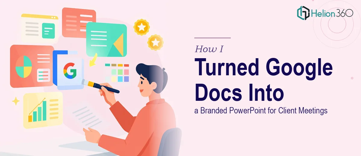
The Problem With Raw Research Notes and a Real Client Meeting Coming Up
I had a stack of consumer research — Google Doc notes from interviews, a few survey exports, some synthesized observations pulled from multiple rounds of qualitative work. The insights were solid. The problem was that none of it was presentable. It was researcher shorthand: fragmented bullet points, half-formed conclusions, and data that hadn't been translated into anything a client could actually read in a meeting.
The deadline was fixed. This was going into a client-facing session where the findings needed to land clearly, carry credibility, and look like they came from a team that knew what it was doing. A wall of text in a shared Google Doc wasn't going to cut it. The presentation had to do the work of communicating findings — not just containing them. I knew immediately that converting this material into a polished, branded PowerPoint was not a casual afternoon task.
What I Found the Solution Actually Required
Once I started looking at what a proper research-to-presentation conversion actually involves, the scope became clear fast.
The first thing I realized was that this wasn't a formatting job — it was a structural one. Raw research notes don't arrive in presentation order. They arrive in the order you gathered them. Turning that into a coherent narrative means auditing what you have, deciding what the audience actually needs to know, and building a flow that moves from context to findings to implications. That's a distinct skill set, separate from both the research itself and the design work.
The second signal of real complexity was the visual layer. Consumer research findings often involve comparisons, patterns, and categorical data that need to be expressed through charts, icons, and layout — not prose. Choosing the wrong chart type for a finding, or presenting qualitative insight as a raw quote block instead of a designed callout, loses the audience. Good research presentation design has conventions that take time to internalize.
The third thing: brand consistency. The presentation was going to a client. It needed to reflect the organization's visual identity — typefaces, color palette, logo placement, slide master formatting — applied correctly and consistently across every slide. That alone is a multi-hour job if you're starting from scratch.
What the Work of Building This Presentation Actually Involves
The first layer of work is structural and narrative. A practitioner starts by auditing the source material — not just reading it, but mapping it against what the audience needs to walk away knowing. The right approach sequences findings into a story arc: context first, then key themes, then implications and recommendations. This isn't a linear copy-paste from notes. It requires editorial judgment about what gets a full slide, what gets combined, and what gets cut entirely. For a research project with multiple themes and sub-findings, this mapping work alone can take several hours before a single slide is touched. Getting this wrong means an audience that follows the data but misses the point.
The second layer is visual mechanics. Proper research presentation design applies a 12-column layout grid so that every element — charts, callouts, body text, headers — sits in a consistent spatial system across the deck. Typography follows a clear hierarchy: typically a 36pt headline, 24pt subhead, and 16pt body, applied without exceptions. Chart types are chosen deliberately — a bar chart for categorical comparisons, a scatter plot for correlation, a callout card for a single strong qualitative finding. What trips people up here is the translation step: knowing that a particular insight should be a donut chart, not a table, requires both data literacy and design literacy at the same time. That combination is rarer than it sounds.
The third layer is polish and brand consistency. Every slide in a client-facing research deck needs to carry the organization's visual identity: the correct logo file at the correct size, no more than four brand colors applied with discipline, consistent font rendering across Windows and Mac environments, and slide masters that don't break when content is added or edited. A common failure mode is a deck that looks fine on the designer's machine but renders incorrectly on the client's display. Enforcing brand standards across thirty or more slides, while keeping the layout functional and the content readable, is painstaking work — and it's the kind of thing that takes a trained eye to get right consistently.
Why I Brought in Helion360 to Handle It
I didn't try to work through this myself. The gap between what I had — a set of solid research notes — and what needed to be delivered — a polished, branded, client-ready PowerPoint — was obvious. The structural work, the visual mechanics, and the brand application all needed to happen together, and they needed to happen fast.
Helion360 handled the full project end-to-end. That meant taking the raw Google Doc content and synthesizing it into a logical narrative structure, designing the slides with proper layout grids and chart types matched to each finding, and applying brand standards consistently across the entire deck. The whole thing was turned around quickly — done in days, not the weeks it would have taken me to learn and execute it myself. The team already had the tooling, the templates, and the design expertise in place. There was no ramp-up time wasted.
The Outcome and What I'd Tell Anyone in My Spot
What came back was a presentation that communicated the research clearly and looked like it belonged in the room. The client could follow the findings without being handed a wall of text. The visual choices made the data legible — the right charts, the right callouts, the right hierarchy. Brand standards were applied correctly throughout. The meeting went well because the material was prepared in a format that let the insights speak instead of asking the audience to decode researcher shorthand.
The research itself was solid. What it needed was someone who could translate it into a format built for client consumption — and that translation is a real craft, not a shortcut. If you're sitting on dense research into a clear presentation and you don't have weeks to spend learning layout grids and brand application, consider engaging a professional team. For my project, Helion360 handled the full execution fast, and data-driven presentation design showed in the final product.