

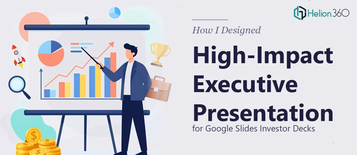
When the Stakes Are Too High to Wing It
We had a launch event coming up in less than two weeks. The audience was not a casual one — we were presenting to high-level executives and potential investors who had seen hundreds of decks before. I knew from the start that this Google Slides corporate presentation needed to be sharp, data-driven, and visually polished enough to hold the room without being over-designed.
I decided to take the first pass myself. I had a solid understanding of the content — the company story, the product vision, the financials — so laying out the narrative felt manageable. But when it came to actually building the slides, that is where things started to slow down.
Where the DIY Approach Hit a Wall
The content itself was not the problem. The challenge was turning that content into something a room full of executives would engage with on sight. The charts I was pulling from our reports needed to be rebuilt as clean visual elements, not just pasted in. The slide layouts felt inconsistent across sections. And whenever I tried to make one part look professional, another section would fall out of balance.
I was spending hours on spacing, font sizing, and color alignment — time I did not have with the event date approaching. I also realized that designing for investors specifically requires a different visual language than a standard internal deck. It needs to feel authoritative and modern without feeling cluttered or overproduced.
After a few days of iteration that were not moving the needle, I reached out to Helion360. I explained the brief, the audience, the timeline, and what I had built so far. Their team took it from there.
What the Design Process Actually Looked Like
Helion360 started by reviewing the existing draft and asking a few focused questions — what tone did we want the presentation to carry, which data points were most critical, and how much flexibility did we have with the brand colors and typography. That conversation alone helped clarify things I had not fully thought through.
From there, they rebuilt the deck in Google Slides with a structure that made the flow of information feel intentional. The charts were redesigned as clean, readable visuals with proper hierarchy. The section transitions were consistent. Every slide had breathing room — which sounds simple, but makes an enormous difference when executives are processing information quickly in a live setting.
They also balanced the imagery with the data in a way I had struggled with. The company's innovative positioning came through visually without the slides feeling like a marketing brochure. It read like a business case, which is exactly what investors need to see.
What the Final Deck Delivered
The presentation came together with a few days to spare before the event. The Google Slides format meant the team presenting could make last-minute copy tweaks easily without breaking anything visually. That flexibility turned out to be more valuable than I had anticipated.
The design was clean and modern — exactly what we had asked for — but more importantly, it was designed with the audience in mind. The charts communicated the right things at a glance. The visual storytelling supported the spoken narrative rather than competing with it. And the overall presentation felt like something that belonged in front of a high-stakes room.
Looking back, the lesson was straightforward. I could manage the content strategy and the business narrative. What I could not do quickly — and well — was translate all of that into a professionally designed corporate presentation under time pressure. That gap is real, and pretending it is not just costs you time and quality.
If you are preparing a presentation for executives and the design is holding you back, Helion360 is worth reaching out to — they handle exactly this kind of high-stakes work and deliver without the back-and-forth that slows most projects down.