

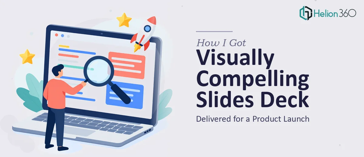
The Problem With Presenting a Product Launch on a Deadline
I was staring at a product launch timeline with a hard presentation date and a slide deck that looked like a rough internal draft. The deck needed to cover an introduction, company background, product highlights, benefits, testimonials, and a clear call-to-action — six distinct sections that each needed to land with a different kind of weight.
The audience was mixed: potential customers, channel partners, and internal stakeholders who would be using this material beyond the launch event itself. A generic template wasn't going to cut it. The presentation needed to feel cohesive, on-brand, and genuinely persuasive — not just informative.
I knew straight away that this wasn't something I could assemble over a weekend and expect it to perform. A product launch only happens once, and first impressions in a competitive market are hard to recover from. This needed to be done right.
What I Found a Professional Google Slides Deck Actually Requires
When I started looking into what a well-executed Google Slides product launch deck involves, I realized quickly that the gap between "slides that work" and "slides that look like a template" is significant.
The first signal was narrative structure. A product launch deck isn't a linear list of facts. It has to move an audience through a specific emotional and logical arc — from awareness and credibility through to desire and action. Getting that arc right means auditing every content block and making deliberate decisions about what belongs on which slide and in what order.
The second signal was brand fidelity. Google Slides has known limitations around typography rendering, image compression, and color accuracy compared to native design tools. Maintaining brand consistency across a multi-section deck — with the right hex values, font weights, and spacing — requires working around those limitations systematically, not casually.
The third signal was infographic and visual integration. The deck needed supporting visuals that weren't just decorative. Diagrams, benefit callouts, and testimonial layouts all had to be purpose-built for the content, not dropped in from a stock library. That's a different skill set than knowing your way around a slide application.
What the Work That Needs to Happen Actually Looks Like
The right approach to a Google Slides product launch deck starts with a structural and narrative audit of the source content. Done well, this means mapping each content section — introduction, product highlights, benefits, social proof — to a specific slide function: orienting, educating, persuading, or closing. A deck with six sections typically spans 18 to 28 slides when properly sequenced, and each slide should carry exactly one primary message. The decision a practitioner makes here is how much content lives on each slide versus how much moves to the presenter's notes, and that decision shapes the entire experience. Getting this wrong means audiences either disengage from text-heavy slides or lose the thread on slides that are too sparse.
Visual mechanics are where most DIY decks fall apart. Proper Google Slides deck design uses a consistent layout grid — typically a 12-column underlying structure — with type hierarchies set at roughly 36pt for headlines, 22pt for subheads, and 16pt for body content. Color application follows a strict primary and secondary palette, usually no more than four brand colors deployed with discipline across every master slide. Infographics need to be built as native vector elements rather than imported rasters so they remain sharp on large screens and don't degrade when the file is shared. Each of these rules has to be applied consistently across every slide, which is time-consuming even for experienced designers working in a familiar tool.
Polish and cross-slide consistency is the last layer, and it's where the hours quietly disappear. Every transition, every icon set, every text box margin, and every image crop needs to read as part of the same design system. Testimonial slides require a different visual treatment than product feature slides, but both have to feel like they belong to the same deck. In practice, this means cycling through the full deck multiple times — checking alignment to the pixel, verifying that brand elements haven't drifted between sections, and confirming that the call-to-action slide lands with enough visual weight to prompt the intended response. For someone without a repeatable production process already in place, this stage alone can consume more time than the initial design pass.
Why I Brought in Helion360 to Handle It
Once I understood what the work actually involved, attempting it myself wasn't a realistic option. The timeline was tight and the stakes were real. I needed a team that already had the process, the tooling, and the visual judgment built in — not someone learning on my project.
Helion360 handled the full deck end-to-end. That meant taking the content outline, structuring the narrative arc across all six sections, building out the slide-by-slide layout system in Google Slides, and producing the infographics and visual elements from scratch to match the brand identity. It also meant QA across the full deck for consistency before anything came back to me.
The turnaround was fast — polished deck delivered in a week, not weeks. What would have taken me considerably longer to learn, set up, and execute properly was handled in a fraction of that time. The difference is a team that does this work all day, with production workflows already dialed in.
What the Deck Delivered and What I'd Tell Anyone in My Position
The finished Google Slides deck came back polished, on-brand, and structured exactly the way a product launch presentation should be. Each section flowed naturally into the next. The infographics supported the key messages without overwhelming them. The call-to-action slide had real presence. Feedback from the launch audience was strong, and the deck has continued to be used in follow-up conversations with prospective customers well beyond the original event.
If you're looking at a product launch presentation and can see the gap between where your draft is and where it needs to be, Helion360 is the team I'd engage — they delivered fast, handled the full scope of the work, and brought the kind of execution depth this type of project genuinely requires.