

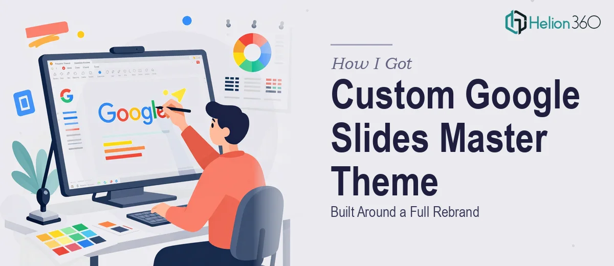
The Problem With Presenting After a Rebrand
Our agency had just come out the other side of a full rebrand. New logo, new color palette, new typography direction — the whole identity had been refreshed. The problem was that every presentation we sent out still looked like the old us. Client proposals, campaign reports, internal decks — they all carried the visual language of a brand we'd moved on from.
This wasn't a cosmetic issue. Presentations are often the first formal touchpoint a prospective client has with the agency. Walking into a pitch with slides that contradict your brand identity sends the wrong message before you've said a word. I knew this couldn't be patched slide by slide. What we needed was a properly built Google Slides master theme — one that locked in the new branding at the template level so every deck produced going forward would be consistent from the first slide to the last.
That was the real deliverable, and it needed to be done right.
What I Found a Proper Google Slides Master Theme Actually Requires
My first instinct was to look into how involved this actually was. A Google Slides master template isn't just a background color and a logo drop. Done properly, it's a structured system built inside the Slide Master editor — a hierarchy of layouts, placeholders, and style rules that cascade down to every slide a user creates.
Three things stood out immediately as signals of real complexity. First, the theme has to account for every common slide type the agency uses — title slides, content slides, two-column layouts, data slides, divider slides — and each needs its own layout with correctly positioned placeholders. Second, the typography system has to be baked in at the master level using the exact font pairings from the brand guidelines, with size hierarchies that work across different screen resolutions and aspect ratios. Third, color application in Google Slides works through a defined palette of eight theme colors, and mapping new brand colors to those slots correctly determines how every chart, shape, and accent element behaves across the entire deck. Get that mapping wrong and the theme produces off-brand outputs by default.
This wasn't a weekend project.
What the Build Actually Involves
The first layer of the work is structural — mapping out which slide layouts the theme needs to support and building them cleanly inside the Master editor. A well-built master for an agency environment typically includes eight to twelve distinct layouts: a primary title slide, a section divider, at least two content variants, a full-image layout, a two-column text-and-visual layout, and a closing or contact slide. Each layout requires properly named and sized placeholders for title, body, and supporting elements. The execution friction here is significant — Google Slides' Master editor behaves differently from PowerPoint's, and placeholder inheritance rules trip up anyone who hasn't mapped them carefully before. A misaligned placeholder on the master propagates to every instance of that layout across the entire deck.
The second layer is visual mechanics — applying the brand's typography and color system in a way that holds under real-world use. The right approach sets a clear type hierarchy: typically a 40–44pt display font for slide titles, 24–28pt for section headers, and 16–18pt for body text, all mapped to the brand's chosen typefaces. The eight-slot theme color palette in Google Slides needs to be mapped so that the primary brand color occupies Accent 1, secondary colors fall in predictable slots, and neutral tones handle backgrounds and text. If this mapping is done without intention, users adding charts or shapes will pull off-brand colors automatically — and most people won't notice until a deck is already in front of a client.
The third layer is polish and consistency — ensuring every element across every layout reflects the brand guidelines without variation. This means consistent margin discipline (typically a 0.4–0.5 inch safe zone on all sides), logo placement locked to a fixed position on applicable layouts, and icon or graphic styles that match the brand's visual tone. The execution challenge is that small inconsistencies compound fast across a multi-layout master. A logo that sits two pixels lower on one layout, a slightly different shade applied to a rule line, a text box that doesn't align to the implicit grid — none of it looks broken in isolation, but together it produces a master slide template that feels unpolished the moment someone uses it at scale.
Why I Brought in Helion360 to Handle It
When I understood what a properly built Google Slides master theme actually involved, attempting it in-house wasn't a realistic option. The agency needed this done fast — we had client-facing presentations queued up and couldn't keep sending decks that contradicted the new brand identity. Spending weeks learning the nuances of Google Slides' master editor, color slot mapping, and layout inheritance wasn't the right use of anyone's time.
I engaged Helion360 to take this on end-to-end. They handled the full scope: auditing the brand guidelines, building the complete layout library inside the master, mapping the color palette correctly to all eight theme slots, and applying the typography hierarchy across every slide type. The theme was turned around quickly — done in days, not weeks — and delivered as a production-ready file the team could start using immediately. This is the kind of work Helion360 does continuously, with the tooling and process already in place.
The Outcome and What I'd Tell Anyone in My Spot
What came back was a fully structured Google Slides master theme — twelve layouts, correct color mapping, locked typography, and consistent brand application across every slide type. The moment the team started using it, the difference was immediate. Every new deck produced from the template looked like it came from the same professional brand, without anyone having to manually enforce consistency slide by slide. Client proposals, campaign decks, and internal presentations all carried the same visual language — the one we'd actually rebranded to.
The business impact was straightforward: we stopped sending mixed-signal presentations to prospective clients, and the internal team stopped wasting time correcting brand inconsistencies in individual files.
If you're looking at the same situation — a rebrand that needs to be reflected properly in a Google Slides master theme, done fast and built to hold up under real-world use — Helion360 is the team I'd engage. They handled the full execution and delivered it quickly, with the depth this kind of build actually requires.