

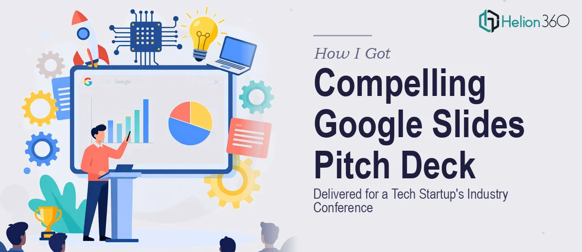
The Presentation Was Coming Up Fast and the Stakes Were Real
We had a major industry conference on the calendar, and we needed our pitch deck to do serious work. This wasn't an internal update or a casual demo — it was a room full of people who would be forming opinions about our startup in the first thirty seconds of every slide. The pitch needed to communicate our vision clearly, show off our competitive edge, and hold together as a polished, cohesive story from the first slide to the last.
We had content. What we didn't have was a Google Slides pitch deck that looked and felt like it belonged in that room. Our existing materials were scattered — good ideas buried in functional-but-forgettable formatting. With roughly two weeks to finalize everything, I recognized quickly that this wasn't a situation where "good enough" would cut it. It needed to be done right, and it needed to be done fast.
What I Found a Professional Pitch Deck Actually Requires
When I started looking at what a well-designed Google Slides pitch deck for a tech startup actually involves, the complexity became clear immediately. It's not a matter of applying a template and dropping in bullet points.
First, the narrative architecture matters as much as the visuals. A pitch deck has a specific job: it needs to move an audience through a logical sequence — problem, solution, market, traction, team — in a way that builds conviction. Getting that sequence wrong, or burying the key point three slides too late, costs you the room.
Second, Google Slides has real design constraints. Achieving pixel-level consistency, managing master slide inheritance, working with brand-accurate color palettes and type hierarchies — these are not things that happen automatically. They require deliberate setup and discipline across every slide.
Third, startup pitch decks for conference settings have audience expectations baked in. Investors and industry professionals have seen hundreds of these. Anything that looks templated, misaligned, or visually inconsistent reads as a signal about the quality of the team behind it. The bar for what looks credible in that environment is higher than most people expect.
What the Work Actually Involves
The starting point for a pitch deck like this is structural — a full audit of the existing content followed by a deliberate story mapping exercise. The right approach identifies which slides carry the narrative load (problem, solution, market size, traction, team) and determines the correct order and weighting for a conference context. This isn't a formatting pass; it's a strategic layer that decides what each slide is arguing and how it connects to the next. The execution friction here is real: restructuring content without losing the founder's voice, while also tightening copy to fit the three-to-five-second read budget each slide gets, routinely takes multiple rounds of review and adjustment before the arc feels genuinely tight.
Once the structure is set, the visual mechanics define whether the deck looks credible or amateurish. A properly built Google Slides pitch deck uses a consistent layout grid — typically a 12-column system — with a type hierarchy locked at roughly 36pt for headlines, 24pt for subheads, and 16pt for body copy. Chart types are chosen deliberately: comparison data goes to bar charts, trend data to line charts, and proportional data to donut charts rather than pie charts. Every visual choice carries a logic. The friction is in execution: maintaining this discipline across fifteen to twenty slides, with varied content types on each, requires hours of careful slide-by-slide work even for an experienced designer — and a single misaligned element on a projected slide is visible from the back of the room.
Polish and brand consistency across the full deck is where many DIY attempts fall apart at the finish line. A professional pitch deck applies a maximum of four brand colors with clearly defined usage rules — primary for key callouts, secondary for supporting elements, neutral for backgrounds and body text, and an accent used sparingly for emphasis. Custom iconography, consistent padding across all content blocks, and lock-step alignment between text frames and image placeholders all have to be applied and verified slide by slide. In Google Slides, unlike desktop software, certain formatting behaviors don't propagate automatically from master slides, which means each layout variant needs individual attention. That level of consistency takes far longer than it looks from the outside.
Why I Brought Helion360 in to Handle the Full Project
I didn't spend time experimenting on this one. The combination of a hard conference deadline, the audience we'd be in front of, and the clear complexity of doing the work well made the decision straightforward — this needed a team that does this work every day, with the tooling and expertise already in place.
Helion360 handled the full project end-to-end: the content restructuring and narrative sequencing, the Google Slides build with proper master slide architecture, and the full visual treatment including brand application, custom slide layouts, and data visualization across the traction and market slides. They turned it around quickly — the kind of speed that comes from having a defined process, not from cutting corners. What would have taken me weeks of learning curve and back-and-forth guesswork was handled in a fraction of that time. The deck they delivered was ready to present, not ready to keep editing.
The Result and What I'd Tell Anyone in the Same Spot
The final pitch deck held together as a single, confident story. The visuals communicated the startup's competitive position clearly, the slide flow kept the audience moving at the right pace, and the design looked exactly like it belonged in a major conference setting. Feedback from the room confirmed it landed the way we needed it to.
If you're looking at a similar situation — real deadline, real audience, real stakes — and you can see that doing it well is more involved than your available time allows, consider startup pitch deck design services to handle the full execution fast. Learn more about what a professional pitch deck actually requires, and explore the specifics of building a compelling tech startup pitch deck. The depth of work this kind of presentation needs is exactly what brings results in front of serious audiences.