

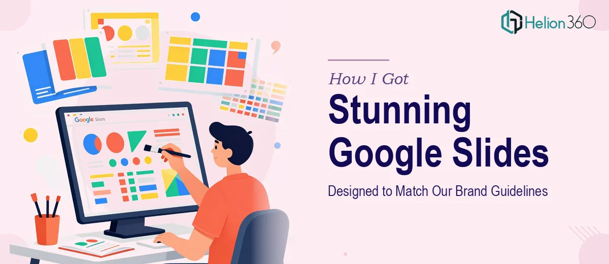
The Presentation Was Due and It Looked Like a First Draft
I had a set of Google Slides that needed to go in front of a senior audience — and they looked exactly like what they were: functional but unfinished. Inconsistent fonts, mismatched colors, layouts that shifted from slide to slide. The content was solid. The presentation was not.
What made it worse was the context. These slides needed to reflect our brand — specific color values, typography, visual language — and nothing in the current deck came close. It wasn't just an aesthetic problem. A presentation that looks off-brand signals that the thinking behind it is off too. That's not the impression I wanted to make.
I knew this needed proper Google Slides design work, not a quick cleanup. The moment I started mapping out what that actually required, it became clear this wasn't something to attempt casually.
What Doing This Well Actually Involves
I started researching what a professional Google Slides redesign looks like when done correctly, and the scope surprised me.
The first thing that stood out was brand application. It's not just plugging in hex codes. Proper brand alignment across a multi-slide deck means building out a master slide system — theme colors, font pairings, background treatments — so that every slide inherits the right settings rather than being styled individually. That alone is a system-level task.
The second thing was layout consistency. Slides that look polished use an underlying grid structure, with element placement, margin widths, and text box sizing governed by actual spatial rules. Without that foundation, slides that look fine individually feel chaotic as a deck.
The third signal was visual hierarchy. Choosing which information gets visual weight — and expressing that through type size, contrast, and placement — is a design decision, not a formatting decision. Getting it wrong means the audience doesn't know where to look.
That was enough for me to recognize this needed someone who works in this space every day.
What the Work Actually Requires
The right approach to Google Slides design starts with structural and narrative work before any visual changes happen. This means auditing the existing slides for content flow, identifying where the story arc breaks down, and deciding what each slide is actually trying to communicate. A proper deck has one core message per slide, with supporting elements that reinforce rather than compete. Doing this audit rigorously on a 20-plus slide deck takes time — and skipping it means the visual design gets applied to a structure that still doesn't work.
Visual mechanics come next, and they're more exacting than most people expect. Professional Google Slides design uses a defined layout grid — often a 12-column base — with consistent margins, padding, and element alignment across every slide. Typography follows a strict hierarchy: titles typically sit at 36pt, subheadings at 24pt, and body text at no smaller than 16pt for readability. These aren't suggestions; they're the rules that make a deck feel coherent rather than assembled. Setting up master slides correctly so these rules propagate without manual adjustment per slide is a task that trips up anyone who hasn't done it dozens of times.
Polish and brand consistency form the third layer, and this is where a lot of well-intentioned attempts fall apart. Brand application means limiting the palette to a maximum of four brand colors with clearly defined roles — primary, secondary, accent, neutral — and applying them with discipline across backgrounds, text, icons, and data visuals. It also means icon style consistency, image treatment uniformity, and ensuring that no slide deviates from the master without a deliberate reason. Reviewing every slide against that standard at the end of production, and correcting the edge cases that always appear, is the kind of detail work that separates a professional result from something that almost looks right.
Why I Brought Helion360 in to Handle the Full Project
Once I understood the scope, the decision was straightforward. I wasn't going to spend two weeks learning the finer points of Google Slides master slide architecture and brand system application just to produce one deck. The work needed someone with that expertise already built in.
Helion360 handled the project end-to-end and delivered fast. The full scope — structural audit and content organization, master slide setup with brand-accurate colors and typography, and slide-by-slide visual execution — was turned around in a fraction of the time it would have taken me to work through it. They came in with the tooling, the design system thinking, and the Google Slides-specific knowledge already in place.
What I didn't have to do was manage pieces or review partial work. The brief went in, and a complete, brand-aligned deck came back. That's the value of engaging a team that does this work all day.
What Was Delivered and What I'd Tell Anyone in My Spot
The finished deck was exactly what the project needed. Consistent layout from slide one to the last, brand colors and typography applied correctly throughout, visual hierarchy that made the content easy to follow, and a master slide system that meant any future edits would hold the design standards automatically. The presentation looked like it belonged to the brand — because it did.
The broader takeaway was that Google Slides design done properly is a system problem, not a styling problem. You're not just making things look nicer; you're building a coherent visual framework that communicates before the presenter says a word. That's a different kind of work than most people account for when they think about "cleaning up" a deck.
If you're looking at a similar situation — slides that need to look professional and align with brand standards, with a real deadline attached — Helion360 is the team I'd engage. They handled the full execution quickly and brought the kind of design depth the work actually requires.