

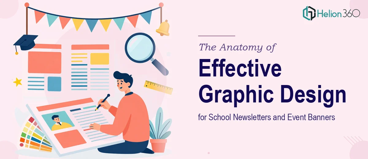
Why Newsletter and Banner Design Is Harder Than It Looks
School newsletters and event banners occupy a deceptively demanding corner of graphic design. They look simple — a header, some text, maybe a photo — but the moment you try to make one feel cohesive, energetic, and on-brand all at once, you realize how many decisions are actually in play.
For organizations like martial arts schools, community sports programs, or after-school academies, these materials carry the entire public face of the program. A newsletter that looks thrown together signals disorganization to parents, even when the program itself is excellent. An event banner that lacks visual impact gets ignored in a busy gymnasium or community board. The stakes are real: enrollment decisions, event turnout, and community trust all hinge partly on how professional and engaging the design feels.
Done well, a newsletter builds ongoing brand recognition across every issue. Done badly, it creates noise that readers scroll past or toss aside. The gap between those two outcomes is almost entirely a function of intentional design decisions — not expensive software, but disciplined craft.
What Thoughtful Newsletter and Banner Design Actually Requires
The work is not just about making things look attractive. There are several distinct capabilities that separate polished design from a rushed attempt.
First, the design needs to carry a brand identity consistently across both formats — newsletter and banner — even though those two formats have completely different dimensions, viewing distances, and reading contexts. A newsletter is read at arm's length on a screen or printed page. A banner is scanned from across a room in a matter of seconds. Design that works for one will fail the other if the underlying brand system is not strong enough to flex.
Second, typography has to do serious structural work. Readers do not read newsletters linearly — they scan. A clear typographic hierarchy, with a dominant headline, a readable subhead, and a clean body size, guides the eye naturally without the reader noticing it. The same principle applies to banners, only more compressed.
Third, color usage needs intention, not decoration. Vibrant event organizations are often tempted to use every color in their palette everywhere, which produces visual chaos rather than energy. A restrained, deliberate palette applied confidently reads as far more dynamic than a cluttered one.
Fourth, both deliverables need to meet print and digital production standards — and those standards differ in ways that trip up designers who only work in one medium.
How to Actually Build These Designs Well
Establishing the Grid and Layout Structure
Every well-designed newsletter starts with a grid. For a standard letter-size newsletter (8.5 × 11 inches), a three-column grid gives enough flexibility to mix full-width hero images, two-column feature stories, and single-column callout boxes without the layout feeling rigid. The gutter between columns should sit at a minimum of 0.125 inches for print, though 0.1875 inches is more forgiving with commercial printers.
For digital-only newsletters distributed as PDFs or HTML emails, the equivalent structure uses a 600px-wide container — the safe width for most email clients — divided into a two-column or three-column system with 20px gutters. Keeping the live text area inside a 560px content width prevents clipping on mobile.
Event banners need their own grid logic. A standard horizontal event banner at 4 feet × 2 feet (a common indoor competition size) works best when the design is divided into a strong left-anchored information zone and a right-side visual zone, or vice versa. The key rule: the headline must be legible from at least 15 feet away, which in practical terms means a minimum of 150pt type at print resolution, printed at 100 DPI at full scale or 300 DPI at one-quarter scale in the working file.
Typography Hierarchy That Actually Works
A functional three-level type hierarchy for a martial arts school newsletter might look like this: a 36pt bold display font for the newsletter nameplate and article headlines, an 18pt semi-bold for section subheadings, and an 11pt regular weight for body copy with 14pt line spacing. That 11/14 ratio is the baseline for comfortable reading in print; anything tighter than 11/13 starts to feel cramped.
For event banners, the hierarchy compresses dramatically. The event name or call-to-action runs at 200–300pt depending on banner dimensions. The secondary detail line — date, location, registration link — drops to roughly one-third of that size. The tertiary information, like a website URL or sponsor acknowledgment, drops again to one-fifth. If all three levels feel equally loud, none of them communicate.
Font pairing should be simple: one display face for headlines, one workhorse sans-serif for body and supporting text. Introducing a third typeface almost always creates visual noise rather than richness.
Color Application and Brand Consistency
The palette for a martial arts school typically draws on bold primaries — deep reds, navy, black, white — with an accent color for energy. The discipline in application matters more than the palette itself. The primary brand color should anchor the masthead, section headers, and banner background. The accent color appears sparingly: on calls-to-action, pull quotes, and highlight elements — not on every element that needs emphasis.
A working rule: no more than four colors active on any single layout, and no more than two appearing in the same design zone. On the banner, a high-contrast pairing of background and headline color — for instance, a deep navy field with white knockout type — will outperform a more complex gradient treatment at every viewing distance.
For print files, colors need to be specified in CMYK, not RGB. A color that looks vivid on screen in RGB (say, a bright red at R:255, G:0, B:0) can print noticeably different when converted to CMYK at press time without a careful profile assignment. The working file should be built in CMYK from the start, with a bleed of 0.125 inches on all edges for any print piece that runs color to the edge.
Image Selection and Placement
Action photography of students, instructors, and competition moments is the natural content for this kind of design. Images for print newsletters need a minimum resolution of 300 DPI at final placed size — a 4-inch-wide image placed at 100% must be at least 1,200 pixels wide at the source. Web-optimized JPEGs at 72 DPI will look visibly soft in print, and this is one of the most common production errors in community organization design.
For banners, images work best when they are treated as environment rather than subject — a blurred action background behind bold type reads more powerfully at distance than a detailed foreground photo that competes with the headline for attention.
What Goes Wrong When This Work Is Rushed
Skipping the brand audit before starting is the most expensive shortcut. When a designer jumps straight into layout without establishing which fonts, colors, and logo versions are approved, the newsletter and banner end up with inconsistencies that compound across every future issue. A logo placed at slightly different sizes, a headline font that varies between the newsletter and the banner — these drift accumulates into a fragmented identity.
Using RGB color mode for print files is a consistent source of production surprises. Colors shift on conversion, and without a proofing step, the printed piece can look noticeably different from the screen mockup that was approved. Building CMYK files from the start and running a soft-proof before submitting to print eliminates this problem.
Underestimating the polish phase is common. Spacing adjustments, optical margin alignment, kerning on display headlines, and consistent padding inside text boxes each take real time. A layout that looks complete at 75% zoom often reveals misalignments and inconsistencies at 100%, and print reveals even more. Rushing this phase produces designs that almost look professional — which is often worse than something clearly rough, because it signals lack of attention rather than lack of resources.
Building one-off files instead of templates compounds the labor cost significantly over time. A master newsletter template with locked grid guides, paragraph styles, and a linked logo file makes every subsequent issue dramatically faster and keeps the brand consistent without extra effort.
Finally, reviewing your own work in isolation after a long session is unreliable. The eye stops registering familiar errors. A second reviewer — even a non-designer checking for typos, spacing oddities, and color coherence — catches what the original designer misses.
What to Take Away From This
Newsletters and event banners look like entry-level design tasks until you sit down to do them well. The real skill is in building a system — a grid, a type scale, a color application rule — that makes every iteration consistent, production-ready, and genuinely compelling to the audience it needs to reach.
If you would rather have this handled by a team that does this work every day, explore our banner design services, or learn more about how we've tackled similar challenges: how we got 12 Shopify banners and web sliders done right and our approach to product web banner slides that convert.