

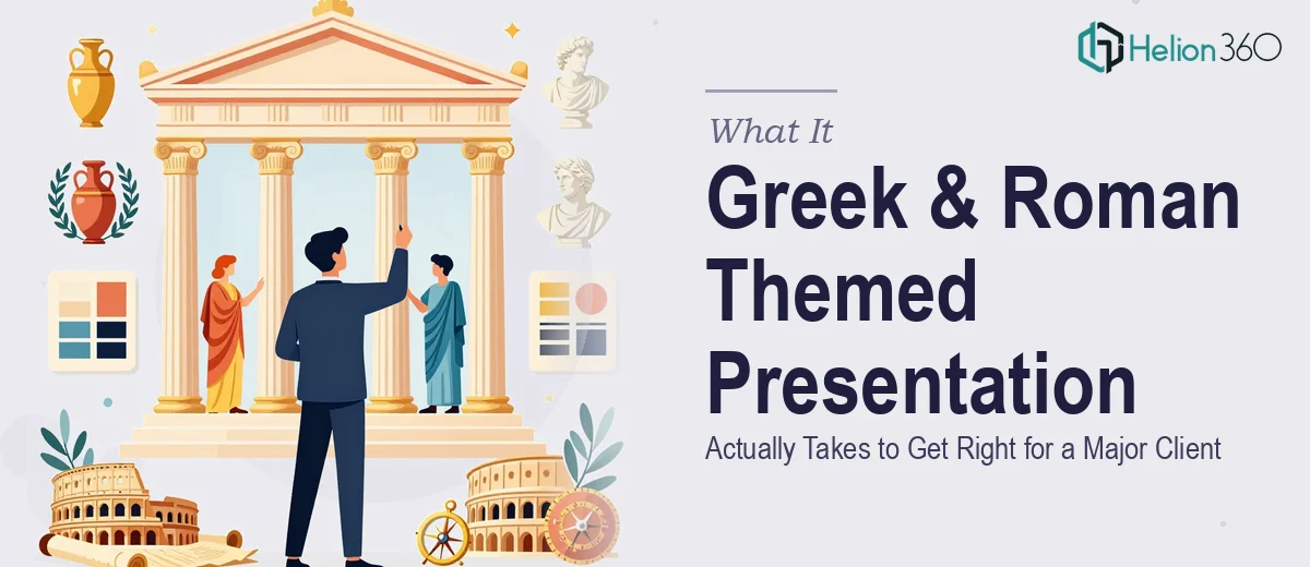
The Client Was Important. The Theme Was Ambitious. The Stakes Were Real.
When the brief landed — a Greek and Roman themed presentation for a major client, tied to a larger marketing campaign — the stakes were immediately clear. This wasn't an internal deck or a rough pitch. It was a client-facing piece that had to land with visual authority and historical authenticity, while still serving as a sharp, modern marketing asset.
The theme itself raised the bar considerably. Ancient Greece and Rome carry a weight of visual expectation. Done well, the result is commanding and memorable. Done carelessly, it looks like a costume — surface-level imagery slapped onto a generic slide template. The client would notice the difference, and so would the audience.
I recognized quickly that this kind of presentation — themed, historically grounded, tied to brand and campaign goals — wasn't something to wing with a stock template and a few clip-art columns. It needed to be done properly, from concept through final delivery.
What Doing This Well Actually Requires
Once I started looking at what a properly executed Greek and Roman themed presentation involves, the complexity became obvious fast.
The first signal was the visual research requirement. Authentic representation of Greco-Roman aesthetics — architectural orders (Doric, Ionic, Corinthian), mosaic patterns, fresco color palettes, classical sculpture proportions — takes real knowledge to apply without tipping into cliché. The wrong shade of terracotta or a misapplied motif breaks the illusion entirely.
The second signal was typography. Classical-themed presentations live or die on type choices. The tension between historical resonance and modern readability is real — using a serif that feels Roman without becoming unreadable at body size is a specific craft decision, not a default.
The third was campaign alignment. Because this presentation sat inside a broader marketing campaign, every design choice — color palette, iconography, layout language — needed to connect back to the campaign's visual identity. That kind of cohesion across a multi-slide deck doesn't happen by accident.
The Work That Goes Into a Presentation Like This
The structural and narrative work comes first, and it's more involved than it sounds. A themed presentation isn't just visual decoration layered over a content outline — the theme has to serve the story. That means auditing the source content, identifying where historical references reinforce the client's message versus where they become noise, and mapping a slide arc where the classical aesthetic amplifies the argument rather than distracting from it. Getting that story architecture right before a single layout is built is what separates a coherent deck from one that looks busy and unfocused. This planning phase takes real time and discipline, especially when working with a client-facing brief that has campaign-level stakes.
The visual mechanics of a Greco-Roman themed deck require decisions that go well beyond choosing a marble background. Proper execution involves a defined palette drawn from classical fresco tones — think warm ochres, Pompeian reds, travertine whites, and deep cerulean — applied within a strict maximum of four brand-aligned colors so nothing reads as arbitrary. Typography needs a deliberate hierarchy: display type at 40pt or above for section headers using a historically resonant serif, body type at 18–20pt in a clean, readable weight that doesn't fight the ornamentation. A 12-column underlying grid keeps architectural symmetry intact across slides. Any of these decisions made inconsistently across 20 or 30 slides creates visual noise that undermines the entire theme.
Polish and consistency across the full deck is where execution either holds together or falls apart. In a themed presentation, every decorative element — column motifs, border treatments, divider graphics, iconographic accents — needs to appear at consistent sizing, alignment, and opacity across every slide it touches. If the same Ionic capital graphic appears at three different scales across three slides, the deck loses its sense of craft immediately. Maintaining that level of discipline across a full client-ready deck while also managing last-minute content changes — which always happen — requires the kind of systematic approach that comes from building decks at volume. It's the difference between a presentation that looks designed and one that looks assembled.
Why I Brought Helion360 in to Handle It
I didn't spend a week trying to figure out the visual research, build a style guide, and execute thirty slides myself. The moment I understood what this presentation actually required — historically grounded visual design, campaign-level consistency, and a tight turnaround — it was obvious that engaging a team with the right expertise was the only move that made sense.
Helion360 handled the full project end-to-end: the visual concept development grounded in authentic Greco-Roman aesthetics, the typography and palette system built to serve both the theme and the campaign brief, and the full slide build from structure through final polish. They turned it around quickly — done in days, not the weeks it would have taken me to research, design, and iterate through a system I'd be building from scratch. The tooling, the reference library, the design judgment — it was already in place. I handed over the brief and the content, and what came back was a deck that held together as both a historical piece and a sharp client-facing asset.
What the Deck Delivered and What I'd Tell Anyone in the Same Position
The final presentation hit the mark the brief demanded. The Greco-Roman theme felt considered and authoritative — not theatrical. The palette, the type system, and the decorative language all read as intentional and cohesive from the first slide to the last. The client-facing quality was evident, and it served the campaign it was built to support.
Anyone looking at a similarly ambitious themed presentation — one where the visual concept has to be historically credible, brand-consistent, and ready for a real audience on a real deadline — should think carefully about how much runway they actually have. The research alone takes longer than most people expect, and that's before a single slide is built.
If you're in that position and need the work handled end-to-end without burning weeks on a learning curve, Helion360 is the team to engage — they brought the expertise and the speed this kind of project demands, and delivered a result that would have taken me far longer to reach on my own.