

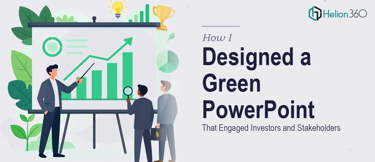
The Brief Sounded Simple Enough
When our sustainability team asked me to pull together a presentation covering our eco-friendly initiatives, I thought it would take an afternoon. The content was all there — key achievements from the past two years, future green goals, challenges we had navigated, and a few data points on carbon reduction. What could be that hard?
The answer, as it turned out, was quite a lot.
The problem was not the content. It was the audience. This green PowerPoint presentation needed to work for two completely different groups — our internal leadership team, who wanted operational detail and honesty about challenges, and potential investors, who needed a compelling narrative that showed measurable progress and long-term vision. Designing one deck that served both without diluting either message was where I ran into a wall.
Where the DIY Approach Broke Down
I spent the first two days building slides in PowerPoint. I had a loose green color palette going, a few icons I had downloaded, and a rough slide order. But every time I stepped back and looked at the full deck, something felt off.
The slides looked inconsistent. Some had too much text, others felt sparse. The data slides — showing emissions reductions and waste diversion rates — were just plain bar charts that did not communicate the scale of what we had actually achieved. The visual hierarchy was all over the place, and nothing felt designed with intention.
More importantly, the presentation did not feel like it was telling a story. It was a list of facts dressed up with a green background. That is not what investors or internal stakeholders respond to.
I knew I needed help from someone who understood both sustainability presentation design and the expectations of a mixed professional audience.
Bringing in the Right Support
After searching around, I reached out to Helion360. I explained the situation — the dual audience, the sustainability content, the need for a cohesive green design language that felt professional rather than just thematic. Their team asked the right questions from the start: What tone did the investors expect? How much detail did internal stakeholders need? Were there brand guidelines to follow?
Within a day, they had a clear brief and a plan. I sent over my rough draft, the raw data, and a few reference points on the kind of visual style I had in mind.
What the Final Presentation Looked Like
The redesigned sustainability PowerPoint came back structured around a clear narrative arc. It opened with a strong executive summary that worked for both audiences, then moved into specific achievement milestones visualized through clean data graphics — not just bar charts, but progress indicators and comparison visuals that made the numbers feel meaningful.
The challenges section, which I had been nervous about including, was handled well. Rather than hiding difficulties, Helion360 framed them as part of an honest, forward-thinking sustainability story — the kind of transparency that actually builds investor confidence rather than undermining it.
The color system was consistent throughout. Green tones were used purposefully, not decoratively, and every slide had breathing room. The typography was clean and the visual hierarchy made it easy to follow whether you were scanning quickly or reading carefully.
The future goals section closed with a forward momentum feel — specific targets, timelines, and a visual roadmap that gave both internal teams and investors something concrete to engage with.
What I Took Away from This
The real lesson here was that designing a presentation for a mixed audience is genuinely hard. It requires decisions about structure, emphasis, and visual storytelling that go well beyond picking a green color scheme and adding content. A sustainability presentation that needs to work for investors and internal stakeholders at the same time is a design and communication problem, not just a formatting task.
I also learned that the visual layer of a presentation does real work. The way data is displayed, the way challenges are framed, the way goals are visualized — all of it shapes how the audience receives the message. Getting that right matters.
If you are working on a sustainability presentation or any business deck that needs to speak to multiple audiences at once, Helion360 is worth reaching out to — they handled exactly the kind of complexity I could not resolve on my own, and the result was a deck I was genuinely proud to present.