

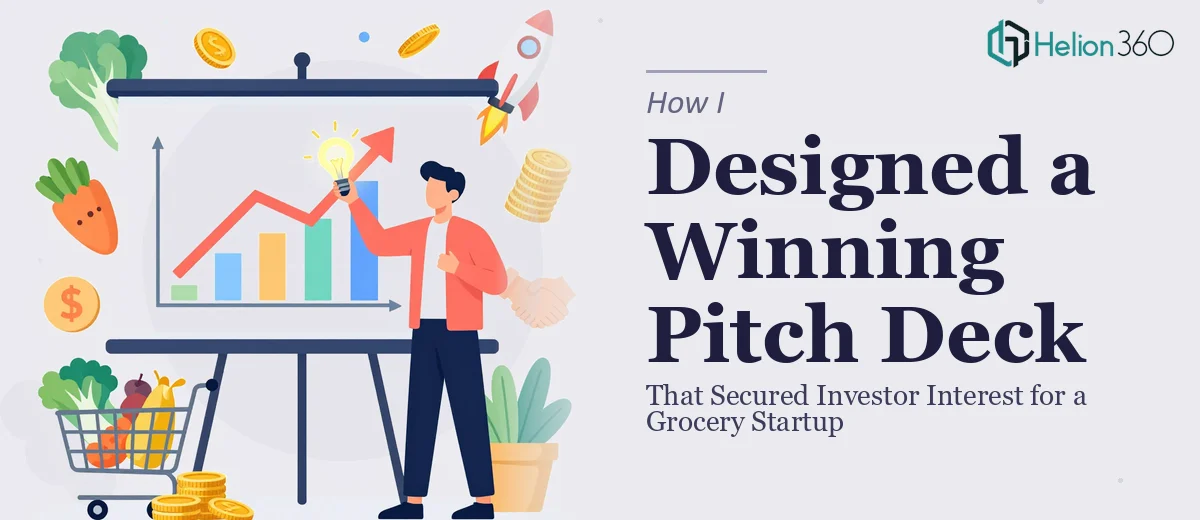
The Situation and What Was at Stake
We had a grocery startup with a genuinely strong concept — a differentiated model, a clear target market, and a founding team that knew the space. What we didn't have was a pitch deck that could walk an investor through all of that in fifteen minutes and leave them wanting to write a check.
The timeline was tight. Investor conversations were already scheduled, and showing up with a cluttered, inconsistently designed slide deck wasn't an option. First impressions in fundraising are difficult to recover from, and a pitch deck that looks like it was assembled overnight signals something about how the business is run.
I knew the story we needed to tell — market opportunity, competitive landscape, our product model, financials, team — but I also knew that knowing the story and knowing how to present it visually are two very different skills. This needed to be done right, and it needed to be done fast.
What I Found a Strong Investor Pitch Deck Actually Requires
I spent time looking at what separates a pitch deck that gets meetings from one that gets politely ignored. The gap is bigger than most founders expect.
First, the structure has to be investor-grade. That means a specific narrative sequence: problem, solution, market size, business model, competitive positioning, traction, financials, and team — each slide earning the right to exist and leading logically to the next. Skipping steps or stacking too much onto a single slide breaks the flow investors are trained to follow.
Second, the data has to be visualized, not just reported. Showing a TAM figure as a plain number on a text slide misses the opportunity to communicate scale. Done well, market analysis and financial projections use charts, comparisons, and visual hierarchy to make the numbers feel real and credible.
Third, the visual identity has to be coherent across every slide. Inconsistent fonts, misaligned brand colors, and unpredictable layouts create low-level friction that undermines trust — even when the content is solid. These details matter more than founders realize going into the process.
What the Work Actually Involves
The right approach to a grocery startup pitch deck starts with a structural audit of the source content and a deliberate mapping of the narrative arc. Each section — problem, market, product, competitive landscape, financials, team — needs a defined slide count and a clear job to do. The market analysis section alone often requires separating TAM, SAM, and SOM across multiple slides with a logical visual build, rather than dumping all three figures onto one crowded frame. Getting that story sequence right before touching a single design element is what separates decks that flow from decks that feel like a scrambled list of facts. This phase is slower and more iterative than it looks, because restructuring content mid-design is significantly more expensive than getting the architecture right first.
The visual mechanics of a professional pitch deck operate within strict constraints that non-designers routinely underestimate. A well-built deck uses a consistent layout grid — typically 12-column — with defined type hierarchy: headline at 36pt, subhead at 24pt, body at 16pt, with no exceptions. Brand colors are locked to a palette of no more than four values, applied consistently across backgrounds, chart fills, and accent elements. Financial slides and competitive landscape charts require purpose-built chart types — waterfall charts for financial storytelling, 2x2 positioning matrices for competitive mapping — not default PowerPoint bar graphs. Building these from scratch on a master slide system that propagates correctly takes hours of precise work even for experienced designers.
Polish and consistency across a full 15-to-20 slide deck is where most self-built decks fall apart visibly. Every icon set needs to match in weight and style. Every image needs consistent treatment — same overlay opacity, same border radius, same alignment logic. Slide transitions and any animation need to serve the narrative, not distract from it. Running a full consistency pass across a completed deck — checking alignment to the pixel, verifying color hex values, auditing font rendering — is its own discrete phase that takes focused time and a trained eye. It's the kind of detail that investors may not consciously notice when it's done well, but they absolutely notice when it isn't.
Why I Brought in Helion360 to Handle It
I looked at what doing this well actually required and made the call quickly: this wasn't something to attempt myself on a two-week deadline while also running the business.
Helion360 handled the full project end-to-end — narrative structure and content organization, full visual design across all slides including the market analysis, competitive landscape, financial projections, and team section, and a final consistency pass before delivery. I didn't hand them a polished outline and ask for a visual treatment. I handed them the raw content and they built the deck.
The turnaround was fast. What would have taken me weeks of learning, iteration, and inevitable redesigns was handled in days. They came in with the structural knowledge of what investors expect from a pitch deck, the design tooling already in place, and the experience of having built decks like this before. That combination is what made the speed possible.
The Result and What I'd Tell Any Founder in This Position
The deck that came back was investor-ready in a way the raw content never could have been on its own. The narrative moved cleanly from problem to opportunity to model to financials. The visual design was consistent, on-brand, and built to communicate rather than decorate. Walking into investor meetings with it felt different — there was no apologizing for slides, no mental overhead of knowing something looked rough.
The conversations that followed were substantive. Investors engaged with the content rather than getting distracted by how it was presented, which is exactly the outcome a good pitch deck creates.
If you're a founder looking at the same gap — strong concept, tight timeline, and a clear sense that the deck needs to be better than you can produce yourself right now — Helion360 is the team to engage. They delivered end-to-end, fast, and at the level of execution this kind of work demands.