

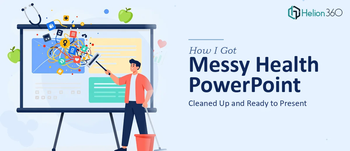
The Slide Deck That Was Going Nowhere
I was handed a folder of PowerPoint files tied to a healthy living initiative aimed at educating Utah communities about better lifestyle choices. The goal was straightforward: take these existing slides, clean them up, and make them presentation-ready for community outreach events.
What I found inside those files was anything but straightforward.
Slides had mismatched fonts, inconsistent color schemes, walls of text that would lose any audience in seconds, and data points that were scattered without context. Some slides had placeholder images that were never replaced. Others had content layered in ways that made editing feel like defusing a wire puzzle.
I understood the mission clearly — the Be Healthy Utah initiative carried real value and the information itself was solid. The problem was purely in how it was packaged.
Where the Self-Fix Attempt Hit a Wall
I started working through the deck manually. I standardized a few fonts, deleted some redundant slides, and tried to bring a consistent color palette across the deck. That part went fine.
But then came the harder problems. Certain slides had health statistics that needed to be verified and presented accurately without losing their impact. Some data was buried in dense paragraphs when it needed to be in a visual format — a simple chart or icon-based layout that a general audience could absorb quickly.
I also realized the slides had no consistent visual hierarchy. A community audience doesn't read left to right across a jam-packed slide. They scan. And these slides were not built for scanning.
Formatting issues in PowerPoint also started stacking up. Animations that fired in the wrong order, text boxes that shifted when viewed on a different screen resolution, and a master slide that hadn't been properly set up — meaning every manual fix I made risked breaking something else.
This wasn't a problem of understanding the content. It was a problem of scale, precision, and the kind of design eye that comes from doing this work repeatedly.
Bringing in the Right Team
After hitting that wall, I reached out to Helion360. I explained what the project involved — a health initiative PowerPoint cleanup, a community-focused audience, and a deck that had good content buried under poor formatting and inconsistent design.
Their team asked the right questions upfront: What was the presentation's purpose? Who was the audience? Were there brand colors or guidelines to follow? How many slides needed work?
That intake process alone signaled that they understood this wasn't just a cosmetic job. Clean up a presentation the wrong way and you strip the message along with the clutter.
What the Cleanup Actually Involved
Helion360 went through the entire deck systematically. They rebuilt the master slide so every layout change would propagate consistently. They restructured text-heavy slides by pulling out key takeaways and presenting them as visual anchors rather than paragraphs.
Health statistics that had been buried in body copy were converted into simple, readable data callouts. Slide transitions were standardized. The color palette was aligned across every slide without making the deck feel templated or generic.
They also flagged a few slides where the information flow didn't match the narrative — where a slide about nutrition outcomes appeared before the slide explaining what the program actually was. That kind of content-level attention made a real difference in how the final deck read as a whole.
The presentation cleanup went from something I would have been hesitant to put in front of an audience to something that looked like it had been built with intention from the start.
What I Took Away from This
A PowerPoint cleanup sounds simple until you're inside a deck that has accumulated design decisions from multiple contributors over time. The visual inconsistency, broken formatting, and poor information hierarchy aren't always visible until you try to fix one thing and three others shift.
For health-focused presentations especially, clarity matters more than creativity. The audience needs to trust the information, and a poorly formatted slide can undermine that trust before a single word is spoken.
Getting structured support — from a team that treats presentation design as a craft rather than a checkbox — changed the outcome significantly.
Need Help With a Similar Project?
If you have a presentation that carries important information but isn't ready to face an audience, Helion360 is worth reaching out to. They step in when the work gets too layered to handle efficiently on your own and deliver results that hold up under scrutiny.