

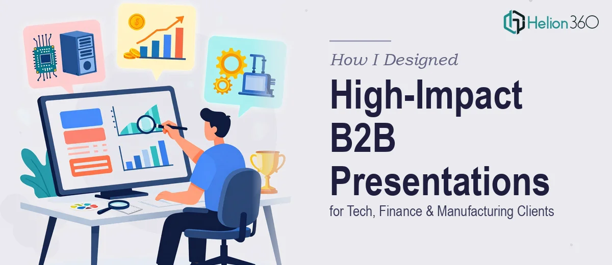
When One Presentation Style Stopped Working for Everyone
I was managing presentation projects across three very different industries — technology, finance, and manufacturing. Each client had its own audience, its own data complexity, and its own idea of what a polished B2B PowerPoint presentation should look like.
At first, I thought I could handle it by building a solid master template and adapting it per client. That worked for a while. But the deeper I got into each project, the clearer it became that a one-size approach was failing everyone.
The tech client needed animated product flow diagrams and clean UI-inspired layouts. The finance client wanted dense data visualizations that still felt readable at a glance. The manufacturing client had process documentation that needed to be broken into logical, visual steps without losing technical accuracy. Each of these required a fundamentally different design approach — not just a color swap.
Where the Work Got Complicated
The slide layouts I was producing looked acceptable, but acceptable wasn't the goal. B2B sales presentations in competitive industries need to do real work — they need to build credibility, carry an argument, and hold attention in a boardroom.
I spent two weeks trying to get the data visualization slides right for the finance deck alone. The charts were accurate, but visually cluttered. The slide hierarchy wasn't guiding the eye to the right conclusions. And every time I fixed one slide, something else in the template broke the consistency.
The manufacturing deck had its own issues. Complex process flows didn't fit cleanly into standard slide grids. I was manually adjusting shapes for hours and still couldn't get the visual logic to feel natural.
It was at this point that I realized I needed more than design effort — I needed design expertise specifically built around B2B presentation work.
Bringing in the Right Help
After hitting a wall across all three projects simultaneously, I reached out to Helion360. I explained the scope — three active decks, three industries, inconsistent templates, and a tight turnaround. Their team asked the right questions immediately: Who is presenting? Who is the audience? What action should each deck drive?
That framing shift alone was clarifying. They weren't just thinking about how slides look. They were thinking about how presentations perform.
Helion360 took over the design execution across all three decks. For the tech client, they built clean, modular layouts with subtle motion that didn't distract from the product story. For the finance client, they redesigned the data slides using a clear visual hierarchy — key metrics leading, supporting detail following. For the manufacturing client, they restructured the process flows into a logical visual sequence that actually made the complexity easier to follow.
What the Final Decks Looked Like
The consistency across all three projects was what stood out most. Even though each deck had a distinct visual identity suited to its industry, the underlying design logic was coherent. Slide transitions were purposeful, not decorative. Every chart had a clear title that told you what to take away before you read the data.
The templates were also built to be reusable. Slide libraries were organized so that future updates — a new product feature, a revised forecast, a process change — could be dropped in without breaking the design system.
One thing I hadn't anticipated was how much cleaner the content itself became once the design structure was right. When slides have strong visual hierarchy, weak content becomes obvious. The Helion360 team flagged a few slides where the messaging was unclear, which led to better content decisions before the decks went out.
What I Took Away from the Process
Designing high-impact B2B PowerPoint presentations across multiple industries isn't just a design challenge — it's a communication challenge. The visual layer has to serve the argument, not decorate it.
Working with a team that understood both the design craft and the business context made a measurable difference in the final output. The decks went to client meetings and held up exactly as intended.
If you're managing complex presentation projects across industries and finding that the design work is slowing down the delivery, that's usually a signal that the scope has outgrown a general approach.
Need help with a B2B presentation that actually works? Helion360 steps in when the design complexity gets ahead of the timeline — reach out and let their team take it from there.