

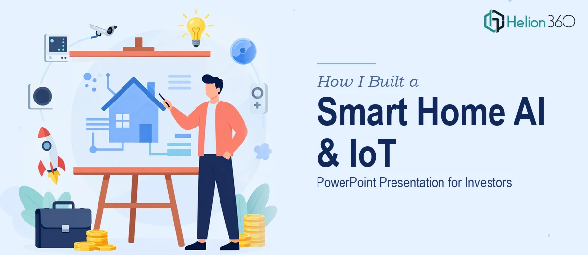
The Brief Seemed Straightforward at First
I was tasked with putting together an AV presentation for a tech company focused on smart home solutions. The goal was clear: create a PowerPoint deck that covered the latest trends in AI and IoT technologies, how they apply to smart home devices, and why now is the right time for investors to pay attention.
The audience was a mix of potential investors and industry professionals. These are people who sit through a lot of presentations. They notice when something looks rushed, when the data is stale, or when the story doesn't hold together visually. So the stakes were real.
I started with what I knew — the content. I had a good grasp of the subject matter, and I could pull together a reasonable outline covering market growth, AI integration in smart home ecosystems, IoT device adoption rates, and use cases.
Where the Complexity Crept In
The content side was manageable. The design side was a different story.
For a standard internal presentation, clean slides and consistent fonts would be enough. But this was going in front of investors. The brief specifically called for a sleek, modern layout with high-quality graphics. It also needed to be delivered as a fully editable PowerPoint file and a PDF version. And there was an open invitation to include supporting audio or video clips where they added value.
That last part — multimedia integration — was where things got complicated. Embedding video and audio into PowerPoint in a way that's stable across different machines and operating systems is not as simple as it sounds. I spent a couple of hours on that alone and kept running into compatibility issues.
Beyond the technical problems, I was also struggling with the data. The presentation needed current statistics — global smart home market projections, AI adoption curves, IoT device penetration numbers. Finding reliable, up-to-date figures, citing them properly, and then designing slides that visualized them without looking cluttered was eating up far more time than I had budgeted.
Two weeks sounds like enough time. It isn't, when you factor in revisions, formatting, file testing, and the reality that this kind of presentation needs multiple rounds of polish before it's investor-ready.
Bringing in the Right Help
After hitting a wall on the design and multimedia side, I came across Helion360. I explained what the project needed — the topic, the audience, the deliverables, the timeline — and their team took it from there.
What stood out was that I didn't have to over-explain the context. They understood immediately that this was an investor-facing deck, which meant the visual hierarchy, data presentation, and overall feel had to communicate credibility before a single word was read.
They handled the slide design from scratch, built out the layout around the smart home and IoT content I had drafted, sourced and integrated current market data, and formatted everything so it was clean and fully editable. The PDF export was formatted separately to ensure it read well as a standalone document — not just a flattened version of the PowerPoint.
The multimedia elements were also handled properly. Short ambient video clips were embedded cleanly, tested for compatibility, and kept optional so the deck would still work in environments where video might not play.
What the Final Deck Looked Like
The finished presentation covered the global smart home market trajectory, AI-driven automation trends, IoT connectivity standards, real-world device applications, and a competitive landscape overview — all within a visual framework that felt modern without being distracting.
Slide transitions were minimal and purposeful. Data was presented through clean charts rather than tables. The color palette was consistent and professional. Every section flowed logically into the next.
Helion360 delivered both the editable PowerPoint and the PDF version on time. Running through it before the actual presentation, it was clear the work communicated seriousness. That matters when you're asking investors to pay attention.
What I Took Away from This
The lesson wasn't that I couldn't handle the project. It was that certain parts of a high-stakes presentation — precise design execution, multimedia stability, data visualization — are specialized enough that forcing them through a general workflow produces mediocre results.
Knowing where to draw that line, and having a team like Helion360 available to handle the parts that require dedicated expertise, is what made the difference between a presentation that looked capable and one that actually was.
Working on a presentation that needs to land with investors or senior professionals? Helion360 steps in when the work gets too complex or time-consuming to handle alone.