

The Situation That Made It Clear This Wasn't a DIY Project
We had a pitch coming up that mattered. Not a casual stakeholder check-in — an actual room full of people who would be evaluating whether our product was credible enough to back. The presentation needed to do more than look clean. It needed to feel like the product itself: interactive, intentional, and built with real design discipline.
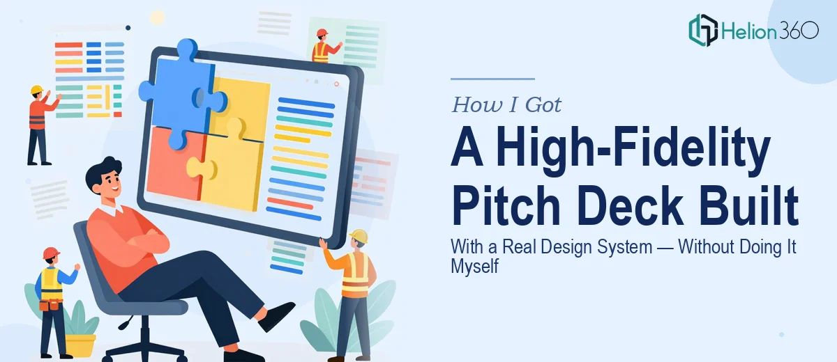
I knew early on that a standard slide deck wasn't going to cut it. The ask was for something high-fidelity — the kind of interactive pitch deck that uses a live design system, behaves like a real UI prototype, and communicates product thinking before a single word is spoken. The moment I started mapping out what that actually required, I realized this wasn't something I could slot into a weekend.
What I Found Out a Proper Interactive Pitch Deck Actually Involves
I spent time understanding what doing this well actually looks like before making any decisions. The research alone was clarifying.
First, a high-fidelity interactive pitch deck isn't just a presentation with nice slides — it's built on a design system. That means tokens, component libraries, spacing rules, and type scales that need to be defined and applied consistently before a single screen is designed. Tools like Zeplin are used to bridge the gap between those design assets and anything that gets handed off to developers or reviewed in a live context.
Second, the interactivity layer adds a meaningful layer of complexity. Click states, transition logic, prototype flows — these need to be mapped and tested, not just sketched. A prototype that breaks during a pitch is worse than no prototype at all.
Third, the visual language has to carry the brand with precision. For a startup pitching investors, mismatched typography or inconsistent UI components signals sloppiness at the exact moment you're trying to convey operational discipline. The margin for error is narrow and the stakes are high.
That combination — design system rigor, prototype logic, and brand precision under deadline — told me clearly that this needed a specialist, not a generalist.
What the Execution Actually Looks Like
The work on a project like this starts with establishing the design system foundation. In practice, that means defining a spacing grid — typically an 8-point base unit applied at 4, 8, 16, 24, and 48px increments — along with a type hierarchy (usually a 36pt/24pt/16pt heading-to-body scale), a token-based color system capped at four to five brand primaries, and a component library that covers buttons, cards, input fields, and navigation elements. Getting this system to propagate correctly across every artboard in Zeplin, with consistent naming conventions and linked styles, takes days of focused work for someone who does it regularly. For someone starting from scratch, the ramp-up alone can consume the entire available timeline.
Once the system is in place, the prototype logic layer begins. This is where interaction flows are mapped — which slides link to which, what happens on a tap or click, how transitions reinforce the narrative rather than distract from it. Each flow state needs to be deliberate: an investor clicking through a product demo section should feel guided, not lost. The execution friction here comes from the number of edge cases: broken links, misaligned layers, prototype paths that loop incorrectly, or animations that perform differently across devices. Testing every path takes methodical time that most teams don't have in the lead-up to a pitch.
The final layer is visual consistency and brand application across every screen. A pitch deck built on a proper design system should look like one unified product, not a collection of individually designed slides. That means auditing every artboard for padding alignment, checking that icon weights match across sections, ensuring that no rogue font slipped in from a copied element, and confirming that the color palette is applied with the same logic on slide one as on slide twenty-five. This kind of polish is invisible when it's done right and immediately obvious when it isn't — and it's the part that most people underestimate until they're deep into it.
Why I Brought Helion360 In to Handle the Full Build
I didn't attempt any of this myself. Once I understood the scope — design system setup, prototype logic, and full visual polish across every screen — it was obvious that the right move was to bring in a team with the tooling and expertise already in place.
Helion360 handled the project end-to-end: building out the component library and design tokens, wiring the prototype flows with the correct interaction logic, and applying the brand system with the consistency the pitch required. The turnaround was fast — done in days, not weeks, which mattered given the timeline we were working against.
What made the difference wasn't just the output quality. It was that the team understood the context: this wasn't a UI exercise, it was a pitch artifact. Every design decision was made with the audience in mind, not just the design brief.
What the Deck Delivered — and What I'd Tell Anyone Facing the Same Call
The final deck performed the way it needed to. It moved through the narrative cleanly, the prototype interactions held up in the room, and the visual consistency signaled the kind of product discipline that investors notice. There were no broken links, no mismatched components, no moments where the design pulled attention away from the story being told.
The broader lesson I took from the project is that a high-fidelity startup pitch deck is a real design system project — not a slide design project that happens to have a few click-throughs. If you're looking at the same scope and want it handled end-to-end without the weeks of ramp-up, consider how getting a pitch deck designed fast requires the right specialized team — one that can deliver the full execution depth this kind of work demands and knows exactly what a pitchable result needs to look like.