

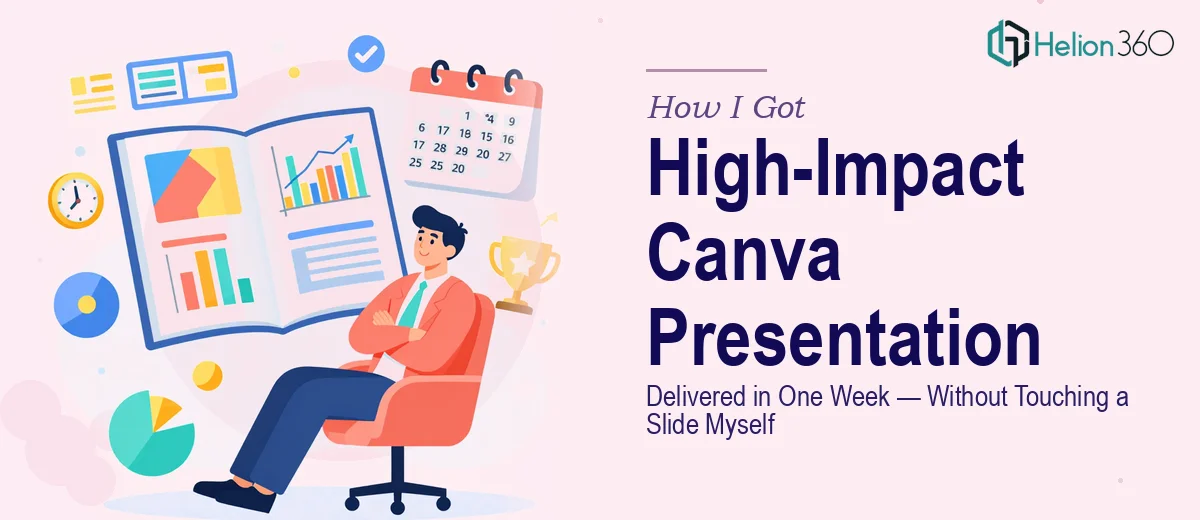
The Situation and What Was Actually at Stake
I had a client-facing presentation due in less than a week. The audience was a room of decision-makers who would be evaluating our positioning against at least two other options — so this wasn't a situation where a rough deck with mismatched fonts and cluttered slides was going to cut it. The presentation needed to do real work: communicate clearly, look sharp, and hold attention from the first slide to the last.
I had the content — or most of it. What I didn't have was the time or the toolkit to turn that content into something that would actually land well visually. I've used Canva before for lightweight things, and I knew just enough to understand that building a high-impact Canva presentation the right way is a different exercise entirely from dropping text into a template and calling it done. This needed to be done properly, and I recognized that quickly.
What I Found the Work Actually Required
I started digging into what professional-grade Canva presentation design actually involves, and the list got long fast. The first thing that stood out was the visual hierarchy problem. Canva gives you flexibility, but that flexibility becomes a liability the moment you have more than a handful of slides — because nothing forces consistency. Every slide can drift. Font sizes, spacing, color usage, element alignment — all of it requires deliberate discipline that templates alone can't enforce.
The second thing that struck me was how much the narrative structure mattered before any design work even started. A well-designed presentation that tells the wrong story in the wrong order still loses the room. That meant the content needed to be audited, restructured, and sequenced before a single visual decision was made.
Third, I realized that client-facing work at this level requires brand alignment that goes beyond picking a color from a palette. Logo placement, font pairing, spacing rules — these need to be applied consistently across every slide, not just the hero frames. That's the kind of detail that separates a professional deck from one that looks like it was assembled in a hurry.
What Proper Canva Presentation Design Actually Involves
The structural work comes first and it's the part most people skip. A well-built Canva presentation starts with a clear narrative audit — identifying what the audience needs to understand, in what order, and what each slide is responsible for communicating on its own. The right approach sequences content into a logical arc: context, tension, solution, evidence, close. Done properly, no slide is a standalone orphan. Each one feeds the next. Getting this structure right before opening any design tool takes real time, and skipping it produces decks that look fine individually but fail as a unified story.
The visual mechanics of a high-quality Canva presentation are more specific than most people expect. Consistent layouts depend on a defined spacing grid — typically an 8px or 12px base unit — applied across every frame so margins, padding, and element placement never look accidental. Typography hierarchies follow a strict scale: a primary heading around 36–40pt, subheadings at 22–26pt, and body text at 14–16pt, with no more than two typefaces used across the entire deck. Color usage is limited to a defined palette of three to four brand-aligned values, applied with rules about which color anchors headings, which handles accents, and which is reserved for calls to action. Violating any of these rules even once creates visual noise the audience notices, even if they can't name it.
Polish and cross-slide consistency is where the effort compounds. In Canva, there's no master slide system the way PowerPoint enforces it — so consistency has to be maintained manually or through carefully locked shared elements and style-guide discipline. That means every icon set needs to match in weight and style, every image treatment needs the same overlay or crop ratio, and every data visual needs to use the same color coding logic as the rest of the deck. On a twenty-slide presentation, this kind of audit and correction work runs into hours — and for someone learning it as they go, the timeline stretches further still.
Why I Brought in Helion360 to Handle It
I looked at what the work actually required and made the call quickly: this wasn't something I was going to execute well in the time I had. The gap between what I could produce myself and what this presentation needed to be was real, and closing that gap through trial and error wasn't a realistic option with a client meeting on the calendar.
Helion360 handled the full project end-to-end — narrative restructuring, visual design, and full consistency polish across every slide. They took the content I had, identified what needed to be reworked structurally, and built the deck from a solid foundation rather than just applying a surface treatment to what I'd handed over. The turnaround was fast — the complete presentation was delivered in days, not the weeks it would have taken me to work through the learning curve and execution depth myself. What they returned was a deck that looked like it had been built by a team that does this work every day. Because it had been.
The Result and What I'd Tell Anyone Facing the Same Call
The presentation went into that client meeting looking exactly like what it needed to be — structured, visually cohesive, and on-brand throughout. The feedback from the room confirmed it: the clarity of the story and the quality of the visuals made the content easier to follow and the case easier to make. That outcome wasn't accidental. It was the direct result of having the work done properly by people who understood what properly actually looks like.
If you're looking at a similar situation — a client-facing Canva presentation on a tight timeline, with real stakes attached to how it lands — Helion360 is the team I'd engage. They handle the full scope fast, and they bring the execution depth this kind of work genuinely requires.