

The Situation and Why Getting It Wrong Wasn't an Option
We had a major industry conference coming up, and the presentation representing our company needed to be sharp. Not "good enough" sharp — genuinely polished, on-brand, and built to hold attention in a room full of people who had seen a thousand slides before.
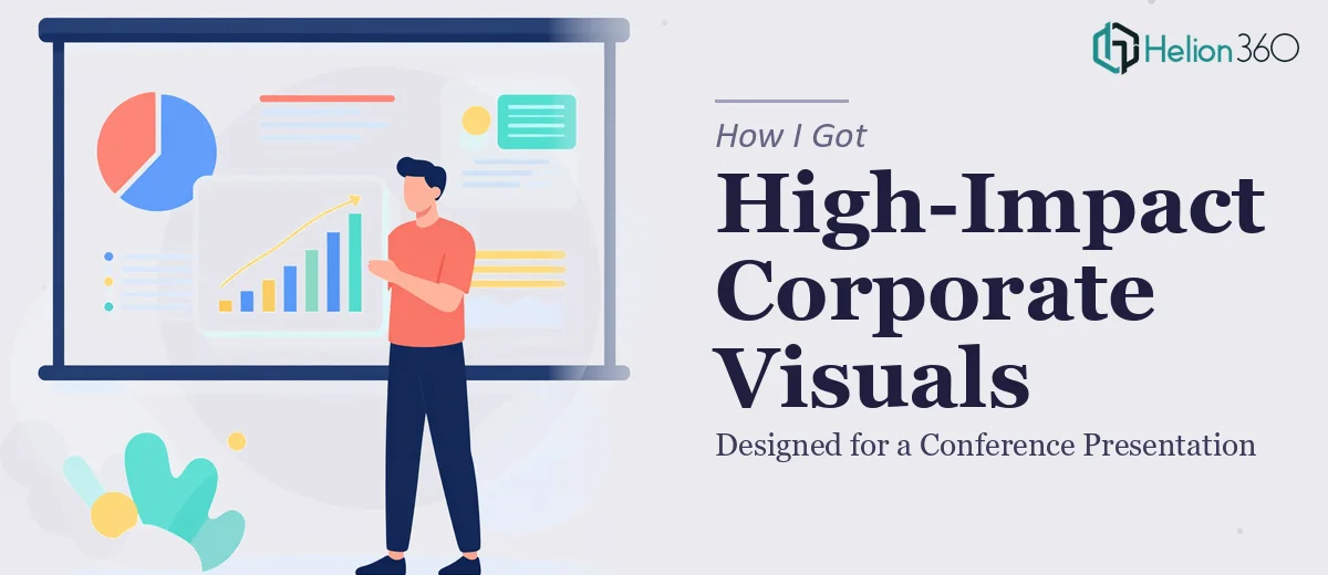
The deck was carrying real weight. It needed to communicate complex product data, showcase our roadmap, and leave the audience with a clear sense of who we are. A slide-heavy wall of text or a clipart-level animation job wasn't going to cut it. The stakes — in terms of perception, credibility, and follow-on conversations — were real.
I looked at what was in front of me and knew immediately: this needed proper PowerPoint design with animation, done by people who do this work every day.
What I Found Out This Kind of Work Actually Requires
Before I did anything else, I spent time understanding what a genuinely well-executed animated corporate presentation actually involves. What I found made it clear this wasn't a weekend task.
First, the design decisions alone are substantial. A professional presentation isn't just resized text on a colored background. It requires a functioning slide master, a locked brand palette applied consistently across every layout, and a typographic hierarchy — typically something like 36pt for headlines, 24pt for subheads, and 16pt for body — enforced without exception.
Second, animation in PowerPoint is far more nuanced than dragging an element onto an entrance path. The timing, sequencing, easing curves, and coordination between multiple objects on a single slide all have to be deliberate. Done poorly, animation is distracting noise. Done well, it guides attention and makes data land.
Third, data visualization inside a corporate presentation follows its own rules — chart type selection, data-ink ratio, axis labeling conventions — that differ meaningfully from what most people default to when building slides themselves.
This was clearly a specialized skill set, not a task I could self-teach at speed.
The Work That Needs to Happen Inside a Project Like This
The starting point for any presentation of this scope is structural. The raw content — talking points, data exports, product specs — has to be audited and mapped into a logical narrative arc before a single slide gets built. That means deciding what sequence of information creates the strongest case, which supporting points belong on stage versus in an appendix, and how many slides each section warrants. A 30-slide deck with no clear through-line reads like a document, not a presentation. Getting the structure right typically takes several rounds of outline review and is the part most people skip entirely — which is why so many corporate presentations feel like they're going in circles.
Once structure is locked, the visual mechanics take over. A well-built corporate presentation runs on a 12-column grid, with a fully configured slide master that controls spacing, color zones, placeholder positions, and font rendering globally. Typography follows strict hierarchy rules — no more than three type sizes per slide, no more than four brand colors active at any time. Charts are rebuilt natively in PowerPoint rather than pasted as images, ensuring they scale cleanly and can be edited later. Setting this up correctly across a full master — with all layout variants accounted for — is several hours of precision work even for someone experienced. For someone less familiar, it can consume an entire project timeline just to get the foundation stable.
Animation and transition design is the layer that either elevates the deck or exposes its weaknesses. The right approach uses entrance animations on a per-element basis — controlled through the Animation Pane with custom timing offsets, typically 0.2–0.5 second delays between sequenced objects — rather than applying blanket transitions that feel generic. Builds should reveal information in the order a speaker wants the audience to process it, not all at once. Morph transitions, when used between slides with shared elements, create continuity that makes the deck feel produced. This layer requires both technical fluency in PowerPoint's animation engine and an eye for pacing — a combination that takes real time to develop and even more time to execute cleanly across a full deck.
Why I Brought Helion360 in to Handle the Full Project
I recognized quickly that attempting this myself — or piecing it together on the side while managing everything else — wasn't the smart move. The project needed end-to-end execution: structure, design, animation, and brand consistency delivered as a complete package, not assembled in pieces.
Helion360 handled the full scope. They took the raw content and brief, mapped the narrative structure, built the slide master and layout system from scratch, designed each slide to the grid, and applied the animation layer with proper sequencing and timing throughout. The deck was turned around quickly — done in a fraction of the time it would have taken me to work through the learning curve and execute it myself, let alone at the quality level the conference required.
What made it the right call was that they already had the tooling, the process, and the eye for this work built in. There was no ramp-up time. The brief went in, and a polished, fully animated corporate presentation came back.
What the Project Delivered and What I'd Tell Anyone in My Spot
The final deck was clean, fully on-brand, and built for how the presentation would actually be delivered — with animations that supported the speaker rather than competing with them. Data slides were clear and visually distinct. The narrative held together from opening to close. Walking into that conference with a presentation that looked purpose-built, not assembled, made a real difference in how the audience received it.
The lesson I'd share is straightforward: professional PowerPoint design with animation isn't a light lift, and the gap between a self-built deck and one built by people who do this work every day is visible in the room. If you're facing a corporate presentation project and want it handled end-to-end without the weeks of learning curve, Helion360 is the team I'd engage — they delivered fast and brought exactly the execution depth this kind of work requires.