

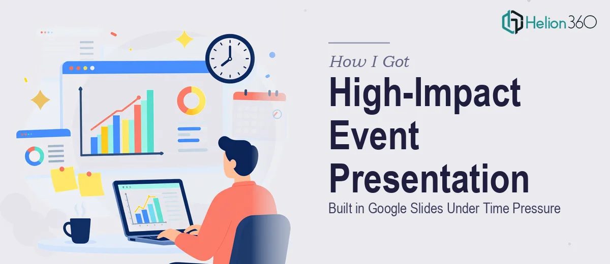
The event was days away and the presentation didn't exist yet. Not a rough draft, not a skeleton — nothing. The brief called for a Google Slides deck that would carry the room: branded, dynamic, with charts and visuals that made the key points land rather than just appear. The audience would be in the room watching live, which meant every slide had to hold up at full screen without looking like it was assembled in a hurry.
I knew immediately that this wasn't something to wing. The stakes were visible — a weak deck at a live event reads as unpreparedness to everyone in the room. I needed it done right, and I needed it done fast.
What I Found This Kind of Project Actually Required
When I looked into what a properly executed event presentation in Google Slides actually involves, the scope expanded quickly. This wasn't just dropping content into a template.
A well-designed event deck requires a coherent visual system — a master slide structure that controls fonts, colors, and spacing globally so every slide feels like it belongs to the same presentation. It requires charts and data visuals that are actually readable at projection scale, not just on a laptop screen. And it requires brand alignment throughout: correct hex values, logo placement that follows guidelines, and a typographic hierarchy that guides the eye without fighting the content.
Each of those three things sounds manageable in isolation. Together, under a real deadline, they represent several hours of skilled execution — and that's before accounting for iteration, edge cases, and the specific quirks of Google Slides as a design environment.
The Work That Goes Into Building a Deck Like This
The right approach to an event presentation starts with structure. Before a single visual is placed, the narrative needs to be mapped: what each slide needs to communicate, what order creates momentum, and where data visuals carry the argument versus where a strong headline or image does. A practitioner working through this typically audits all source content first, then organizes it into a flow with a clear opening, a body that builds, and a close that lands. Getting this wrong at the start means redesigning slides later — which eats time that isn't there under a tight deadline.
Visual mechanics are where the real complexity lives. A properly built Google Slides deck uses a 12-column layout grid to align elements consistently across slides, with a typographic scale — typically 36pt for slide titles, 24pt for key callouts, 16pt for body — enforced through slide masters rather than set manually per slide. Charts need to be sized for legibility at full-screen projection, which often means larger labels, reduced data density, and deliberate use of color to separate series. Getting all of this to behave correctly inside Google Slides, especially when charts are imported or built natively, requires experience with the platform's constraints — it doesn't always behave the way a desktop design tool would.
Brand consistency across a full deck is the third place this work becomes demanding. Proper brand application means using a defined palette of no more than four primary colors, applying them according to hierarchy rules rather than for decoration, and ensuring logos appear at correct proportions in designated zones on every applicable slide. In practice, this means building a locked master system at the start and then checking every slide against it at the end — a QA pass that takes real time when the deck runs to twenty or more slides and the event context means there is no room for a logo that's slightly off-spec or a heading that broke the grid.
Why I Brought in Helion360 to Handle It
I didn't sit down and attempt this myself. The combination of structural thinking, visual execution, and brand discipline — all compressed into a tight window — made it clear that this needed a team with the tooling and experience already in place.
Helion360 handled the full project end-to-end. That meant taking the source content and brand assets, building the master slide system from scratch in Google Slides, designing and formatting every slide including the data charts and visuals, and delivering a presentation that was ready to present without any further work on my end.
The turnaround was fast — done in a fraction of the time it would have taken me to learn the execution depth this project needed, let alone get it right. What would have taken days of trial and error on my part was handled quickly by a team that does exactly this work every day, with the platform expertise and design process already built in.
The Result and What I'd Tell Anyone Facing the Same Situation
What came back was a Google Slides deck that looked like it had been in production for weeks. The visual system was consistent across every slide, the charts were clean and readable at full screen, the brand was applied correctly throughout, and the narrative flow made sense from the first slide to the last. The event went smoothly — the presentation held up exactly as it needed to in the room.
If you're looking at a similar situation — a live event coming up fast, a Google Slides deck that needs to be professional, branded, and visually sharp — Helion360 is the team I'd engage. They delivered business presentation design services end-to-end, fast, with exactly the level of execution this kind of project demands.
For similar challenges under pressure, learn what it takes to deliver high-impact presentation decks under tight deadlines. You can also explore how dynamic Google Slides presentations work for high-profile events.