

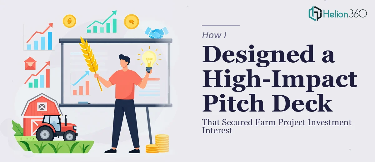
The Deck We Had Wasn't Going to Cut It
We had a farm project with real momentum behind it — sustainable growing practices, an innovative model, and a market opportunity that was genuinely compelling. What we didn't have was a pitch deck that communicated any of that clearly. The existing slides were dense, visually inconsistent, and read more like an internal planning document than something you'd put in front of investors or strategic partners.
The stakes were high. We had a narrow window to get in front of people who could move this project forward, and first impressions in those rooms are unforgiving. A cluttered deck with weak visual hierarchy doesn't just underperform — it signals that the team behind it hasn't done the work. I knew immediately that a real farm project pitch deck redesign wasn't something to approach casually.
What I Discovered This Kind of Work Actually Takes
I started by mapping out what a properly redesigned investor pitch deck would actually require, and the scope became clear fast. This wasn't a matter of swapping fonts and adding a few icons. A pitch deck that works for an agriculture startup has to do several things simultaneously: tell a coherent story, handle complex data without overwhelming the reader, and look like it belongs in a Series A conversation.
Three things stood out immediately as signaling real complexity. First, the narrative structure had to be rebuilt from the ground up — our existing content was organized around internal logic, not investor logic. Second, the visual system needed to reflect both the sustainability angle and the credibility of a growth-stage venture, which is a specific tonal balance that's easy to get wrong. Third, the data — market size projections, yield models, sustainability metrics — needed to be presented in a way that was both visually clean and instantly readable under pressure. That combination of storytelling, design craft, and domain awareness isn't something you improvise.
What a Proper Pitch Deck Redesign Actually Involves
The foundation of any strong pitch deck redesign is a structural and narrative audit. The right approach starts by mapping the existing content against the standard investor narrative arc — problem, solution, market, traction, team, ask — and identifying where the current deck drifts, repeats itself, or buries the lead. For a farm project, this means deciding early which story to lead with: the sustainability case, the market timing, or the operational model. The decision a practitioner makes here shapes every slide that follows. Getting this wrong at the outline stage means beautiful slides built on a weak foundation, and experienced investors notice the gaps regardless of how polished the visuals are.
Visual mechanics are where the work becomes technically demanding. A well-constructed pitch deck runs on a consistent layout grid — typically a 12-column system — with a strict typographic hierarchy: title text at 36pt, body at 24pt, supporting detail at 16pt or below. Color discipline matters just as much: the right approach limits the palette to four brand-aligned colors maximum, with a clear distinction between primary action colors and supporting neutrals. Charts presenting market data or yield projections need to follow data visualization rules — the right chart type for the claim being made, labeled axes, no chartjunk. Setting this system up correctly across a master slide template, then applying it consistently to 15 or 20 slides, is methodical work that takes hours even for practitioners who know the tools well.
Polish and brand consistency across the full deck is where many redesign attempts fall apart. Every slide needs to feel like it belongs to the same visual world — consistent icon weights, aligned image treatments, uniform spacing between elements, and a tone that reads as both professional and mission-driven. For a sustainability-focused agriculture startup, that means the visual language has to carry warmth and credibility simultaneously, without tipping into either generic corporate or overly rustic territory. Applying that level of consistency across a complete deck, catching every misaligned element and every off-brand color, requires a trained eye and a disciplined review process that most people simply don't have time to run themselves.
Why I Brought Helion360 in to Handle the Full Project
I didn't spend time attempting to work through this myself. Once I saw what the work actually required — narrative restructuring, a full visual system build, data slide design, and brand-consistent polish across the entire deck — it was obvious that engaging the right team was the smart move.
Helion360 handled the project end-to-end: they restructured the narrative arc from scratch, built a visual system appropriate for an agri-tech investor audience, and redesigned every slide with proper layout grids, typography hierarchy, and a color palette that reflected the project's sustainability positioning without sacrificing professional credibility. The data slides — market projections, sustainability metrics, growth model — came back clean and investor-ready.
What stood out was the speed. The full redesign was turned around in days, not weeks — handled in a fraction of the time it would have taken me to learn and execute it myself. The team does this work constantly, with the tooling and expertise already in place, and it showed in the output.
What the Deck Delivered and What I'd Tell Anyone in My Spot
The redesigned deck was a different object entirely. It opened with a clear problem statement, moved through the opportunity and our approach with real momentum, and presented the financial and sustainability data in a way that was immediately readable. The visual system was coherent and professional — the kind of deck that signals the team behind it is serious.
When we took it into conversations with potential investors and partners, the response was different from what we'd experienced with the old version. People engaged with the content rather than getting lost in it. The narrative did the work it was supposed to do.
If you're looking at a similar situation — a pitch deck redesign that needs more than cosmetic fixes, a real deadline, and no margin for a mediocre outcome — Helion360 is the team I'd engage. They delivered fast, handled the full execution depth this kind of work requires, and the result spoke for itself.