

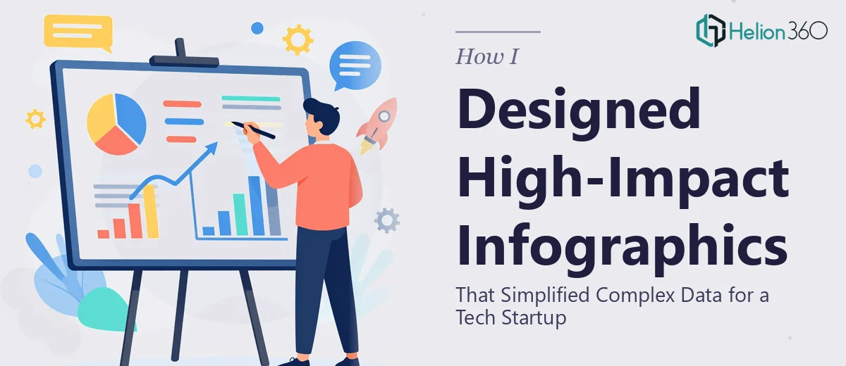
The Problem Was Simpler to Name Than to Solve
We were building out the marketing strategy for a new tech startup and the presentations we had were doing the opposite of what they were supposed to do. The data was solid. The message was clear in our heads. But on the slides, it looked like a spreadsheet had been pasted into PowerPoint and called a day. Complex product metrics, multi-step workflows, and market sizing numbers were sitting in walls of text that no one in the room was going to read.
The stakes were real. These presentations were going to be used across investor conversations, sales meetings, and internal alignment decks. A confused audience is a lost audience. I knew the fix wasn't just "make it look nicer." Turning dense technical data into clean, persuasive infographics and branded visual content was a specific kind of work — and it needed to be done properly.
What I Found the Solution Actually Required
Once I started looking at what genuinely good infographic design for a tech startup involves, it became clear fast that this wasn't a cosmetic exercise. The work sits at the intersection of information architecture, visual design, and brand communication — and each of those demands its own expertise.
The first signal of real complexity was the data itself. Product metrics, TAM/SAM/SOM figures, and process flows don't translate to visuals automatically. Someone has to make deliberate decisions about what to show, what to cut, and which chart form actually serves the data rather than decorates it. The second signal was brand consistency. For a startup still establishing its visual identity, every infographic, illustration, and layout choice is contributing to how the company looks — or doesn't look — credible. And the third signal was volume. This wasn't one infographic. It was a full set of presentation materials that needed to feel cohesive across dozens of slides, across multiple use cases.
What the Work Actually Involves
The right approach to infographic design for presentations starts with a structured audit of the source content. Every dataset, every process description, every market claim has to be assessed for what visual format will communicate it most clearly — whether that's a flow diagram, a segmented bar chart, a comparative icon grid, or a custom illustration. The practitioner's decision here is not just aesthetic. Choosing the wrong chart type for a data relationship (say, a pie chart where a slope graph is needed) actively misleads the audience. Mapping the full narrative arc before touching a design tool is what separates presentation infographics from decoration.
Visual mechanics are where the execution gets technical. A well-structured presentation uses a 12-column layout grid so that elements align consistently across every slide without manual adjustment. Typography hierarchy runs at roughly 36pt for headlines, 24pt for subheadings, and 16pt for body and data labels — and it has to hold across infographic slides, text-heavy slides, and transition slides alike. Custom illustrations need to be built as vectors so they scale cleanly and can be recolored to match brand palettes without degradation. Anyone setting this up from scratch, without an established system, will spend days just getting the master slides and style guides right before a single content slide is finished.
Brand application across a full presentation set is where consistency tends to break down. A disciplined approach uses no more than four brand colors, assigns each a specific role (primary, secondary, accent, neutral), and enforces those roles across every chart fill, icon, background, and text element. Startup brands often exist only in a logo and a hex code at this stage, which means the designer is also building out a functional color system on the fly. Getting palette discipline right on slide 5 and then watching it drift by slide 20 is one of the most common failure modes in DIY presentation work — and it's exactly the kind of detail that signals whether a company looks put-together or still figuring it out.
Why I Brought in Helion360 to Handle It
I looked at what the work genuinely required — structural content decisions, visual mechanics, brand system development, and consistency across a full presentation set — and it was immediately clear that attempting this in-house wasn't the smart move. Not because the team lacked talent, but because this kind of work requires a specialist's tooling and depth of practice that takes years to build.
Helion360 handled the full project end-to-end. That meant taking the raw data and content, making the narrative and visual structure decisions, building out the infographics and custom illustration elements, and delivering a complete, on-brand presentation set. The turnaround was fast — done in days, not the weeks it would have taken to learn and execute this internally. They came in with the systems already in place: the grid structures, the brand color methodology, the illustration workflow. There was no ramp-up time, no back-and-forth on fundamentals.
What Was Delivered and What I'd Tell Anyone in My Spot
The output was a full suite of presentation-ready infographics and visual content that made the startup's story readable at a glance. Market sizing data that previously required explanation now communicated itself. Product workflows that had been described in paragraphs became clean visual sequences. The brand identity came through consistently across every slide — not as an afterthought but as a design system that held.
The presentations landed differently in the room. Stakeholders engaged with the content instead of trying to parse it. That's what properly executed infographic design for presentations actually does — it removes the friction between your audience and your message.
If you're looking at the same kind of problem — complex data visualizations, an under-developed visual identity, and a presentation set that needs to work across multiple high-stakes contexts — Helion360 is the team to engage. They delivered fast, handled the full execution depth this work requires, and the result spoke for itself.