

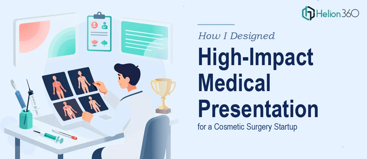
The Conference Was Weeks Away and the Slides Were Not Ready
We had a conference coming up and only one chance to make the right impression. As a small cosmetic surgery startup, the stakes were real. We needed investors, partners, and practitioners in the room to take us seriously — and the presentation we had was not going to do that job.
The existing slides were built around medical diagrams and statistics. The content was solid. The procedures were documented, the data was accurate, and the outcomes we wanted to highlight were all there. But visually, it looked like something put together in a hurry. Dense text, low-contrast diagrams, no consistent color palette, and nothing that gave it any visual identity.
I knew we needed a proper medical presentation design overhaul, but I underestimated how much work that actually involves.
What I Tried Before Asking for Help
I started by downloading a few PowerPoint templates online and trying to rework the slides myself. I spent a couple of evenings adjusting fonts, swapping colors, and repositioning content. Some slides looked better in isolation, but nothing felt cohesive across the whole deck. The medical diagrams in particular were tricky — scaling them without losing clarity, placing them alongside statistics in a way that still read cleanly, deciding how much whitespace to use — it added up fast.
The bigger issue was that I did not have a clear visual language for what a cosmetic surgery presentation should look like. There is a specific balance between clinical credibility and approachable aesthetics that this type of slide deck needs. Too sterile and it loses warmth. Too stylized and it stops feeling trustworthy. I kept overcorrecting in one direction or the other.
After a few attempts, I had a deck that was inconsistent and still not conference-ready. I needed someone who had done this kind of work before.
Bringing In a Team That Knew Medical Presentation Design
After hitting that wall, I came across Helion360. I explained the situation — startup context, conference deadline, medical and statistical content, and the need for something that looked professional without losing the clinical accuracy of the original material.
Their team asked the right questions upfront. What tone did we want? Who was the audience — investors, medical professionals, or both? Were there brand colors or a style guide to work from? Did we want animations or a clean static deck?
I gave them the existing slides, a rough idea of our visual preferences, and some reference images of presentations I felt had the right balance. From there, they handled the rest.
What the Finished Presentation Looked Like
The difference was immediate and significant. Every slide had a clear visual hierarchy. The medical diagrams were integrated into the layout rather than just dropped in. The statistics were visualized through clean charts and callout boxes that made the numbers easy to absorb at a glance. The color scheme was professional without feeling generic — it worked specifically for a cosmetic surgery context.
Helion360 also brought consistency to the deck that I had struggled to achieve on my own. The typography, spacing, and icon style matched across every slide. It looked like one cohesive presentation rather than a collection of individually adjusted pages.
The result was a business presentation that held up under scrutiny. It communicated clearly, looked polished, and reflected well on the startup at exactly the moment we needed it to.
What I Took Away From the Experience
Handling a medical PowerPoint presentation redesign is not just a design task — it is a communication problem that requires both visual skill and an understanding of how professional audiences process information. Trying to solve it with template downloads and manual adjustments was not the right approach for this kind of context.
Knowing when the complexity of a project exceeds what you can efficiently handle yourself is actually a practical decision, not a creative failure. The conference went well, and the slides held their own in the room.
If you are working on a medical or healthcare-related presentation and the current version is not doing justice to the content, investor pitch decks and professional design support are worth exploring — they stepped in at the right moment and delivered exactly what we needed.