

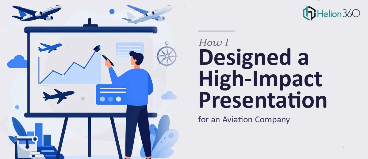
When a Slide Deck Needs to Do More Than Look Good
Running an aviation company means every stakeholder interaction carries weight. Whether you are presenting to potential partners, safety regulators, or investors, the expectation is that your materials reflect the precision and professionalism your industry demands. So when it came time to build a PowerPoint presentation that communicated our company's capabilities, technology investments, and commitment to aviation safety, I knew a generic template was not going to cut it.
I had the content. I had the vision. What I did not have was the time or design expertise to pull it together in a way that matched the seriousness of the subject.
Where I Started — and Where I Got Stuck
I began by sketching out the structure myself. The deck needed to cover our technological advancements, our ground support infrastructure, and our safety protocols — all while staying visually cohesive and on-brand. I had a rough outline across about 18 slides, some existing graphics, and a loose sense of the color palette I wanted.
The moment I opened PowerPoint and started building, things fell apart quickly. Aligning the visual hierarchy across slides, making data-heavy sections readable without feeling clinical, and integrating our brand identity into a layout that still felt modern — each of these pushed past what I could realistically execute in the time I had. Aviation presentations for stakeholders need to carry authority. A misaligned slide or a clunky chart layout signals carelessness, and that is the last impression I wanted to leave.
I also realized I was spending more time fighting with formatting than actually refining the message.
Bringing in the Right Support
After hitting a wall on the design side, I came across Helion360. I explained the context — an aviation business presentation aimed at senior stakeholders, with specific sections on innovation, operational strength, and safety culture. I shared my rough outline, existing brand assets, and a few reference decks that captured the tone I was going for.
Their team asked the right questions from the start. They wanted to understand the audience, the setting the deck would be presented in, and which sections needed the most visual emphasis. That initial conversation made it clear they were not just going to drop in some stock icons and call it done.
What the Design Process Actually Looked Like
Helion360 took the raw structure I had and rebuilt it into a clean, professional slide deck. The visual design balanced formality with a sense of forward momentum — something that matters a lot in an industry where innovation and safety are both central messages.
The technology section was transformed using a combination of clean data visualization and minimal iconography that made complex information easy to scan. The safety and support slides used strong visual anchors that gave those pages a sense of reliability without feeling heavy or dated. Throughout the deck, the typography, spacing, and color choices stayed consistent — something I had been struggling to maintain on my own.
They also handled the transitions and layout logic across the full set of slides, so the deck flowed naturally from introduction through to the closing summary.
The Result and What I Took Away
When the final deck came back, it looked exactly like the kind of presentation a company at the forefront of aviation excellence should be showing stakeholders. The slides were polished without being overdone. The key messages landed clearly. And the design supported the content rather than competing with it.
What I learned from the process is that aviation presentation design is genuinely specialized work. The balance between technical credibility, visual clarity, and brand confidence is hard to strike — especially under time pressure. Trying to build that kind of deck without dedicated design support costs more in time and quality than it saves.
If you are in a similar position — you have the content and the vision but the design execution is holding you back — Business Presentation Design Services is worth exploring. Learn more about how I approached high-impact PowerPoint presentation design and how conference-ready presentations can be delivered under tight timelines. Helion360 handled what I could not and delivered a presentation that was ready to go in front of a serious audience.