

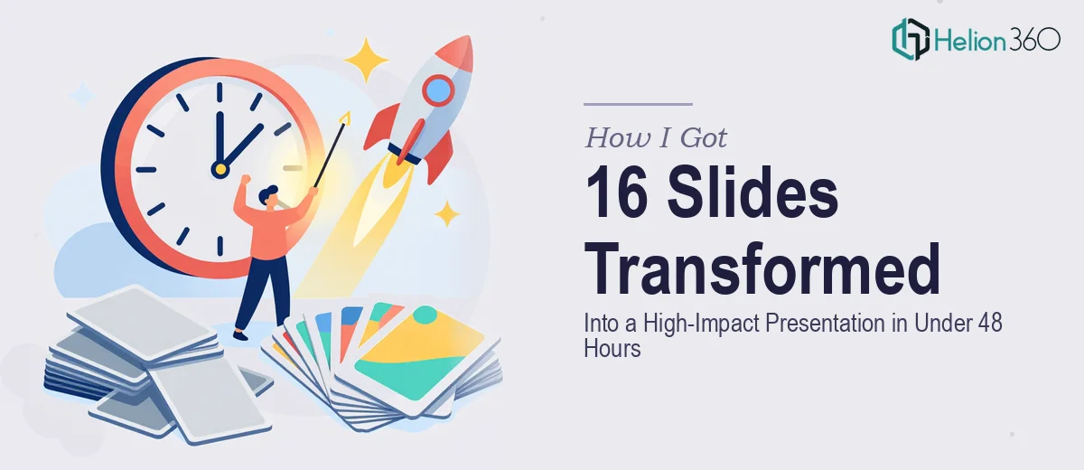
The Situation Was Simple: Good Content, No Time, High Stakes
I had 16 slides that were genuinely well-researched. The information was solid, the arguments were clear, and the data was there. What wasn't there was any visual coherence — inconsistent fonts, mismatched colors, raw data tables that would have put a room to sleep, and a layout that looked like it had been built in pieces by three different people on three different days.
The presentation was going in front of a senior audience within 48 hours. That's not a forgiving window. First impressions in a room like that aren't just aesthetic — they signal how seriously you take your own work. Walking in with slides that look unfinished sends a message, and it's not the one you want to send.
I knew immediately this needed to be handled properly, not patched together overnight.
What I Discovered a Proper PowerPoint Redesign Actually Involves
Before doing anything, I spent time understanding what a real presentation redesign requires — not a quick color swap, but the kind of work that makes a deck look and feel like it was built with intention.
The first thing that struck me was how much of the work happens before a single slide is touched. A proper redesign starts with a content audit: understanding what each slide is trying to communicate, what hierarchy the information should follow, and where the current layout is working against the message rather than for it. That structural layer alone takes real time and judgment.
The second thing was the visual system. A professional redesign doesn't just pick nicer colors — it establishes a consistent design language across every slide: a defined type scale, a limited color palette applied with discipline, a grid that keeps elements from floating freely on the page. When any of those elements are inconsistent across 16 slides, the deck reads as amateur regardless of the content quality.
The third signal of real complexity was the data. Several slides had charts and tables that needed to be rebuilt, not just reformatted. That's a different kind of work entirely.
What a Proper Presentation Redesign Actually Takes to Execute
The structural work comes first, and it's more involved than most people expect. Done well, a slide audit maps every piece of content against a single question: what is this slide's one job? Slides that are trying to do three things at once get restructured. Text-heavy slides get reduced to a headline and supporting visual, with the detail moved to speaker notes. The narrative arc — problem, insight, implication, call to action — gets reinforced so the audience is always oriented. Getting this right across 16 slides, where some have dense content and others have almost none, requires genuine editorial judgment and usually several rounds of structural decisions before any design work begins.
The visual mechanics layer is where the execution complexity really compounds. A proper redesign establishes a 12-column layout grid that governs where every element sits on every slide. Typography gets locked into a strict three-level hierarchy — typically around 36pt for headlines, 24pt for subheads, and 16pt for body — and applied consistently across all masters and layouts. The color palette gets reduced to four brand-aligned colors with defined usage rules: one dominant, one accent, one neutral, one for data. Setting this up correctly in the Slide Master so it propagates without breaking across custom layouts takes hours even for experienced designers, and any shortcut here shows immediately in the final output.
Polish and consistency across a full deck is the layer that separates a professional result from a competent-but-uneven one. Every icon set needs to be unified — same weight, same style, same pixel alignment. Charts need to share axis styles, label formatting, and gridline treatments. Animations, where used, need to serve the content rather than distract from it, and they need to be consistent in timing and type across slides that use them. A single misaligned element or an animation that fires at the wrong speed breaks the sense of quality the rest of the work built up. Across 16 slides, maintaining that level of consistency is the kind of detail work that takes a practiced eye and a systematic review pass, not a single once-over.
Why I Brought Helion360 In From the Start
I didn't attempt this myself. The gap between what the slides needed and what I could realistically execute in 48 hours — while also doing everything else on my plate — was obvious from the first assessment.
Helion360 handled the full project end-to-end. That meant the content audit and restructuring, the visual system setup, the chart and data visual rebuilds, and the final consistency pass across all 16 slides. I didn't hand off a partially done deck — I handed off the brief and the source content, and they took it from there.
What made the difference was speed without cutting corners. The work was turned around quickly — done in a fraction of the time it would have taken me to work through the learning curve on even the technical setup alone, let alone the design judgment calls. This is work they do every day, with the tooling and process already in place to handle it at pace.
The Result, and What I'd Tell Anyone Looking at the Same Problem
The 16 slides came back looking like they had been built from scratch with intention. The visual system was coherent, the content hierarchy was clear, the charts were clean and readable, and the whole deck held together as a single piece of work rather than a collection of slides. The presentation landed well — the audience engaged with the content rather than being distracted by the format.
The lesson wasn't that presentation design is hard in theory. It's that doing it right — under time pressure, across a full deck, with real brand and visual consistency — requires a depth of execution that's genuinely difficult to approximate without the right experience and tools already in place.
If you're looking at a similar problem and need it handled end-to-end without losing days to the learning curve, Helion360 is the team I'd engage — they delivered fast and brought exactly the execution depth this kind of work demands.