

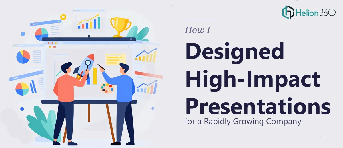
When Your Slides Need to Do More Than Just Show Up
We were heading into a stretch of back-to-back events, and the pressure was real. As a company growing faster than our internal processes could keep up with, we needed our presentations to reflect where we were going, not where we had been. The slides we had were functional, but they felt flat. The brand colors were inconsistent, the layouts were recycled from older templates, and the overall feel did not match the energy we wanted to project.
I figured I could handle it. I had been putting together PowerPoint presentations for years, and I had a rough sense of what we wanted — clean, professional, visually engaging, built around our brand identity. So I started rebuilding the templates from scratch.
Where It Started to Fall Apart
About two days in, I realized the gap between "knowing what looks good" and "being able to execute it" is wider than I had expected. Getting the brand colors to work cohesively across different slide types was trickier than anticipated. The logo placement kept clashing with background images. Charts that looked fine in Excel looked cluttered and hard to read once dropped into a slide. And when I tried to incorporate high-quality images that actually fit the content, the slide proportions felt off.
The deadline was a week out. I had maybe a quarter of the deck looking the way I wanted, and a full slate of other work waiting for me. It became clear that trying to push through this on my own was going to cost us either time or quality — and we could not afford either.
Bringing in a Professional Eye
A colleague mentioned Helion360 after going through something similar with a corporate presentation. I reached out, explained what we had — a few existing templates we liked, brand guidelines, and a rough structure — and their team took it from there.
What stood out immediately was that they did not just clean up what I had done. They looked at the full picture. They rebuilt the master slide template so that brand colors, fonts, and spacing were consistent from the first slide to the last. They worked in the logo elements naturally, not bolted on as an afterthought. Images were selected and sized to actually support the content on each slide rather than just fill space. The graphs were redesigned for clarity — simplified where needed, more visual where the data warranted it.
What the Final Presentation Actually Looked Like
The difference was significant. The presentation felt cohesive in a way that my version never quite managed. Every slide had a clear visual hierarchy — the eye knew where to go first, second, and third. The corporate tone was there, but so was something that could hold an audience's attention rather than lose it to their phones.
Beyond the aesthetics, the practical structure improved too. Slides that had been text-heavy were reworked into layouts where the key message was immediately visible. Data visualization that I had presented in a dense table was reframed as a clean chart with one clear takeaway per visual. The whole deck looked like it came from a team that took its presentations seriously.
What I Took Away From This
PowerPoint presentation design sounds simple until it isn't. The tools are accessible, but professional results — the kind where design reinforces the message instead of competing with it — require a level of visual thinking and technical skill that takes real experience to develop. Brand alignment, slide composition, data visualization, image selection — each of those is its own discipline.
For a company growing quickly and preparing for high-visibility events, cutting corners on presentation design is not actually a savings. It shows.
If you are in a similar position — deadline coming up, slides that are not where they need to be, and not enough hours to close that gap yourself — Helion360 is worth a conversation. They handled what I could not finish alone and delivered work that held up in the room. Learn more about how professional company presentations can elevate your organization's impact.