

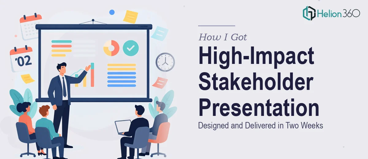
The Situation I Was Staring Down
I had a stakeholder presentation coming up that genuinely mattered. Not a routine update — a structured briefing that needed to synthesize complex research findings, make a clear case to a senior audience, and hold up under scrutiny in a room where attention spans are short and expectations are high.
The deck had to translate dense information into something that was immediately readable, visually credible, and narratively tight. The two-week window was firm. There was no flexibility on the deadline, and there was definitely no margin for a presentation that looked like it was thrown together the night before.
I knew straight away that putting something like this together badly would be worse than not presenting at all. This needed to be done right.
What I Found a Polished Stakeholder Presentation Actually Requires
Once I started looking at what a genuinely high-impact PowerPoint presentation involves, the scope became clear fast.
The first signal was the narrative architecture. A good stakeholder presentation isn't a document reformatted into slides — it's a structured argument. Each slide needs to carry a single idea forward, and the sequence has to build toward a conclusion the audience reaches before you say it out loud. That kind of story mapping takes real editorial judgment, not just slide-building.
The second signal was the visual layer. Stakeholder audiences read hierarchy instantly. If the typography isn't disciplined — if heading sizes are inconsistent, if charts are misaligned, if the color palette drifts across sections — the credibility of the content erodes before anyone reads a word.
The third signal was data. Research findings don't translate to slides automatically. The right chart type for a given dataset, the right level of annotation, the right balance between showing the data and making the point — these are decisions that require experience with both data visualization and audience psychology.
This was not a weekend project.
What the Work Actually Involves
The foundation of a strong stakeholder presentation is structural — auditing the source material, identifying the core argument, and mapping a slide-by-slide narrative arc before a single layout is touched. Done well, this involves distilling findings to one clear headline per slide, sequencing sections so each one builds logically on the last, and writing titles that function as assertions rather than labels. The execution friction here is real: most people underestimate how long it takes to move from a body of research to a clean narrative spine. Without that structure locked in first, the visual work that follows is built on sand.
The visual mechanics of a high-impact PowerPoint presentation depend on a disciplined layout system. Proper slide design uses a consistent grid — typically a 12-column base — with type hierarchies set at roughly 36pt for headlines, 24pt for supporting points, and 16pt for annotations or footnotes. Brand colors are held to a maximum of four active palette values, with intentional use of white space to direct the eye. The friction comes from applying these rules consistently across 20, 30, or 40 slides — especially when content varies in density from slide to slide. A grid that works for a two-column data slide doesn't automatically work for a full-bleed visual, and reconciling those edge cases takes time and judgment that isn't obvious until you're inside the problem.
Data visualization in a stakeholder context has its own conventions. Bar charts work for comparisons across discrete categories; line charts belong to trend data over time; and tables should only appear when the audience needs to look up specific values rather than grasp a pattern. Each chart needs a clear declarative title — not "Revenue by Region" but "Western Region Outperformed All Others in Q3" — and annotation that guides the eye to the finding without cluttering the visual field. Getting this right across multiple data slides, while keeping visual weight balanced with the rest of the deck, is the kind of work that trips up even experienced PowerPoint users who don't specialize in presentation design.
Why I Brought in Helion360 to Handle It
I looked at what the work actually involved and made a quick decision. I didn't have the specialized design experience to execute the visual layer at the level this audience expected. I didn't have the time to work through the structural editing, the grid setup, the chart decisions, and the consistency passes — not in two weeks, not alongside everything else on my plate.
Helion360 handled the full project end-to-end. That meant the narrative architecture — taking the research material and building a clean, logical slide-by-slide argument — as well as the full visual execution: layout system, typography, data visualization, and brand consistency across every slide. They turned the whole thing around quickly, in a fraction of the time it would have taken me to learn and execute it at that standard myself.
What made the difference was that this is work they do constantly. The tooling, the design judgment, the editorial process — it's already in place. I didn't have to explain what good looked like. They already knew.
What Came Out of It and What I'd Tell Anyone in My Spot
The deck that came back was exactly what the situation called for. The narrative was clean and built its case slide by slide without ever feeling like it was lecturing. The visuals were polished and consistent — the kind of presentation that signals competence before the speaker says a word. The data was presented clearly, with every chart making its point without requiring the audience to interpret raw figures. Stakeholders engaged with it the way I'd hoped: they were following the argument, not struggling to read the slides.
The broader lesson was straightforward. A complex multi-phase project presentation for a senior audience is not a design task you can wing. The structural work, the visual discipline, the data visualization choices — each layer has its own depth, and doing all of them well at the same time, under a real deadline, requires experience that's hard to build in a rush.
If you're looking at a similar situation and want the work handled end-to-end without the learning curve, Helion360 is the team I'd engage — they delivered fast and brought exactly the level of execution depth that turning warehouse KPI data into a management presentation requires.