

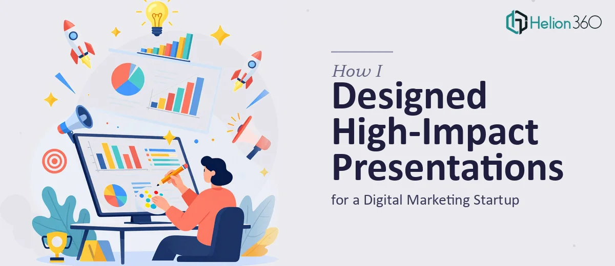
When Every Slide Needed to Do More Than Look Good
I was brought into a fast-moving digital marketing startup that had a clear problem: their presentations were not keeping up with their ideas. The team was sharp, their campaigns were producing results, and the strategy behind every pitch was solid. But the slides told a different story. Walls of text, inconsistent fonts, no visual hierarchy — the kind of deck that makes an audience tune out before the third slide.
My job was to fix that. Not just clean things up, but actually build a visual presentation system that could work across PowerPoint and Google Slides depending on who was presenting and where.
The Problem Was Bigger Than I Expected
I started by auditing the existing decks. There were campaign recap presentations, client-facing pitch decks, internal team updates, and a few investor-facing documents floating around in different states of completion. Each one had been made by a different person, using different templates, and none of them aligned visually with the brand.
I could handle basic formatting and layout adjustments on my own. I reorganized a few slides, tightened the copy, and brought some consistency to the font choices. But the scope kept expanding. The startup wanted a full visual overhaul — custom slide layouts, branded master slides, data visualization for campaign metrics, and animated transitions that reinforced the narrative rather than just adding noise.
That level of work required more than a few hours of tweaking. A polished, consistent presentation design system for a growing startup takes real expertise in both PowerPoint and Google Slides, and it requires understanding how visual storytelling actually functions in a marketing context.
Bringing in the Right Support
After hitting a wall with the volume and complexity of the work, I reached out to Helion360. I walked them through the situation — multiple presentation types, a startup audience that expected sharp visuals, and a need for consistency across both PowerPoint and Google Slides formats. Their team understood the brief immediately.
They started with the master slide design, building a branded template system that established typography, color, spacing, and layout rules across every deck. From there, they moved into individual presentation builds — the marketing pitch deck, the campaign performance reports, and the investor-facing material. Each one followed the same visual language but was structured for its specific audience and purpose.
What the Finished Presentations Actually Looked Like
The difference was significant. Slides that had been cluttered with bullet points were rebuilt as clean visual layouts with supporting icons, charts, and whitespace that let the content breathe. Data-heavy campaign slides got proper data visualization treatment — bar charts, comparison layouts, and metrics callouts that made the numbers readable at a glance.
The Google Slides versions were built to mirror the PowerPoint files closely, so the team could present from either platform without losing visual quality. Custom animations were added selectively — only where they genuinely helped move the story forward.
Helion360 also delivered a slide library, which meant the startup's team could build new presentations going forward without starting from scratch each time. That alone saved significant time for their internal marketing team.
What I Took Away From This
Working on this project clarified something I had suspected for a while. Designing high-impact presentations for a professional marketing environment is not the same as knowing how to use PowerPoint. It requires a structured approach to visual storytelling, an understanding of how audiences process information slide by slide, and the technical skill to execute cleanly across tools and formats.
I could contribute meaningfully to the content strategy and brief, but the execution at that scale needed specialists. The presentations that came out of this process were used in actual client meetings and investor conversations, and they held up.
If you are working on a presentation project that has grown beyond simple formatting fixes — multiple decks, branded templates, or cross-platform delivery — Helion360 is worth reaching out to. They handled the complexity cleanly and delivered work that was ready to use.