

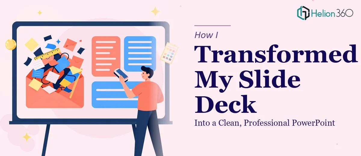
The Deck Was a Mess — and the Deadline Was Close
I had a presentation due in a few days, and when I opened the file to do a final review, I realized just how bad it looked. Slides with inconsistent fonts, text boxes overlapping visuals, bullet points stacked six deep, and colors that did not match anywhere across the deck. It had been built in pieces by multiple people over several months, and it showed.
The content was solid. The logic was there. But visually, the PowerPoint was impossible to follow. If I sent it out the way it was, it would undercut everything the content was trying to say.
I Tried to Fix It Myself First
I spent a few hours going slide by slide — standardizing fonts, adjusting spacing, trying to align elements properly. PowerPoint's alignment tools helped to a degree, but the deeper I went, the more problems I uncovered. Some slides had five different font sizes on them with no hierarchy. Others had charts that were barely readable at normal zoom levels. A few slides had been built from screenshots of other presentations and were not even editable.
I could clean the surface, but the structural problems were a different matter. Getting the slide design to feel cohesive — not just tidy — required skills and time I did not have at that point.
Bringing In Outside Help
After hitting a wall, I came across Helion360. I explained the situation: a 30-slide presentation with inconsistent formatting, weak visual hierarchy, and no real design logic holding it together. I needed it cleaned up and made to look like a professional presentation — without changing the content itself.
Their team asked a few focused questions about branding preferences, the audience, and whether there was an existing style guide. There was not, so they worked from the tone of the content and a color direction I described. Then they got to work.
What the Redesign Actually Involved
The turnaround was faster than I expected. When the revised file came back, the difference was immediate. The slide design had a consistent visual system — one font family used purposefully across headings, body text, and callouts. The layout had breathing room. Charts had been rebuilt cleanly with proper labels and readable type sizes.
What stood out most was the hierarchy. Each slide had a clear focal point. The eye knew where to go first. That was something I had struggled to achieve on my own, even after hours of manual adjustments.
The presentation redesign also handled the previously uneditable screenshot slides. They had been rebuilt as native PowerPoint elements, which meant I could go in later and update numbers or text without breaking the layout.
What I Took Away From This
The experience changed how I think about slide cleanup work. There is a difference between fixing formatting errors and actually redesigning a presentation to communicate clearly. The first is tedious but manageable. The second involves design decisions — spacing, contrast, type scale, visual flow — that go beyond what most of us can reliably do under deadline pressure.
I also realized that a cluttered presentation is not just an aesthetic problem. Audience attention is limited, and a slide that forces someone to search for the main point is a slide that loses them. Clean professional presentations are a communication tool, not just a visual preference.
Having a team that could step in, understand the intent behind the content, and translate it into a coherent visual structure was genuinely useful — not as a shortcut, but as the right tool for the job.
If your presentation is in a similar state — functional on paper but rough in execution — Helion360 is worth reaching out to. They handled what I could not pull off alone and delivered a polished result that was ready to present.