

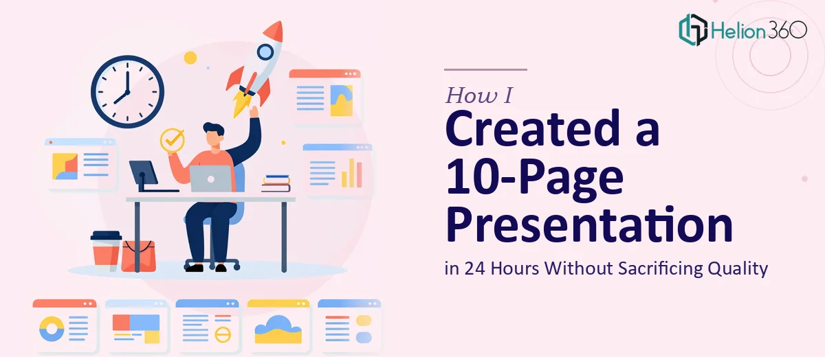
The Clock Was Already Ticking When I Started
I had one afternoon, one evening, and half a morning. That was it. The ask was straightforward enough on paper — a 10-page PowerPoint that covered our company's mission, core services, and a few case studies showing real results. Clean, professional, something we could send out or present without embarrassment.
The problem was not the content. I had notes, I had bullet points, I had rough ideas about what each slide should say. The problem was turning all of that into a cohesive, well-designed company presentation that actually looked like it had been thought through — in less than 24 hours.
Where It Started to Fall Apart
I opened PowerPoint and started with a blank slide. That was my first mistake. Blank slides have a way of staying blank when you are working under pressure.
I pulled a template from the default library, swapped in our brand colors, and started dropping in text. By slide three, I already knew it was going wrong. The layout felt inconsistent, the case study slides looked clunky, and nothing had a clear visual flow. Every slide felt like a separate document rather than part of a single story.
I tried to simplify. I cut back on design ambitions and focused on just getting the content right. But even a "simple" company profile presentation needs structure — an intro that sets tone, a services section that is scannable, case studies that feel credible without being overloaded with text. That balance takes more skill than I had bandwidth for at that moment.
By hour four, I had six slides I was not happy with and a deadline that was not moving.
Handing It Off to Someone Who Could Actually Deliver
After hitting that wall, I came across Helion360. I explained the situation — 10 slides, 24-hour turnaround, company overview format with mission, services, and case studies — and their team took it from there.
I sent over the content notes I had already drafted, mentioned the general tone I was going for (clean, no heavy graphics, professional but approachable), and they got to work. There was no lengthy back-and-forth to get started. They understood the scope immediately.
What the Final Presentation Looked Like
The delivered PowerPoint was exactly what I had been trying to build but could not pull together on my own under the time pressure.
The opening slides established the company clearly — not with walls of text, but with one or two focused points per slide, supported by clean visual layout. The services section was organized in a way that made it easy to scan without losing depth. The case study slides were the part I had struggled with most, and those came out particularly well — each one told a compact story with a clear structure: the situation, what was done, and the outcome.
Helion360 kept the design straightforward, which was the right call. No unnecessary animation, no decorative elements that distracted from the content. Just a consistent visual system that made the presentation feel like a single, coherent document.
What a Tight Deadline Taught Me
A 24-hour turnaround for a company presentation is absolutely doable — but only if the execution is handled by someone who does this regularly. The content side, the messaging, the story you want to tell — that part I could handle. The translation of that content into a well-structured, professionally designed PowerPoint is where the gap showed up.
I also learned that "simple" presentations are not actually simple to design well. A clean 10-page company profile requires real layout discipline. Every slide has to carry its weight. There is no room for filler, but there is also no room for slides that feel bare or unfinished.
If you are facing the same kind of crunch — a company presentation that needs to look polished but needs to be ready fast — Helion360 is worth reaching out to. They handled what I could not in the time I had, and the result was something I was genuinely confident sending out.