

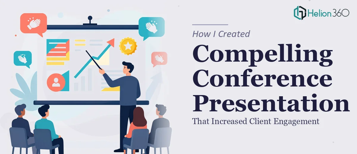
The Brief Was Simple. The Execution Was Not.
We had an upcoming industry conference, and I was tasked with putting together a presentation deck that would represent our services clearly and convincingly. The goal was straightforward: walk the audience through what we do, why it matters, and how it creates real value for clients.
I figured I could handle it. I had a rough outline in my head, access to our existing materials, and enough time to pull something together. Or so I thought.
Where My First Draft Fell Apart
I opened PowerPoint and started building. Within a few hours, I had something that technically covered the content — but it looked flat. The slide structure was inconsistent, the information flow felt choppy, and the visual hierarchy made it hard to know where to look first on any given slide.
The deeper problem was that I was thinking like someone who knew the content, not like someone seeing it for the first time. When you're too close to the material, it's easy to overload slides with text or assume context that the audience doesn't have. My conference presentation deck had both problems.
I tried tightening the copy and swapping in better visuals from stock libraries, but the cohesion just wasn't there. What I had was a collection of slides, not a presentation.
Recognizing the Gap Between Good Enough and Actually Good
After a couple of revision cycles that weren't moving the needle, I accepted that the issue wasn't just the visuals — it was the structure, the storytelling, and the design working together as a system. That's a different skill set than knowing your own content.
A colleague had mentioned Helion360 after they helped with a similar project. I reached out, explained what I was working on, shared my draft, and outlined what wasn't working. Their team asked the right questions upfront — about the audience, the tone we wanted, the key message we needed to land — and then they took it from there.
What the Redesigned Deck Actually Looked Like
The difference in the revised presentation was immediately visible. The opening slide set the context clearly without cramming in too much text. Each section had a logical flow that built on the previous one rather than just moving to the next topic. The visual design was consistent throughout — typography, color usage, icon style, and spacing all felt like they belonged to the same system.
More importantly, the slides were designed to support a speaker rather than replace one. Information was layered in a way that let me guide the audience rather than have them read ahead. That shift alone changed how I felt about presenting the material.
The data slides — the ones I had struggled with most — were cleaned up into clear, focused visuals that made the key point obvious without requiring the audience to interpret raw numbers on their own.
The Outcome at the Conference
When I delivered the presentation, the response was noticeably different from what I had anticipated when looking at my original draft. Attendees stayed engaged through the full session. Several came up afterward with specific questions about our services — which is exactly what a well-structured conference presentation deck should do. It doesn't just inform; it invites a next conversation.
I've since used the deck as a template baseline for other client-facing presentations, which has saved a significant amount of time on follow-on projects.
What I'd Do Differently From the Start
Honestly, I would skip the back-and-forth of trying to get a rough draft to a professional standard on my own. The value isn't just in making slides look better — it's in having someone who understands presentation design structure the content in a way that actually serves the audience.
There's a real difference between a presentation that covers the material and one that moves people. Getting to the second version is harder than it looks, and it requires more than good content.
If you're preparing for a conference or client-facing presentation and you're finding that your draft isn't landing the way it should, Helion360 is worth reaching out to — they handled exactly the kind of structural and visual work that I couldn't get right on my own, and the result spoke for itself.