

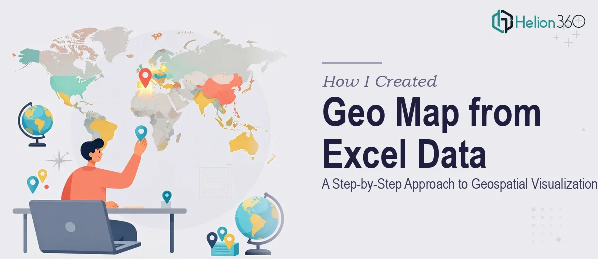
When a Spreadsheet Full of Location Data Needs to Become a Map
I had a dataset sitting in Excel — rows and rows of location names, coordinates, and attribute values tied to different geographic regions. The ask was straightforward on the surface: turn this into a geo map that people could actually read and use. Easy enough, I thought.
What I did not anticipate was how quickly a "simple mapping task" could spiral into something far more involved.
What I Tried First
My first instinct was to use Excel's built-in map chart feature. For basic country-level data, it works reasonably well. But my dataset had more granularity — city-level points, varying attribute weights, and a need for visual clarity that Excel's native charts just could not deliver cleanly.
I tried exporting the data and pulling it into a few online mapping tools. Some handled the data fine but produced outputs that looked generic and were not print-ready. Others required the data to be reformatted in ways that took more time than the mapping itself. I spent a good part of an afternoon reformatting columns, fixing coordinate formats, and chasing down why certain locations were not plotting correctly.
The bigger issue was the output quality. The end product needed to work both on screen and in print — high resolution, clean labels, and a visual style that matched the project's standards. None of the tools I tried got there without significant manual adjustment.
Where the Complexity Really Showed Up
Geospatial data visualization sounds technical, and it is. When the dataset includes multiple location attributes — not just where something is, but what value or category it carries — the map has to communicate layers of information simultaneously. Color coding, size scaling, label placement, and legend design all matter.
I could get the data onto a map. What I could not easily do was make it look intentional, accurate, and presentation-ready within the timeframe I had.
Bringing in the Right Help
After hitting that wall, I reached out to Helion360. I explained the project — the Excel dataset, the location attributes, the dual-format output requirement — and they took it from there.
What stood out was that they asked the right questions upfront. They wanted to understand how the map would be used, who the audience was, and whether any specific regions needed emphasis. That context shaped the final design in ways I had not fully thought through myself.
They worked with the raw Excel data directly, cleaning up the location entries, standardizing the coordinate data, and building out a geo map that accurately represented every data point. The visual hierarchy was clear — viewers could immediately read which regions carried higher values and how the distribution looked across the full geography.
The Final Output
The delivered map was high resolution, exported in formats suitable for both web display and print. The color scheme was consistent, the labels were legible at multiple sizes, and the legend made the attribute data easy to interpret without any explanation needed.
Looking at it compared to what I had managed to produce on my own, the difference was not subtle. The Helion360 team had turned the same dataset into something that communicated clearly and looked professionally finished.
What This Project Taught Me About Geospatial Visualization
Geographic mapping from Excel data is one of those tasks that seems like it should be quick but rarely is. The data preparation alone — making sure coordinates are accurate, attributes are correctly formatted, and outliers are handled — takes real attention. Add in the design layer, and it becomes a specialized skill set.
If your dataset is small and the output requirements are basic, Excel's native map chart or a simple online tool might get you there. But when the data has depth, the output needs to meet professional standards, or the timeline is tight, trying to force it through a generic tool costs more time than it saves.
Geospatial data visualization done well requires both technical accuracy and visual judgment — knowing not just how to plot points, but how to make the map readable and meaningful at a glance.
If you are working with location-based Excel data and need a data visualization toolkit that actually communicates something clearly, Helion360 is worth reaching out to. For similar approaches to transforming data, explore how others have tackled interactive web dashboards and interactive Tableau visualization — they handled the full process from raw data to finished output, and the result spoke for itself.